Towards effective visual analytics on multiplex and multilayer networks111This work has been partly supported by the Italian Ministry of Education, Universities and Research FIRB grant RBFR107725. The manuscript has been accepted for publication in Chaos, Solitons and Fractals: the interdisciplinary journal of Nonlinear Science, and Nonequilibrium and Complex Phenomena. The manuscript will undergo copyediting, typesetting, and review of the resulting proof before it is published in its final form. Please note that during the production process errors may be discovered which could affect the content, and all disclaimers that apply to the journal apply to this manuscript.
Abstract
In this article we discuss visualisation strategies for multiplex networks. Since Moreno’s early works on network analysis, visualisation has been one of the main ways to understand networks thanks to its ability to summarise a complex structure into a single representation highlighting multiple properties of the data. However, despite the large renewed interest in the analysis of multiplex networks, no study has proposed specialised visualisation approaches for this context and traditional methods are typically applied instead. In this paper we initiate a critical and structured discussion of this topic, and claim that the development of specific visualisation methods for multiplex networks will be one of the main drivers pushing current research results into daily practice.
keywords:
multiplex , visualisation , analytics1 Introduction
Over the last few years multiplex networks have acquired more and more prominence as a promising research direction connecting and complementing many different fields [1, 2, 3]. Due to the high level of flexibility of multiplex networks and to a wide range of potential applications the theoretical analysis of these kinds of networks is advancing fast [4, 5, 6, 7], showing that single-network theory is not sufficient to handle them. However, when it comes to visualisation traditional schemes are still applied. Our claim is that shifting from a single-layer to a multiplex perspective also poses new problems concerning network visualisation and about how to handle the richer data that multiplex networks convey. This requires new approaches challenging some of the traditional dogmas of network visualisation.
Generally speaking the visual representation of network data has two main goals: on the one hand a visual representation can be used as an exploratory tool to obtain relevant insights about the network structure or network properties, on the other hand it can be used to report the results of a pre-existing analysis in an easily accessible way. In both cases network visualisation involves aspects of information design and geometric representation [8]. These two goals can be applied to two main aspects, leading to completely different visualisations: we can either focus on the network structure or represent some specific network characteristics or metrics.
Among the visualisations focusing on the network structure, graphs and their application to social networks known as sociograms [9] have seen, so far, the most widespread adoption. A sociogram representing people working at the same department of a University and the relation having lunch together is shown in Figure 1(a). Sociograms put a lot of emphasis on layout, because positional differences are the most accurately perceived graphical attribute [10] and also because some network properties like modular structure and node centrality may emerge out of a good layout. This is the case in Figure 1(a). For a detailed survey on graph visualisation see [11].
While probably the most appealing, the visualisation of the network structure is not the only way to make sense of a network: sometimes it appears to be more convenient to rely on more traditional data visualisation techniques, especially when the network structure does not fit any standard layout or when the network is too large. We can thus describe a network using numbers, either a single value or a distribution, and use traditional visualisations not specifically developed for graphs. A simple example in this context is the study of the degree distribution of a network, which is usually illustrated using a log-log plot (for long tail distributions) or simple histograms like the one about our example lunch network shown in Figure 1(b).
While in this work we focus on the visualisation of the multiplex network structure222For some examples of visualising network metrics please refer to B., it is important to mention the role of network metrics in visual analytics: the two aforementioned options can in fact be merged together, and sociograms can be enriched with information about metrics. In Figure 1(c) the same lunch sociogram is again visualised, but now node sizes represent the node degree. In this way it is possible to communicate information about the network structure (e.g. the presence of clusters) and information regarding single nodes (e.g. degree centrality) at the same time.
Following this idea, this article shows how to use analytical measures to improve the structural visualisation of multiplex networks. However, we will see that the simple application of the same principle to multiplex networks, that is, augmenting sociograms with network metrics, does not work as well as in single networks. On the contrary, we explore the possibility of using network metrics to reduce, or simplify the multiplex. The underlying idea is that multiplex networks carry overabundant information and visualising everything may lead to noise hiding relevant knowledge. But before presenting the details we start our discussion from the existing naive visualisations directly extending single-network approaches.
2 From single networks to multiplexes
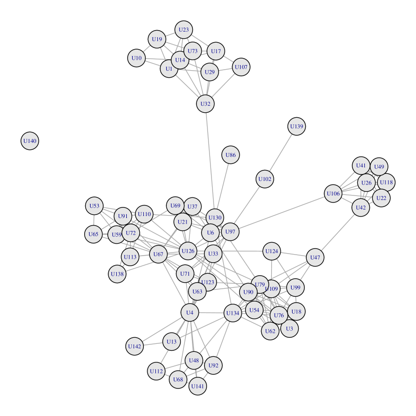
When we move into a multiplex network perspective the additional complexity in the added relations makes the choice of an appropriate layout more challenging. In the following we are going to explore a real-world multiplex network containing five different types of relationships existing among employees of a Computer Science department of a Danish University. The data set counts 61 nodes connected over five different layers: work, leisure, coauthor, lunch and Facebook. More details about the dataset are provided in A. Further in the article we will refer to the dataset as AUCS. In Figure 2 we can see again the lunch layer of the AUCS multiplex network (left) and the whole network with the four additional kinds of relations (right).
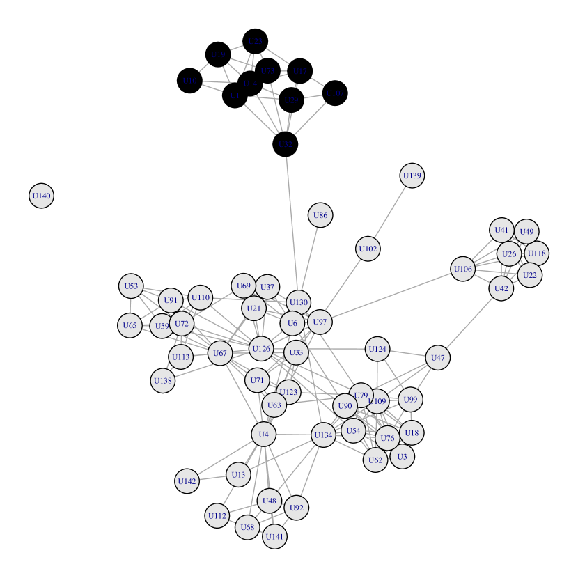
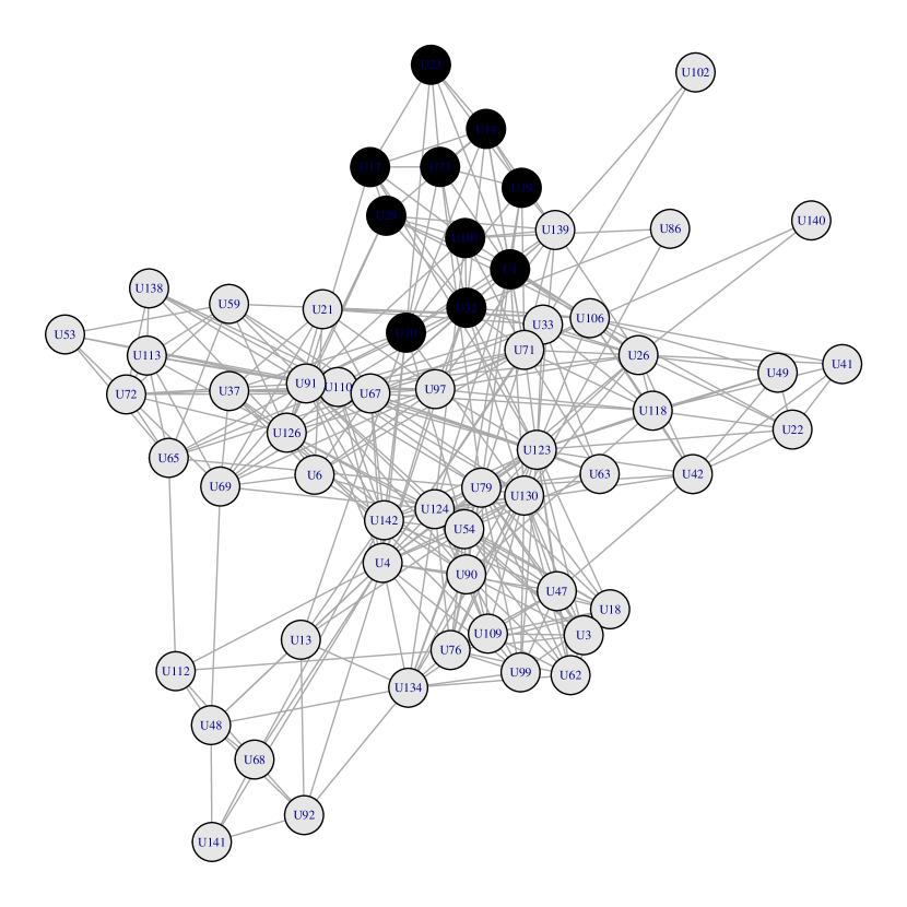
Comparing the two visualisations we can see how the clear structure of the lunch network becomes more blurred and confused if we take connections from all the layers into consideration. As an example, we have highlighted a clearly visible cluster in the left hand side network using a black node background. The same nodes are also black-marked in the graph with all the multiplex connections, and we can see that the cluster has been partially attracted towards the center of the figure and some of its peripheral nodes are now more connected to other nodes outside the cluster. Network visualisation is already a complex task for single-layer networks when they count a large number of highly interconnected nodes. When it comes to multilayer networks the task is even more challenging and even adopting a 3-dimensional interactive visualisation [12] a multiplex network quickly becomes incomprehensible as soon as it contains a few dozen nodes.
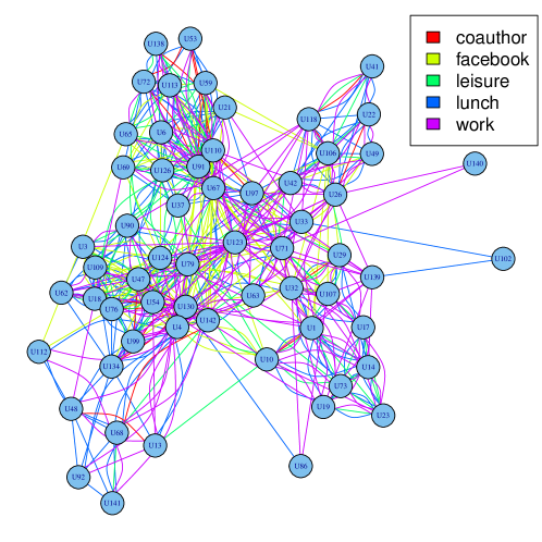
In addition, while the graph in Figure 2(b) still shows some structural features, e.g., some denser locations, information about the different layers is completely lost. Therefore, a more typical way to preserve some of the multilayer information is to assign a colour to each layer as in Figure 3. However, although fancier, this figure does not add much to the flattened uncoloured case. Even if some denser regions can still be observed it is almost impossible to understand how those are related to the underlying multiplex structure. In addition, it is very challenging to focus on a specific network layer within this chaotic overlapping of edges.
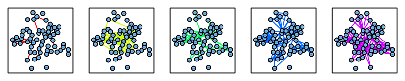
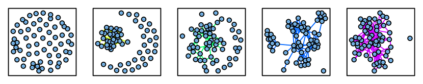
Two alternative visualisations concluding our review of typical approaches are shown in Figures 4 and 5. Both methods just slice the multiplex into its layers. In order to simplify a comparison between the layers, in Figure 4 the nodes have been placed using the same layout in each slice333In this specific case we have computed the common layout on the flattened graph, but any layer can be used to this aim.. However if different layers contain different connections their internal structure can become invisible. This is evident e.g. comparing the lunch layer in Figure 2 with the same layer visualised in Figure 4 (fourth slice, blue edges). If we use a specific layout for every layer as in Figure 5 we can better appreciate the structure of each layer but we loose the possibility of detecting structures developing over multiple layers.
3 Augmented multiplex sociograms
In a similar way to what happens for single layer networks, analytical measures like the ones defined in [13] can be used to increase the information content of the graphs introduced in the previous section. The next step in our exploration of visualisation strategies is thus to use some metrics to produce augmented versions of the multiplex sociograms.
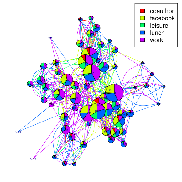
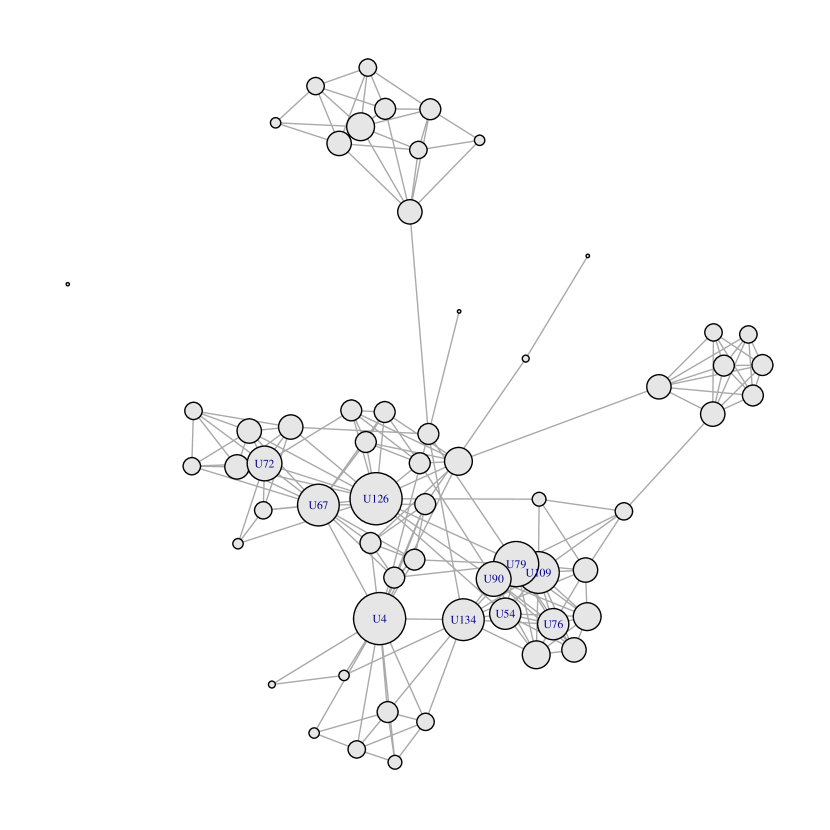
Figure 6 shows a coloured multiplex network where every node contains information about its degree (node size) and the degree composition on the various layers (pie chart). While this may look like an interesting visualisation it is hard to claim that it provides a clear understanding of the underlying network structure. The main issue with this visualisation can still be described as overabundant information: edges overlap with each others and generate an intricate pattern.
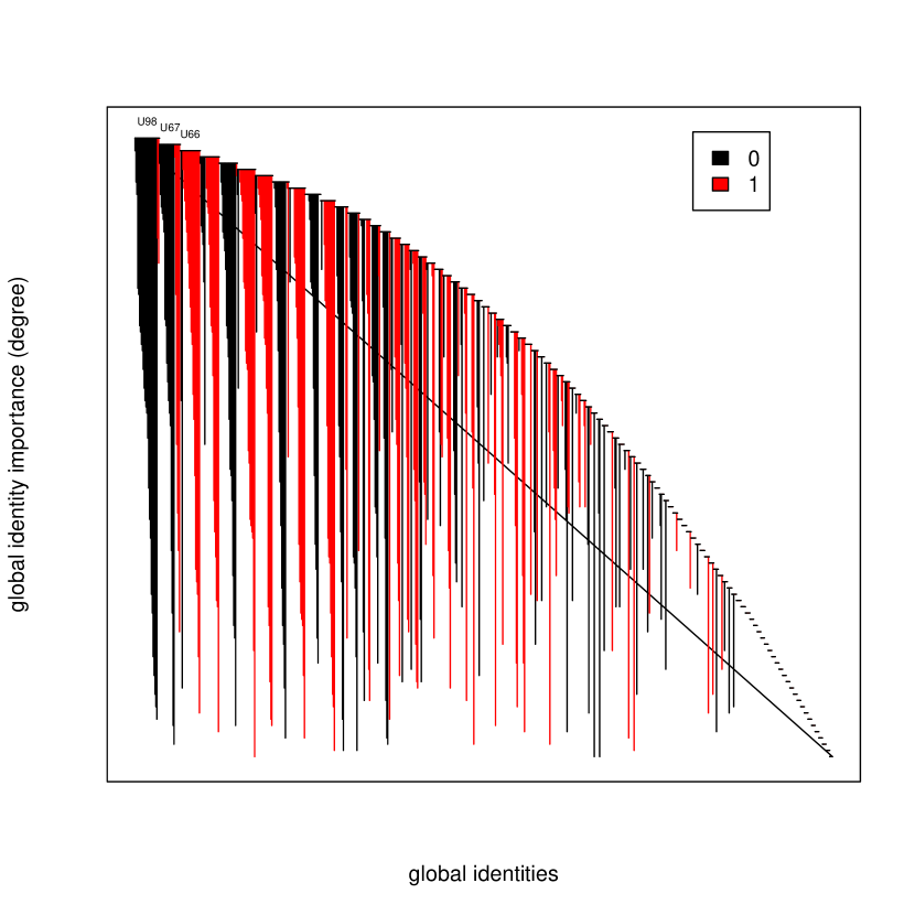
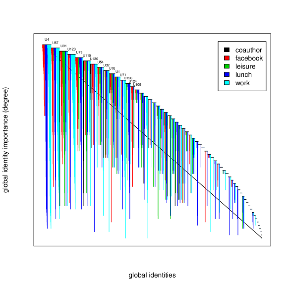
In order to remove this intricacy, we have explored alternative visualisations rearranging the edges in a non-standard way so that overlapping is prevented. An approach following the idea in [14], that we call here a ranked sociogram, abandons the traditional sociogram visualisation — where edges go from one node to the other — and replaces it with ranking-based positioning of nodes and edges where the ranking is based on a specific metric. In a ranked sociogram nodes are plotted according to a chosen metric on a classical xy plot (Figure 7 ranks them according to their aggregated degree). Every node has a length on the x axis that is defined by a set of edges connecting the vertical position of node a with the vertical position of node b. All the edges expand only on the vertical axis and show the distance between the nodes according to the chosen ranking. Every edge is also represented using a different colour according to its corresponding layer.
This produces a clear perception of how many connections every node has on every single layer and how far the connected nodes are in terms of the chosen metric. In Figure 7 the user with the highest degree (U4) is mainly connected through the work layer, the lunch layer and the Facebook layer while he/she has no connections on the leisure and on the coauthor layers. It is also interesting to notice how U4 is connected with users with very different degrees (as indicated by the length of the edges) while this is not happening on the Facebook layer, spanning a shorter range of contacts. This also gives an insight on the layers’ assortativity or dissortativity. Another interesting element that can be noticed studying Figure 7 is that between the top 5 users only two (U91 and U79) show a relevant presence on the leisure layer, which appears to be absent for the three other top users. More details about the ranked sociogram are available in C.
4 Local simplification of multiplex structures
Both the node-augmented visualisation and the ranked sociogram provide some additional information on the distribution of edges into layers, but this does not make the underlying structural representation more clear. For example, in Figure 6 we can still see several unorganised edges in the background.
An opposite way is to use analytical measures to simplify the network visualisation instead of augmenting it. Going back to Figure 6 we can see that all the layers are entirely included in the visualisation. Here we instead propose to include only local parts of each layer. For example, assume that for a specific user only two layers are relevant, e.g., they are the ones used to reach most of its neighbours, or the only way to reach some of them, or the ones defining its affiliation to some community. We can then say that locally around that user those layers are relevant and the others are mainly generating noise. Somewhere else there can be users with a different local view, for which other layers are relevant and the others represent noise.
Having a way to quantify what relevant means, we can thus remove users (and their connections) from layers that are not relevant for them and create a new filtered multiplex providing a combination of the local views of its users. In practice, we do not ask if two layers should or should not be merged, we do not try to measure if they are globally similar or not, but we ask these questions locally, for each pair of nodes, acknowledging that the answer can change when we focus on different portions of the network.
Acknowledging this aspect we introduce sociograms based on local merging techniques. Locally merged sociograms maintain the classical look of sociograms, as well as their intuitive nature, but redefine the edges connecting the nodes. What defines an edge in this filtered sociogram is not the existence of a relationship between node a and node b (which is more and more probable as long as we add layers) but the existence of a connection between nodes playing the same important role for both of them. Focusing on specific multilayer metrics such as those defined in [5] makes it possible to visually isolate relevant network structures hidden inside the multiplex network.
Figure 8(a) shows a local merging sociogram defined according to network/layer relevance with a threshold of 0.6. Relevance [5] computes the ratio between the number of neighbours of a node on layer over the total number of its neighbours on all layers. Defining a local merging sociogram based on this value corresponds to selecting an edge between two nodes of the multilayer network only when a specific layer is more relevant than the input value for both of them. As an example, the network visualised in Figure 8(a) shows all the existing edges connecting two nodes on a given layer that is more relevant than 0.6. It is important to keep in mind that this kind of visualisation considers the relevance value for the dyad and not for the single node, therefore the edges are represented only if they belong to a layer that is relevant for both the nodes of the dyad; this is why we call this a merging.
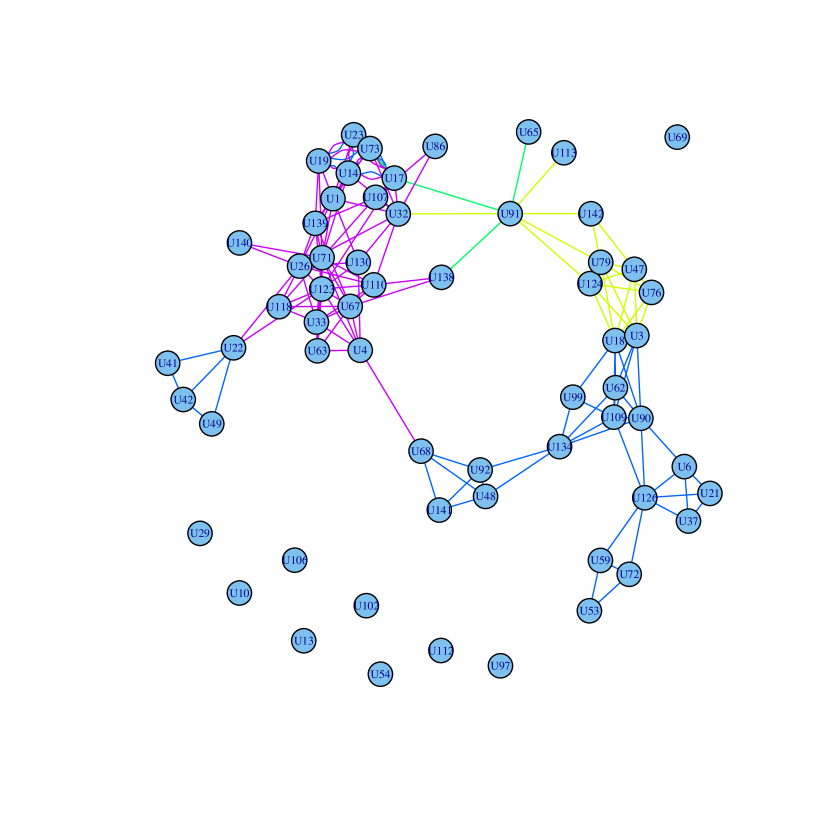
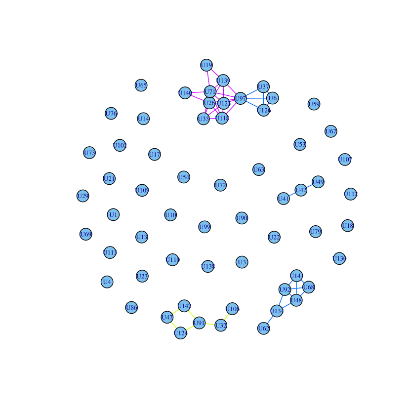
Figure 8(b) introduces a local merging network based on exclusive relevance. Exclusive relevance [5] indicates the fraction of neighbours of a node that are reachable in one step only through a specific layer , making that specific layer essential to ensure the full connectivity of the node. While in a multilayer network nodes and connections are easily replicated through several layers, exclusive relevance measures those connections that are available only on a specific subset of the layers, e.g., on a single layer. From a node-level perspective we can assume that within a multilayer network a layer that shows a high level of exclusive relevance is used by the node in a different way from the other layers. Nodes might have many reasons to maintain different connections in different layers and to keep them separated. Extracting the local merging of a network based on the exclusive relevance of its layers allows us to visualise this aspect focusing on the dyads. As in the previous example, in Figure 8(b) only the edges belonging to a layer with an exclusive relevance higher than a given threshold (0.3 in this case) for both the nodes of the dyads are visualised. The visualised edges are thus only those connecting nodes that are both using that specific layer in a different way, in particular, with connections that are nor replicated in any other layer.


A qualitative description of this phenomenon can contribute to clarify it: if we look at Figure 8(b) and we examine the small clique on the bottom right corner containing users U141, U68, U48 and U92 we notice that these users (1) are tightly connected on the network and (2) can only reach some of their neighbours through this network. For example, U68 is connected to U48 and U92 only because they have lunch together. If we check their connections on the other layers we notice, from the analysis of Figure 5, that they are all connected on the layer with U4. U4 is also connected to the four nodes on the layer, even though this is not visible in Figure 8(a) because this layer’s relevance is below the thresholds used in our examples. A possible interpretation of Figure 8(a) is that U4 is a central hub on the layer (this can easily be confirmed looking at Figure 7) and he/she has lunch with many collaborators, acting as a bridge between different layers. Nevertheless these collaborators get together only during lunches therefore their connections with other co-workers of U4 are necessarily happening only exploiting the network.
To support our claim that local merging techniques based on both relevance and exclusive relevance are able to highlight hidden clusters within multilayer networks, we need to verify that these clusters are not random structures emerging as a result of randomly selecting node pairs from the different layers. More precisely, our hypothesis is that nodes for which a layer has a high relevance tend to be localized in specific parts of the layer, that is, they tend to form well-connected groups. In order to verify this hypothesis we computed the transitivity value of the networks obtained through local merging (based on both relevance and exclusive relevance) and we compared those with the value obtained from a random model. The random model is obtained as follows: for each layer and (exclusive) relevance threshold, we count the number of nodes passing the threshold. However, while in the local merging model we preserve these nodes (and thus the edges between them), in the null model we randomly choose the same number of nodes, preserving the edges among them. If the probability of being connected for a group of nodes is not dependent on the fact that they all have high values of relevance for that layer, then we should not be able to observe a difference with the case where nodes are randomly chosen. To observe this difference, we use transitivity, or clustering coefficient, which measures the probability that two nodes that are both connected to a third node are also connected to each other [15].
Figure 9 shows how the transitivity values are consistently higher in the measured data than in the random models, supporting our claim. The reason why in Figure 9 the values of transitivity disappear above some thresholds depends on the fact that for high thresholds almost all edges are removed, the network becomes almost empty and it is no longer possible to identify hidden structures inside it. This is particularly evident when we use exclusive relevance, where it is not so common to observe people who are only or mainly present in one of the layers: if the filter is too selective we end up with an empty network, for which transitivity is undefined. Interestingly, this affects randomly sampled networks more significantly, supporting again the idea that nodes for which a layer has a high relevance tend to be localized in specific parts of the layer. The drop in transitivity in Figure 9(a), at relevance .9, can also be explained considering that the corresponding simplified network is almost (but not completely) empty.
5 Conclusion
Generating effective visualisations of multiplex networks is an important task in exploratory analyses and reporting. So far, methods developed for simplex networks have often been adapted to multiplexes, using some additional information like colours and line types to differentiate layers. However, a problem with multiplex networks is that they provide more structural information than simplex networks and different layers may not be similar, making it impossible to find layouts which are appropriate for all of them. As a result, even a traditional representation of just nodes and edges may suffer from too much information condensed in a single diagram.
As a way to address this problem, we propose to use network properties to simplify the multiplex. Different measures can be used, leading to different meanings of the graphs. By comparing the results with null models we have seen that real data contains patterns highlighted by these representations and that are not a result of chance.
It is worth noticing that this approach is not necessarily restricted to visualisation. As an example, modern clustering approaches for multiplex networks try to find combinations of layers for which community structures emerge. While this is an interesting novel direction with respect to simplex network clustering, it may not make sense to combine two layers altogether. Some local portions might be correlated enough to be combined, some others might not.
As a final remark, the discussion presented in this work has only focused on the single layers composing the multiplex. However, the simplification measures used in our experiments can also be applied to sets of layers. This leads to interesting combinatorial problems to be investigated in the future.
6 References
References
- [1] M. Magnani, L. Rossi, The ML-Model for Multi-layer Social Networks, in: ASONAM, IEEE Computer Society, 2011, pp. 5–12.
- [2] M. Kivelä, A. Arenas, M. Barthelemy, J. P. Gleeson, Y. Moreno, M. A. Porter, Multilayer Networks, Journal of Complex Networks 2 (3) (2014) 203–271.
- [3] S. Boccaletti, G. Bianconi, R. Criado, C. del Genio, J. Gómez-Gardeñes, M. Romance, I. Sendiña Nadal, Z. Wang, M. Zanin, The structure and dynamics of multilayer networks, Physics Reports 544 (1) (2014) 1–122.
- [4] P. Brodka, K. Skibicki, P. Kazienko, K. Musial, A degree centrality in multi-layered social network, in: International Conference on Computational Aspects of Social Networks (CASoN), IEEE, 2011, pp. 237–242.
- [5] M. Berlingerio, M. Coscia, F. Giannotti, A. Monreale, D. Pedreschi, Multidimensional networks: foundations of structural analysis, World Wide Web 16 (5-6) (2012) 567–593.
- [6] M. Magnani, L. Rossi, Pareto Distance for Multi-layer Network Analysis, in: Social Computing, Behavioral-Cultural Modeling and Prediction, Vol. 7812 of Lecture Notes in Computer Science, Springer Berlin Heidelberg, 2013, pp. 249–256.
- [7] A. Solé-Ribalta, M. De Domenico, S. Gómez, A. Arenas, Centrality rankings in multiplex networks, in: ACM conference on Web science - WebSci, ACM Press, New York, New York, USA, 2014, pp. 149–155.
- [8] U. Brandes, N. Indlekofer, M. Mader, Visualization methods for longitudinal social networks and stochastic actor-oriented modeling, Social Networks 34 (3) (2012) 291–308.
- [9] J. L. Moreno, Sociogram and sociomatrix, Sociometry 9 (1946) 348–349.
- [10] W. S. Cleveland, R. McGill, Graphical perception: Theory, experimentation, and application to the development of graphical methods, Journal of the American statistical association 79 (387) (1984) 531–554.
- [11] T. von Landesberger, A. Kuijper, T. Schreck, J. Kohlhammer, J. J. van Wijk, J.-D. Fekete, D. W. Fellner, Visual analysis of large graphs: State-of-the-art and future research challenges, Comput. Graph. Forum 30 (6) (2011) 1719–1749.
- [12] M. De Domenico, M. A. Porter, A. Arenas, Multilayer Analysis and Visualization of Networks, arXiv preprint 1405.0843.
- [13] M. Magnani, A. Monreale, G. Rossetti, F. Giannotti, On multidimensional network measures, Italian Conference on Sistemi Evoluti per le Basi di Dati (SEBD), 2013.
- [14] W. Longabaugh, Combing the hairball with BioFabric: a new approach for visualization of large networks, BMC Bioinformatics 13 (1) (2012) 275+.
- [15] M. Girvan, M. E. Newman, Community structure in social and biological networks, Proceedings of the National Academy of Sciences 99 (12) (2002) 7821–7826.
- [16] R. E. Moustafa, Parallel coordinate and parallel coordinate density plots, Wiley Interdisciplinary Reviews: Computational Statistics 3 (2) (2011) 134–148.
- [17] M. Magnani, L. Rossi, Formation of Multiple Networks, in: A. M. Greenberg, W. G. Kennedy, N. D. Bos (Eds.), Social Computing, Behavioral-Cultural Modeling and Prediction, Vol. 7812 of Lecture Notes in Computer Science, Springer Berlin Heidelberg, Berlin, Heidelberg, 2013, pp. 257–264.
Appendix A AUCS dataset
The data used in the article was collected at the Department of Computer Science at Aarhus University among the employees. The population of the study is 61 employees (out of the total number of 142) who decided to join the survey, including professors, postdoctoral researchers, PhD students and administration staff.
For our study, we measured 5 structural variables, namely: current working relationships, repeated leisure activities, regularly eating lunch together, co-authorship of a publication, and friendship on Facebook. These variables cover different types of relations between the actors based on their interactions. All relations are dichotomous which means that they are either present or absent, without weights.
Measurements of the first three variables (off-line data) were collected via a questionnaire which had been distributed among the employees on-line. The measurements are results of individual assessments done by the actors and therefore the relations were directed, however, we do not intend to study the aspect of personal perception of the relationships and so we decided to flatten the data into nondirectional connections. Thus, if an actor indicated a tie to actor , we input an edge into the network even if actor did not indicate a tie to actor . On the top of this, the respondents were asked to provide their user information for a couple of most widespread online networks. 77% of the respondents who filled in the questionnaire stated that they have a Facebook account and provided their username. All respondents provided answers to all questions which means that our multi-layer network is complete. Information about the co-authorship relation was obtained from the on-line DBLP bibliography database without the need to directly ask the actors. A co-authorship of at least one publication by a pair of actors resulted in an edge in the network. DBLP gets new data with a delay of several months and therefore the “current working relationships” network is quite distinct from it. Moreover, “current working relationships” network includes other types of interactions than cooperation on papers (e.g. also cooperation on administrative work).
Friendship relations among all the actors who stated that they have a Facebook account were retrieved from the site using a custom application.
Finally, in Table 1 we describe some common statistical measures of the single-layer networks. The Co-authorship network is the smallest and less connected of all layers, Work and Lunch have the most edges and the highest average vertex degree can be observed for the Facebook layer.
| Work | Leisure | Coauthor | Lunch | FB | |
|---|---|---|---|---|---|
| # of edges | 194 | 88 | 21 | 193 | 124 |
| # of con. comp. | 2 | 1 | 8 | 1 | 1 |
| avg. vertex deg. |
Appendix B Visualising Multiplex network metrics
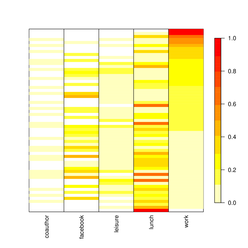
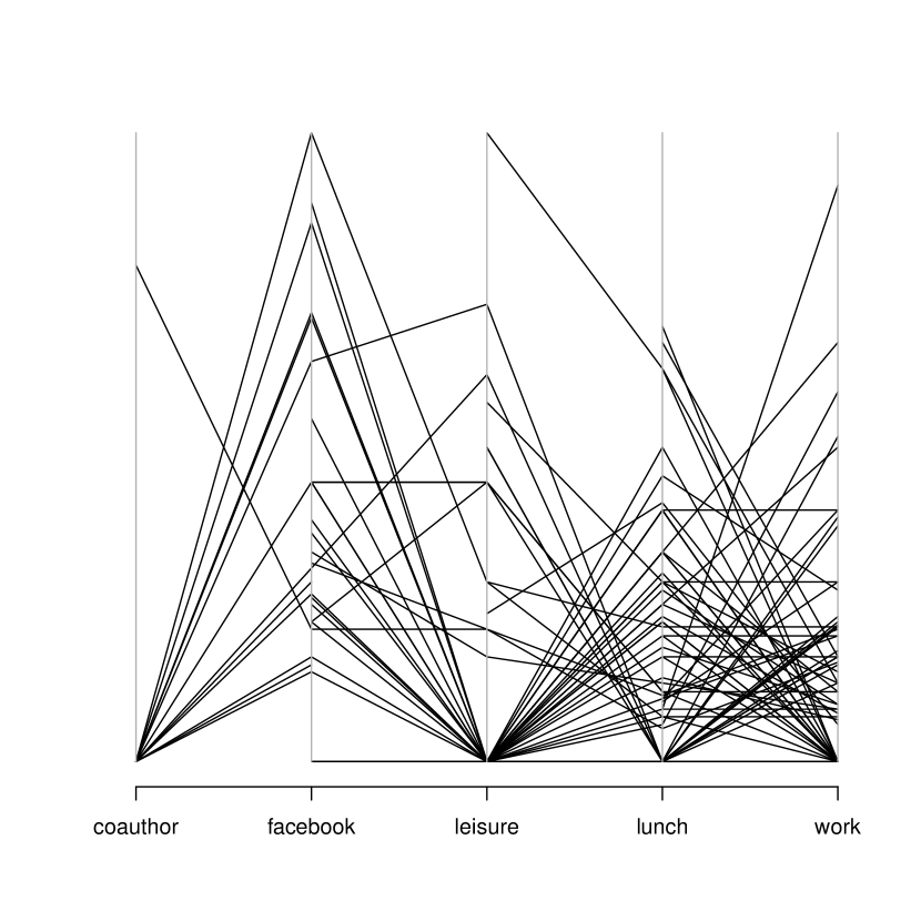
Multiplex networks analysis metrics can be measured on every single layer or combination of layers. As a consequence every node can behave differently on different layers, e.g., a user might be highly connected on Facebook and have almost no followers on Twitter. Parallel coordinates are typical visualisations for multi-dimensional data [16]. Figures 10(a) and 10(b) use two variations of a parallel coordinates plot to visualise some of the metrics defined by [13].
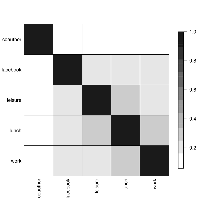
Multiplex network analysis also introduces the possibility to investigate the correlation between two pairs of layers belonging to the same network. A block matrix visualisation can be used to visualise this kind of information. Figure 10(c) shows the values of the Jaccard network correlation [5] for the various pairs of layers of the AUCS multilayer network. While in this case interpretation is straightforward it is still interesting to notice how following a similar approach it is possible to analyse existing correlations not only between pairs of layers but also between any pair of sets of layers.
Appendix C More on the ranked sociogram
A ranked sociogram is able to convey network level information such as the distribution within the multi-layer structure of a specific metric (in this case the degree distribution). Figure 11 shows the ranked sociogram of the degree distribution for two multi-layer networks generated according to an extended Barabasi-Albert and an Erdös-Re nyi model generated using the framework in [17] and the multinet package444https://github.com/magnanim/multiplenetwork. What can be noted is that in a single picture we have an overview of a large quantity of information both about the general multiplex network (degree distribution), about the nodes behaviour on the various levels (distribution of black and red connections) and about the assortativity or dissortativity of the networks (length of the edges).