Foresight: Recommending Visual Insights
Abstract
Current tools for exploratory data analysis (EDA) require users to manually select data attributes, statistical computations and visual encodings. This can be daunting for large-scale, complex data. We introduce Foresight, a system that helps the user rapidly discover visual insights from large high-dimensional datasets. Formally, an “insight” is a strong manifestation of a statistical property of the data, e.g., high correlation between two attributes, high skewness or concentration about the mean of a single attribute, a strong clustering of values, and so on. For each insight type, Foresight initially presents visualizations of the top instances in the data, based on an appropriate ranking metric. The user can then look at “nearby” insights by issuing “insight queries” containing constraints on insight strengths and data attributes. Thus the user can directly explore the space of insights, rather than the space of data dimensions and visual encodings as in other visual recommender systems. Foresight also provides “global” views of insight space to help orient the user and ensure a thorough exploration process. Furthermore, Foresight facilitates interactive exploration of large datasets through fast, approximate sketching.
1 Introduction
Exploratory data analysis (EDA) is a fundamental approach for understanding and reasoning about a dataset in which analysts essentially run mental experiments, asking questions and (re)forming and testing hypotheses. To this end, analysts derive insights from the data by iteratively computing and visualizing correlations, outliers, empirical distribution and density functions, clusters, and so on.
EDA Challenges: Although the capabilities of EDA tools continue to improve, most tools often require the user to manually select among data attributes, decide which statistical computations to apply, and specify mappings between visual encoding variables and either the raw data or the computational summaries. This task can be daunting for large datasets having millions of data items and hundreds or thousands of data attributes per item, especially for typical users who have limited time and limited skills in statistics and data visualization. Even experienced analysts face cognitive barriers in this setting. As discussed in [8, 10], limitations on our working memory can cause large complex data to be overwhelming regardless of expertise, and our tendency to fit evidence to existing expectations and schemas of thought make it hard to explore insights in an unbiased and rigorous manner. Thus people typically fail both to focus on the most pertinent evidence and to attend sufficiently to the disconfirmation of hypotheses [7]. Time pressures and data overload work against the analyst’s ability to rigorously follow effective methods for generating, managing, and evaluating hypotheses.
Foresight: We attack this problem by introducing Foresight, a system that facilitates rapid discovery of visual insights from large, high-dimensional datasets. Foresight enables users to jump-start the exploration process from automatically recommended visualizations, and then gives them increasing control over the exploration process as familiarity with the data increases. The resulting efficiency in insight generation can save users time and dramatically improve their productivity, thereby expanding the depth and breadth of generated hypotheses. Our approach, in which insights are recommended according to objective criteria, also helps the analyst focus more attention on evidence that is highly diagnostic for, or disconfirming to, current hypotheses.
Exploring Insight Space: The key idea is to focus directly on exploring the space of insights rather than the usual space of data dimensions and visual encodings, as in recent visualization recommendation systems (e.g., [9, 12]). We build on ideas from prior research and commercial systems on automated and intelligent analytics (e.g., [1, 2, 11]). Examples of insights include a high linear correlation between attributes and , high concentration about the mean of -values, the presence of extreme -value outliers, a strong clustering of -values according to -values, and so on. Associated with each class of insight are one or more strength metrics that allow ranking—e.g., the Pearson correlation coefficient to measure the strength of a linear correlation—as well as one or more visualization methods. As discussed in Section 2, the metrics impose a structure on insights that can be leveraged for exploration via insight queries. Given an unfamiliar, complex dataset, the user can select one or more preliminary insights to investigate; in this first, open-ended stage of exploration, Foresight visualizes the strongest examples of each insight. Using an iterative procedure, the user can dive deeper into an insight class during a second level of exploration by adding constraints on the data attributes considered or on the values of the strength metric. Finally, each insight can optionally support a third level of exploration by providing an overview visualization to help orient the user and ensure that the exploration process is thorough.
Sketching: We use approximation techniques to achieve interactive performance for insight queries. Specifically, the dataset is preprocessed to compute sketches, samples, and indexes that will support fast approximate insight querying. Importantly, we exploit the composability of certain types of sketches to answer a broad range of insight queries.
Overall, Foresight contributes (i) a novel framework of insights, insight metrics, insight visualizations and insight classes, (ii) sketch composition for fast approximate computation of insight metrics and visualizations, and (iii) an exploration engine for recommending and selecting insights that satisfy user-specified constraints on strength and data attributes.
2 Insights
Here we first describe the basic concepts of queries on insight space and then introduce the specific insights used in Foresight.
2.1 Querying Insight Space
The input data to Foresight is a matrix , where each row represents one of data items and each column represents one of the attributes of an item. In this work, we assume the data has been pre-cleaned. In general, the insights provided by Foresight might reveal additional, more subtle data problems that require further cleaning, e.g., a strong correlation that makes no real-world sense.
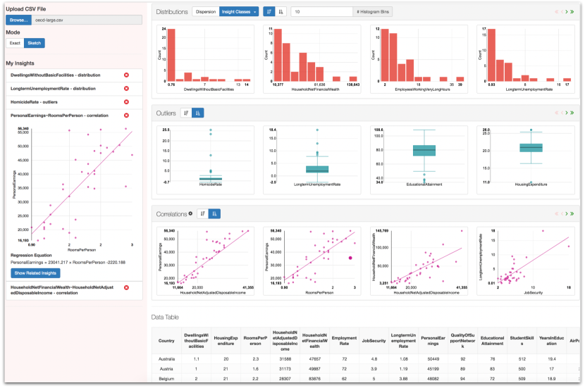
We define an insight as a strong manifestation of a distributional property of the data, such as strong correlation, tight clustering, low dispersion, and so on. We focus throughout on insights involving the marginal distribution of one, two, or three attributes (Figure 1).
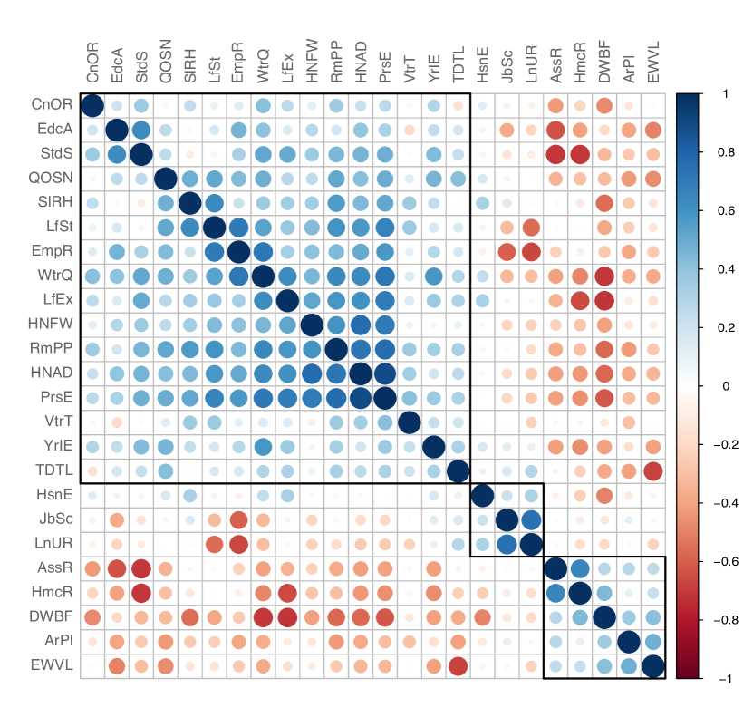
We require that each insight have one or more associated insight metrics that can be used to rank -tuples of attributes based on the strength of the property that defines the insight. Similarly, each insight must have one or more associated data visualizations. Corresponding to each insight is an insight class that comprises all feature tuples whose joint distributions are compatible with the insight’s associated metrics and visualizations. For example, given a data set with attributes , the insight class corresponding to the insight “high linear correlation” would contain all pairs with such that and are both real-valued attributes. Finally, an insight may optionally have one or more associated overview visualizations that display the values of the insight metric over all tuples in the insight class. The global visualization for the insight above, for example, is a heat map where the and coordinates correspond to the different attribute indices and the color and size of the circle centered at encode the Pearson correlation coefficient (Figure 2).
A basic insight query returns the visualizations for the highest-ranked feature tuples according to the insight metric selected, e.g., the attribute pairs with the highest correlations. In general, one or more of the attributes might be fixed, e.g., instead of ranking the highest correlations over all attribute pairs, we can fix and rank correlations only over pairs of the form , i.e., searching for the attributes most correlated with . Insight queries may also have constraints or filters on the strength metric, e.g., we might want to rank only correlated attribute pairs whose correlation coefficient falls in the range because we want to filter out trivially very high correlations. In future work, queries will also allow inclusion of constraints involving metadata about attributes, e.g., to search for attributes that represent currency or dates.
As can be seen, our framework imposes some structure on the space of insights that can be exploited during search. Two insights can be considered “similar” if their metric scores are similar or if the sets of fixed attributes are similar. At any point during the EDA process, the user can step back and look at the overview visualization of an insight (Figure 2). This helps ensure that, in analogy with gradient descent, the EDA process does not get inadvertently “trapped” in some local “neighborhood” of attribute tuples. This capability is particularly important in cases where many attribute tuples have similarly high insight-metric scores, so that the particular set visualized for the user is somewhat arbitrary. Section 4 illustrates the insight-navigation process in a concrete scenario.
2.2 Foresight’s Insight Classes
Foresight is designed to be an extensible system where a data scientist can “plug in” new insight classes along with their corresponding ranking measures and visualizations. We now briefly describe some of the specific insights supported by Foresight. Denote by and the sets of attribute columns in that contain numeric and categorical values. Foresight supports a variety of distinct visual insights, each with a preferred ranking metric and visualization method. Denote by a numeric column with mean and standard deviation , and by a categorical column. For each insight, the ranking metric is italicized.
1. Dispersion: Very high or low dispersion of data values around a population mean is measured by the variance and is visualized via a histogram.
2. Skew: Skewness is a measure of asymmetry in a univariate distribution. It is measured by the standardized skewness coefficient and visualized via a histogram.
3. Heavy Tails: Heavy-tailedness is the propensity of a distribution towards extreme values. It is measured by kurtosis and visualized via a histogram.
4. Outliers: The presence and significance of extreme outliers is measured by applying a user-configurable outlier-detection algorithm—see, e.g., [3]—and computing the average standardized distance of the outliers from the mean, where standardized distance is measured in standard deviations. Outliers are visualized using box-and-whisker plots.
5. Heterogeneous Frequencies: For a categorical column (or a discrete numerical column ), high heterogeneity in frequencies implies that a few values (“heavy hitters”) are highly frequent while others are not. For a configurable parameter , heterogeneity strength is measured by , the total relative frequency of the most frequent elements in . This insight is visualized via a Pareto chart.
6. Linear Relationship: The strength of a linear relationship between two columns is measured using the magnitude of the Pearson correlation coefficient , where and visualized via a scatter plot with the best-fit line superimposed.
Additional Insights: Other insights include multimodality, nonlinear monotonic relationships, general statistical dependencies, and segmentation. Details are suppressed due to lack of space.
3 Sketching
We use sketching [5] to speed up the computation of insight metrics. Some insight metrics are fast and easy to compute, e.g., skewness and kurtosis can both be computed for numeric columns in a single pass by maintaining and combining a few running sums. For the remaining metrics, sketches—lossy compressed representations of the data—are crucial in order to preprocess the data in a reasonable amount of time. Foresight integrates and composes a variety of sketching and sampling techniques from the literature, namely quantile sketch, entropy sketch, frequent items sketch, random hyperplane sketch, and random projection sketch; see, e.g., [5]. As an illustration, we describe the use of the random hyperplane sketch [4] in Foresight for approximating a Pearson correlation coefficient .
To create the sketch, we first generate distinct random vectors , where and each is -dimensional with components drawn independently from the one-dimensional standard normal distribution. For each , define a function by
for , where denotes the “centered” version of column obtained by subtracting from each component. Then the sketch for a specific column is the random bit-vector , which we write as . For -dimensional vectors , set if and otherwise (), and define the Hamming distance between and by . As shown in [4], the quantity , where , is an unbiased estimator of the correlation coefficient .
The bit-vector sketch consumes bits of memory for the entire dataset and can be computed in a single pass of the data in time . Furthermore, computing the estimated correlation coefficient between every pair of features takes time as opposed to time. Setting to a value that is guarantees high accuracy while significantly reducing the time complexity of ranking and searching for correlation coefficients.
Initial experiments (without parallelism) showed accuracy and speedup in preprocessing, with interactive speeds during exploration.
4 Demonstration
4.1 Usage Scenario
We now describe how an analyst uses Foresight to explore a dataset containing wellbeing indicators for the OECD member countries. This dataset contains 25 distinct attributes (indicators) about 35 countries and is included in our demo as an illustration and for ease of comprehension. Foresight is intended to facilitate interactive exploration of datasets with data items of the order of 100K and attributes that number in the hundreds.
The analyst loads the OECD dataset in Foresight and eyeballs various insights displayed in the carousels corresponding to each insight class (Figure 1). She notes instantly that the indicators Working Long Hours and Time Devoted To Leisure have a strong negative correlation, since this is one of the top-ranked correlation insights recommended by Foresight. Encouraged by this quick discovery, she brings this insight into focus by clicking on it. Foresight updates its recommendations by choosing a subset of insights within the neighborhood of the focused insight. The analyst explores the newly recommended correlations through multiple ranking metrics such as Pearson correlation coefficient and Spearman rank correlation and is surprised to learn that Time Devoted To Leisure has no correlation with Self Reported Health.
Intrigued with this lack of correlation, she checks the univariate distributional insight classes. The recommendations within these classes, which have already been updated based on the previous selections, show that Time Devoted To Leisure has a Normal distribution while Self Reported Health has a left-skewed distribution. Having gained greater familiarity with the OECD dataset, our analyst wonders about the factors that affect Self Reported Health. She clicks on the distribution of Self Reported Health, adding this as one of the focal insights. Foresight recommends a new set of correlated attributes and she finds that Life Satisfaction and Self Reported Health are highly correlated.
Satisfied with her preliminary discoveries (and armed with deeper questions about OECD countries than before), our analyst saves the current Foresight state to revisit later and to share with her colleagues.
4.2 Demo Datasets
Our demonstration will feature the following two datasets in addition to the OECD dataset described above.
Parkinson: Parkinson’s Disease (PD) is a progressive neurodegenerative disorder affecting nearly a million people in the US alone. Our second use case applies Foresight to gain insights into a dataset of PD patients with measured clinical descriptors characterizing the disease progression [6]. The dataset has 2K rows and 50 columns and is collected under the Parkinson’s Progression Markers Initiative (PPMI).
IMBD: Our third use case explores a dataset with 5000 movies (rows) and 28 features (columns). The features range from the director name to the IMBD score for each movie. Questions that Foresight users will be able to explore are: What factors correlate highly with a film’s profitability? How are critical responses and commercial success interrelated?
5 Conclusion
We introduce a novel approach to visualization recommendation via the notion of insights. Our approach uses recommendations to guide users in exploring unfamiliar large and complex datasets, and gradually gives them more and more control over the exploration process. Using sketching and indexing methods, our demo system can currently handle datasets with large numbers of rows and moderate numbers of columns. Future work will improve the scalability with respect to columns by incorporating parallel search methods that speed up insight queries.
References
- [1] IBM Watson Analytics. https://www.ibm.com/analytics/watson-analytics/. Accessed: 2017-02-15.
- [2] MS PowerBI. https://powerbi.microsoft.com. Accessed: 2017-02-15.
- [3] C. C. Aggarwal. Outlier Analysis. Springer, 2013.
- [4] M. Charikar. Similarity estimation techniques from rounding algorithms. In ACM STOC, pages 380–388, 2002.
- [5] G. Cormode, M. N. Garofalakis, P. J. Haas, and C. Jermaine. Synopses for massive data: Samples, histograms, wavelets, sketches. Foundations and Trends in Databases Trends in Databases, 4(1–3):1–294, 2012.
- [6] C. G. Goetz, B. C. Tilley, et al. MDS-UPDRS: Scale presentation and clinimetric testing results. Movement Disorders, 23(15):2129–2170, 2008.
- [7] R. Nickerson. Confirmation bias: A ubiquitous phenomenon in many guises. Review of General Psychology, 2(2), 1998.
- [8] P. Pirolli and S. Card. The sensemaking process and leverage points for analyst technology as identified through cognitive task analysis. In Procs. International Conference on Intelligence Analysis, volume 5, pages 2–4, 2005.
- [9] T. Siddiqui, A. Kim, J. Lee, K. Karahalios, and A. Parameswaran. Effortless data exploration with zenvisage. Procs. VLDB, 10(4):457–468, 2016.
- [10] A. Tversky and D. Kahneman. Judgment under uncertainty: Heuristics and biases. In Utility, probability, and human decision making, pages 141–162. Springer, 1975.
- [11] G. Wills and L. Wilkinson. AutoVis: Automatic visualization. Information Visualization, 9(1):47–69, 2008.
- [12] K. Wongsuphasawat, D. Moritz, A. Anand, J. Mackinlay, B. Howe, and J. Heer. Voyager: Exploratory analysis via faceted browsing of visualization recommendations. IEEE TVCG (Proc. InfoVis), 2016.