acmcopyright
Clustrophile: A Tool for Visual Clustering Analysis
Abstract
While clustering is one of the most popular methods for data mining, analysts lack adequate tools for quick, iterative clustering analysis, which is essential for hypothesis generation and data reasoning. We introduce Clustrophile, an interactive tool for iteratively computing discrete and continuous data clusters, rapidly exploring different choices of clustering parameters, and reasoning about clustering instances in relation to data dimensions. Clustrophile combines three basic visualizations – a table of raw datasets, a scatter plot of planar projections, and a matrix diagram (heatmap) of discrete clusterings – through interaction and intermediate visual encoding. Clustrophile also contributes two spatial interaction techniques, forward projection and backward projection, and a visualization method, prolines, for reasoning about two-dimensional projections obtained through dimensionality reductions.
keywords:
Clustering, projection, dimensionality reduction, visual analysis, experiment, Tukey, out-of-sample extension, forward projection, backward projection, prolines, sampling, scalable visualization, interactive analytics.1 Introduction
Clustering is a basic method in data mining. By automatically dividing data into subsets based on similarity, clustering algorithms provide a simple yet powerful means to explore structures and variations in data. What makes clustering attractive is its unsupervised (automated) nature, which reduces the analysis time. Nonetheless, analysts need to make several decisions on a clustering analysis that determine what constitutes a cluster, including which clustering algorithm and similarity measure to use, which samples and features (dimensions) to include, and what granularity (e.g., number of clusters) to seek. Therefore, quickly exploring the effects of alternative decisions is important in both reasoning about the data and making these choices.
Although standard tools such as R or Matlab are extensive and computationally powerful, they are not designed to support such interactive iterative analysis. It is often cumbersome, if not impossible, to run what-if scenarios with these tools. In response, we introduce Clustrophile, an interactive visual analysis tool, to help analysts to perform iterative clustering analysis. Clustrophile couples three basic visualizations, a dynamic table listing of raw datasets, a scatter plot of planar projections, and a matrix diagram (heatmap) of discrete clusterings, using interaction and intermediate visual encoding. We consider dimensionality reduction as a form of continuous clustering that complements the discrete nature of standard clustering techniques. We also contribute two spatial interaction techniques, forward projection and backward projection, and a visualization method, prolines, for reasoning about two-dimensional projections computed using dimensionality reductions.
2 Related Work
Clustrophile builds on earlier work on interactive systems supporting visual clustering analysis. The projection interaction and visualization techniques in Clustrophile are related to prior efforts in user experience with scatter-plot visualizations of dimensionality reductions.
2.1 Visualizing Clusterings
Prior research applies visualization for improving user understanding of clustering results across domains. Using coordinated visualizations with drill-down/up capabilities is a typical approach in earlier interactive tools. The Hierarchical Clustering Explorer [37] is an early and comprehensive example of interactive visualization tools for exploring clusterings. It supports the exploration of hierarchical clusterings of gene expression datasets through dendrograms (hierarchical clustering trees) stacked up with heatmap visualizations.
Earlier work also proposes tools that make it possible to incorporate user feedback into clustering formation. Matchmaker [28] builds on techniques from [37] with the ability to modify clusterings by grouping data dimensions. ClusterSculptor [30] and Cluster Sculptor [8], two different tools, enable users to supervise clustering processes in various clustering methods. Schreck et al. [35] propose using user feedback to bootstrap the similarity evaluation in data space (trajectories, in this case) and then apply the clustering algorithm.
Prior work has also introduced techniques for comparing clustering results of different datasets or different algorithms [10, 29, 34, 37]. DICON [10] encodes statistical properties of clustering instances as icons and embeds them in the plane based on similarity using multidimensional scaling. Pilhofer et al. [34] propose a method for reordering categorical variables to align with each other and thus augment the visual comparison of clusterings. The recent tool XCluSim [29] supports comparison of several clustering results of gene expression datasets using an approach similar to that of the Hierarchical Clustering Explorer.
Clustrophile is similar to earlier work in coordinating basic and auxiliary visualizations to explore clusterings. Clustrophile focuses on supporting iterative, interactive exploration of data with the ability to explore multiple choices of algorithmic parameters along with hypothesis testing through visualizations and interactions as well as formal statistical methods. Finally, Clustrophile is domain-agnostic and is intended to be a general tool for data scientists.
2.2 Making Sense with and of Dimensionality Reductions
Dimensionality reduction is a common method for analyzing and visualizing high-dimensional datasets across domains. Researchers in statistics and psychology pioneered the use of techniques that project multivariate data onto low-dimensional manifolds for visual analysis (e.g., [2, 16, 15, 25, 38, 40]). PRIM-9 (Picturing, Rotation, Isolation, and Masking — in up to 9 dimensions) [15] is an early visualization system supporting exploratory data analyis through projections. PRIM-9 enables the user to interactively rotate the multivariate data while continuously viewing a two dimensional projection of the data. Motivated by the user behavior in the PRIM-9 system, Friedman and Tukey [16] first propose a measure, the projection index, for quantifying the “usefulness” of a given projection plane (or line) and, then, an optimization method, the projection pursuit, to find the most useful projection direction (i.e., one that has the highest projection index value). The proposed index considers the projections that result in large spread with high local density to be useful (e.g., highly separated clusters). In an axiomatic approach that complements the projection pursuit, Asimov introduces the grand tour, a method for viewing multidimensional data via orthogonal projections onto a sequence of two-dimensional planes [2]. Asimov considers a set of criteria such as density, continuity, and uniformity to select a sequence of projection planes from all possible projection planes and provides specific methods to devise such sequences. Note that the space of all possible two-dimensional planes through the origin is a Grassmannian manifold. Asimov’s grand tours can be seen as geodesic curves with desired properties in this manifold.
Despite their wide use (and overuse), interpreting and reasoning about dimensionality reductions can often be difficult. Earlier work focuses on better conveying projection (reduction) errors, integrating user feedback into the projection process and evaluating the effectiveness of various dimensionality reductions. Low-dimensional projections are generally lossy representations of the data relations. Therefore, it is useful to convey both overall and per-point dimensionality reduction errors to users when desired. Earlier research proposes techniques for visualizing projection errors using Voronoi diagrams [3, 26] and “correcting” them within a neighborhood of the probed point [11, 39]. Stahnke et al. [39] suggest a set of interactive methods for interpreting the meaning and quality of projections visualized as scatter plots. The methods make it possible to see approximation errors, reason about positioning of elements, compare them to each other, and visualize the extrapolated density of individual dimensions in the projection space.
In certain cases, expert users have prior knowledge of how the projections should look. To enable user input to guide dimensionality reduction, earlier research has proposed several techniques [9, 13, 17, 20, 21, 44]. Enabling users to adjust the projection positions or the weights of data dimensions and distances is a common approach in earlier research for incorporating user feedback to projection computations. For example, X/GGvis [9] supports changing the weights of dissimilarities input to the MDS stress function along the with the coordinates (configuration) of the embedded points to guide the projection process. Similarly, iPCA [20] enables users to interactively modify the weights of data dimensions in computing projections. Endert et al. [14] apply similar ideas to an additional set of dimensionality-reduction methods while incorporating user feedback through spatial interactions. The spatial interactions, forward projection and backward projection, that we introduce here are developed for dynamically reasoning about dimensionality-reduction methods and the underlying data, not for incorporating user feedback.
Prior research also evaluates dimensionality-reduction techniques [7, 27] as well as visualization methods for representing dimensionally-reduced data [36]. Sedlmair et al. find that two-dimensional scatter plots outperform scatter-plot matrices and three-dimensional scatter plots in the task of separating clusters [36]. Lewis et al. [27] report that experts are consistent in evaluating the quality of dimensionality reductions obtained by different methods, but novices are highly inconsistent in such evaluations. A later study finds, however, that experts with limited experience in dimensionality reduction also lack clear understanding of dimensionality-reduction results [7].
Forward projection, backward projection and prolines are new techniques and complement earlier work in improving interactive reasoning with dimensionality reductions, particularly in order to facilitate dynamically asking and answering hypothetical questions about both the underlying data and the dimensionality reduction.
3 The Design of Clustrophile
We developed Clustrophile for data scientists, using their regular feedback at each stage of the development process. We discuss below the design of Clustrophile, stressing the rationale behind our choices, basic visualizations and interactions.
3.1 Design Criteria
In our collaboration with data scientists, we identified four high-level criteria to consider in designing Clustrophile.
Show Variation Within Clusters Clustering is useful for grouping data points based on similarity, enabling users to discover salient structures in data while reducing the cognitive load. However, differences among data points within clusters are lost. Clustrophile has coordinated views—Table, Projection, and Clustering—that facilitate exploration of differences among data points at different levels of granularity. The projection view holds a scatter-plot visualization of the data reduced to two dimensions through dimensional reduction, thus providing a continuous spatial view of similarities among high-dimensional data points.
Allow Quick Iteration over Parameters In clustering analysis, users typically need to make several decisions, including which clustering method and distance (dissimilarity) measure to use, how many clusters to create, which features and data subsets to consider, and the like. After an initial clustering, users would like to be able to iterate on and refine these decisions. Clustrophile enables users to interactively update and apply clustering and projection algorithms and parameters at any point in their analysis.
Facilitate Reasoning about Clustering Instances Users often would like to know what features (dimensions) of the data points are important in determining a given clustering instance or how different choices of features or distance measures might affect the clustering. Clustrophile allows users to add/remove features interactively and to change distance measures used in clustering and projections.
Promote Multiscale Exploration The ability to interactively drill down into data is crucial for exploration and effective use of visual encoding variables, particularly in two-dimensional space. Clustrophile supports dynamic filtering of data across the views. In addition, Clustrophile makes possible the application of clustering and projection methods to filtered subsets of data, providing a semantic zoom-in and zoom-out capability.
3.2 Views
Clustrophile has five coordinated views: Table, Projection, Clustering, Statistics and Playground.
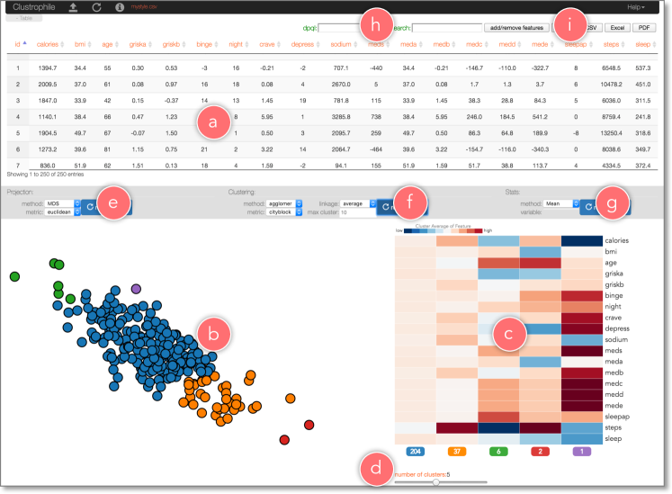
Table The Table view (Figure 1a) contains a dynamic table visualization of data. Tables in Clustrophile can be searched, filtered, sorted, and exported as needed (Figure 1h,i). Upon loading, data first appears as a table listing in this view, giving users a direct and familiar way to access the records. Clustrophile supports input files in the Comma Separated Values (CSV) format. Clustrophile also enables exporting the current table in CSV, Portable Document Format (PDF), or Excel file formats. Alternatively, users can simply the current table to the clipboard to paste in other applications.
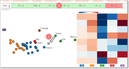
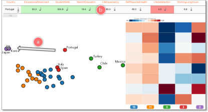
Clustering The Clustering view (Figure 1c) contains a heatmap (matrix diagram) visualization of the current clustering. The columns of the heatmap corresponds to the number of clusters and are ordered from left to right based on size (i.e., the first column represents the largest cluster in the current clustering). The rows of the heatmap represent the features, and the color of each cell encodes the normalized average feature value for clusters. Clustrophile supports dynamic computation of clusterings using the kmeans and agglomerative clustering algorithms with several choices of similarity measures and, in the case of agglomerative clustering, linkage options (Figure 1f). The choices can be changed easily and clustering can be recomputed using the model panel above the clustering view. Similarly, users can dynamically change the number of clusters by using a sliding bar (Figure 1d).
Projection Clustering algorithms divide data into discrete groups based on similarity, but different degrees of variation within and between groups are suppressed. Clustrophile provides two-dimensional projections obtained using dimensionality reduction that complement the discrete clusterings. The Projection view (Figure 1b) contains a scatter-plot visualization of the current data reduced to two dimensions by using one of six dimensionality-reduction methods: Principal Component Analysis (PCA), Classical Multidimensional Scaling (CMDS), non-metric Multidimensional Scaling (MDS), Isomap, Locally Linear Embedding (LLE), and t-distributed Stochastic Neighbor Embedding (t-SNE) [42]. As with clustering, users can select among several similarity measures with which to run the projection algorithms (Figure 1e). Each circle in the scatter plot represents a data point and their color encodes their cluster membership in the currently active clustering method.
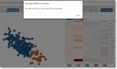
Statistics This view displays the results of the most recent statistical computation. Currently, Clustrophile provides standard point statistics along with a hypothesis-testing functionality using ANOVA and pairwise correlation computations between features (Figure 2).
Playground Clustrophile enables the exploration of two- dimensional projections of the data through forward and backward projections. In the Playground view, users can create a copy of an existing data point and interactively modify its feature values to see how its projected position changes. Conversely, users can change the projected position and see what feature values satisfy this change.
3.3 Interactions
Brushing and Linking. We use brushing & linking to select data across and coordinate the views of Clustrophile. This is the main mechanism that lets users observe the effects of one operation across the views.
Dynamic filtering In addition to brushing, Clustrophile provides two basic mechanisms for dynamically filtering data (Figure 1h). First, its search functionality lets users filter the data using arbitrary keyword search on feature names and values. Second, users can also filter the table using expressions in a mini-language. For example, typing age > 40 & weight<180 dynamical selects data points across views where the fields age and weight satisfy the entered constraint.
Adding and Removing Features Understanding the relevance of data dimensions or features to the analysis is an important yet challenging goal in data analysis. Clustrophile enables users to add and remove features (dimensions) and explore the resulting changes in clustering and projection results (Figure 1i).
3.4 Interacting with Dimensionality Reductions
Dimensionality reduction is the process of reducing the number of dimensions in a high-dimensional dataset in a way that maximally preserves inter-datapoint relations of some form as measured in the original high-dimensional space. As with clustering, most dimensionality-reduction techniques are unsupervised and learn salient structures explaining the data. Unlike clustering, however, dimensionality-reduction methods discover continuous representations of these structures.
Despite its ubiquitous use, dimensionality reduction can be difficult to interpret, particularly in relation to original data dimensions. What do the axes mean? is probably users’ most frequent question when looking at scatter plots in which points (nodes) correspond to dimensionally-reduced data. Clustrophile integrates forward projection, backward projection, and prolines to facilitate direct, dynamic examination of dimensionality reductions represented as scatter plots.
There are many dimensionality-reduction methods [42] and developing effective and scalable dimensionality-reduction algorithms is an active research area. Here we focus on principal component analysis (PCA), one of the most frequently used dimensionality-reduction techniques; note that the discussion here applies as well to other linear dimensionality-reduction methods. PCA computes (learns) a linear orthogonal transformation (high-dimensional rotation) of the empirically centered data into a new coordinate frame in which the axes represent maximal variability. The orthogonal axes of the new coordinate frame are called principal components. To reduce the number of dimensions to two, for example, we project the centered data matrix, rows of which correspond to data samples and columns to features (dimensions), onto the first two principal components, and . Details of PCA along with its many formulations and interpretations can be found in standard textbooks on machine learning or data mining (e.g., [5, 18]).

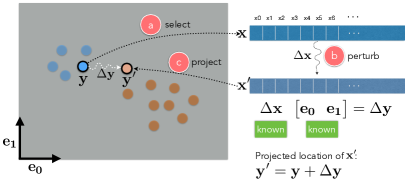
3.5 Forward Projection
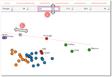
Forward projection enables users to interactively change the feature or dimension values of a data point, , and observe how these hypothesized changes in data modify the current projected location, (Figures 3,4). This is useful because understanding the importance and sensitivity of features (dimensions) is a key goal in exploratory data analysis.
We compute forward projections using out-of-sample extension (or extrapolation) [42]. Out-of-sample extension is the process of projecting a new data point into an existing projection (e.g., learned manifold model) using only the properties of the projection. It is conceptually equivalent to testing a trained machine learning model with data that was not part of training.
In the case of PCA, we obtain the two-dimensional position change vector by projecting the data change vector onto the principal components: , where .

3.6 Prolines: Visualizing Forward Projections
It is desirable to see in advance what forward projection paths look like for each feature. Users can then start inspecting the dimensions that look interesting or important.
Prolines visualize forward projection paths based on a range of possible values for each feature and data point (Figures 5, 6). Let be the value of the th feature for the data point . We first compute the standard deviation for the feature in the dataset and devise a range We then iterate over the range with a step size of , compute the forward projections as discussed above, and then connect them as a path. The constants , control respectively the extent of the range and the step size with which we iterate over the range.
Prolines will be straight lines for linear dimensionality-reduction methods (Figure 6), and therefore computing forward projections only for the extremum values of the range is sufficient. Also note that in the case of PCA projections prolines reduces to plotting the contributions of the feature to the principal components (loadings) as a line vector.
3.7 Backward Projection
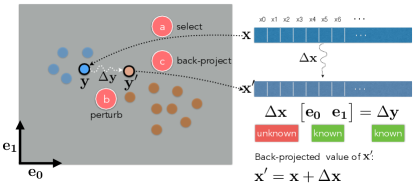
Backward projection as an interaction technique is a natural complement of forward projection. Consider the following scenario: a user looks at a projection and, seeing a cluster of points and a single point projected far from this group, asks what changes in the feature values of the outlier point would bring the apparent outlier near the cluster. Now, the user can play with different dimensions using forward projection to move the current projection of the outlier point near the cluster. It would be more natural, however, to move the point directly and observe the change (Figures 7, 8, 9).
The formulation of backward projection is the same as that of forward projection: . In this case, however, is unknown and we need to solve the equation.
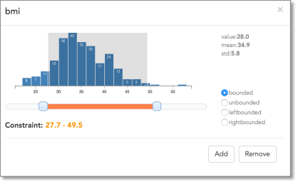
As formulated, the problem is underdetermined and, in general, there can be infinitely many data points (feature values) that project to the same planar position. Therefore, our implementation in Clustrophile supports both unconstrained and constrained backward projections. Users can introduce equality as well as inequality constraints (Figure 10).
In the case of unconstrained backward projection, we find by solving a regularized least-squares optimization problem.
| subject to |
Note that this is equivalent to setting . In general, for linear projections we have the unconstrained back projection directly.
As for constrained backward projection, we find by solving the following quadratic optimization problem:
| subject to | |||||
is the design matrix of equality constraints, is the constant vector of equalities, and and are the vectors of lower and upper boundary constraints.
3.8 System Details
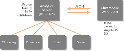
Clustrophile is a web application based on a client-server model (Figure 11). We implemented Clustrophile’s web interface in Javascript with help of D3 [6] and AngularJS [1] libraries. We generated the parser for the mini-language used to filter data with PEG.js [33]. Most of the analytical computations are performed on Clustrophile’s Python-based analytics server, which has four modules: clustering, projection, statistics, and solver. These modules are mainly wrappers, making heavy use of SciPy [22], NumPy [43], and scikit-learn [32] Python libraries. The solver module uses CVXOPT [12] for quadratic programming.
4 User Feedback
Clustrophile is a research prototype under development and has been used over several months by data scientists and researchers in the healthcare domain. While we have not conducted a formal study, we briefly discuss the informal feedback we have gathered.
Users cared most about the time-saving aspects of Clustrophile. They were pleased with the ability to explore different clustering and projection algorithms and parameters without going back to their scripts. Similarly, among Clustrophile’s favorite functionalities were the ability to add and remove features and iteratively recompute clusterings and projections on filtered data while staying in the context of data analysis session. We found that our users were more familiar with clustering than projection; indeed, for some the relation between clustering and projection view was not always clear.
The most important request from our users was scalability. As soon as they started using Clustrophile in commercial projects, they realized that they wanted to be able to analyze large datasets without losing Clustrophile’s current interactive and iterative user experience (more on this in the following section).
5 Sampling for Scale
The power of visual analysis tools such as Clustrophile comes from both facilitating iterative, interactive analysis and leveraging visual perception. Exploring large datasets at interactive rates, which typically involves coordination of multiple visualizations through brushing and linking and dynamic filtering, is, however, a challenging problem. One source of the challenge is the cost of interactive computation and rendering. Another is the perceptual and cognitive cost (e.g., clutter) users incur when dealing with large numbers of visual elements.
There are two basic approaches to this problem: precomputation and sampling [19]. Precomputation involves processing data into a form (typically tiles or cubes) to interactively answer queries (e.g., zooming, panning, brushing, etc.) that are known in advance. This approach has been the prevalent method both in the visualization community and the database community, from which most of the current techniques originate from. However, precomputation is not always feasible or, indeed, desirable. Scalable visualization tools based on precomputation are typically applied to the visualization of low-dimensional, spatial (e.g., map) datasets as precomputation is infeasible when the data is high dimensional, quickly expanding the combinatorial space of possible cubes or tiles. And, in general, precomputation is inflexible as it restricts the ability to run arbitrary queries.
Sampling, considering only a selected subset of the data at a time for analysis, is an attractive alternative to precomputation for scaling interactive visual analytics tools. Sampling has generality and the advantage of easing computational and perceptual/cognitive problems at once. In principle, there is no reason that sampling-based visual analysis should not be a viable and practical option. In the end, the field of statistics builds on the premise that one can infer properties of a population (read complete data) from its samples. There are, however, two major challenges that, we believe, also limit wider adoption of sampling in general [19].
First is a concern about potential biases introduced by sampling. This concern seems, however, to be at least partly unfounded, since neither aggregation bias of precomputation nor sampling bias of complete data appear to cause as much concern. In recent work, Kim et al. improve the effectiveness (and trustworthiness) of sampling-based visualizations by guaranteeing the preservation of relations (e.g., ranking) within the complete data [24]. The second challenge is the lack of understanding how users interact with sampling in visual analytics tools or how sampling affects the user experience and comprehension. Can we develop models of user behavior regarding sampling? How can we improve the user experience with sampling through visualization and interaction? How can users control the sampling process without being experts in statistics?
Addressing these challenges would accelerate the adoption of sampling and improve the utilization of the unique opportunity that sampling provides in enabling visual analysis on large datasets without losing the power of iterative, interactive visual-analysis workflow that tools like Clustrophile facilitate.
6 Reflections on Projections
Using out-of-sample extrapolation, forward projection avoids re-running dimensionality-reduction algorithms. From the visualization point of view, this is not just a computational convenience but also has perceptual and cognitive advantages such as preserving the constancy of scatter-plot representations. For example, re-running (training) a dimensionality-reduction algorithm with addition of a new sample can significantly alter a two-dimensional scatter plot of the dimensionally-reduced data, despite all the original inter-datapoint similarities stay unchanged. Many of the dimensionality-reduction algorithms are based on eigenvector computations. Even different runs on the same dataset can result in different—typically, flipped—planar coordinates (if is an eigenvector of a matrix so is ).
What about interacting with nonlinear dimensionality reductions? There are out-of-sample extrapolation methods for many nonlinear dimensionality-reduction techniques that make the extension of forward projection with prolines possible [4]. As for backward projection, its computation will be direct in certain cases (e.g., when an autoencoder is used). In general, however, some form of constrained optimization specific to the dimensionality-reduction algorithm will be needed. Nonetheless, it is highly desirable to develop general methods that apply across dimensionality-reduction methods.
7 Visual Analysis Is Like Doing Experiments
Data analysis is an iterative process in which analysts essentially run mental experiments on data, asking questions and (re)forming and testing hypotheses. Tukey and Wilk [41] were among the first to observe the similarities between data analysis and doing experiments. They list eleven similarities, for example, “Interaction, feedback, trial and error are all essential; convenience dramatically helpful.” Albeit often implicitly, the visualization literature makes a strong case for designing visual analysis tools to support quick, iterative analysis flow that is conducive to hypothesis generation and testing (e.g., [23]).
We integrate our spatial interaction techniques for exploring and reasoning with dimensionality reductions into Clustrophile, which uses familiar data-mining and visualization methods to facilitate iterative, interactive clustering analysis. Injecting new techniques into familiar workflows is an effective way for assessing their usefulness and adoption. Tukey and Wilk make an important observation on the adoption of new techniques as part of their analogy: “There can be great gains from adding sophistication and ingenuity …to our kit of tools, just as long as simpler and more obvious approaches are not neglected.”
It is a standard practice to design visualization tools by considering criteria determined to support user tasks. While this approach is necessary for creating useful tools, our experience in developing Clustrophile suggests that the design process can benefit from the regulating clarity of general, higher-level conceptual models. To explore and reason about data, analysts generally have the basic data-mining and visualization techniques. They often, however, lack interactive tools integrating these techniques to facilitate quick, iterative what-if analysis. Extending Tukey and Wilk’s analogy between data analysis and running experiments to visual analysis, visual analysis like doing experiments, provides a useful conceptual model for a large segment of visual analytics applications. Clustrophile, along with forward projection, backward projection and prolines, contributes to the kit of tools needed to facilitate performing visual analysis in a similar way to running experiments.
References
- [1] AngularJS. http://angularjs.org/.
- [2] D. Asimov. The grand tour: A tool for viewing multidimensional data. SIAM J. Sci. Stat. Comput., 6(1):128–143, Jan. 1985.
- [3] M. Aupetit. Visualizing distortions and recovering topology in continuous projection techniques. Neurocomputing, 70(7-9):1304–1330, mar 2007.
- [4] Y. Bengio, J.-F. Paiement, P. Vincent, O. Delalleau, N. Le Roux, and M. Ouimet. Out-of-sample extensions for lle, isomap, mds, eigenmaps, and spectral clustering. Advances in neural information processing systems, 16:177–184, 2004.
- [5] C. M. Bishop. Pattern Recognition and Machine Learning. Springer-Verlag, 2006.
- [6] M. Bostock, V. Ogievetsky, and J. Heer. D3: Data-driven documents. IEEE Trans. Visualization & Comp. Graphics, 17(12):2301–2309, 2011.
- [7] M. Brehmer, M. Sedlmair, S. Ingram, and T. Munzner. Visualizing dimensionally-reduced data: Interviews with analysts and a characterization of task sequences. In BELIV’14. ACM, 2014.
- [8] P. Bruneau, P. Pinheiro, B. Broeksema, and B. Otjacques. Cluster sculptor, an interactive visual clustering system. Neurocomputing, 150:627–644, 2015.
- [9] A. Buja, D. F. Swayne, M. L. Littman, N. Dean, H. Hofmann, and L. Chen. Data visualization with multidimensional scaling. Journal of Computational and Graphical Statistics, 17(2):444–472, 2008.
- [10] N. Cao, D. Gotz, J. Sun, and H. Qu. Dicon: Interactive visual analysis of multidimensional clusters. IEEE Transactions on Visualization and Computer Graphics, 17(12):2581–2590, Dec 2011.
- [11] J. Chuang, D. Ramage, C. Manning, and J. Heer. Interpretation and trust. In Proceedings of the 2012 ACM annual conference on Human Factors in Computing Systems - CHI '12. Association for Computing Machinery (ACM), 2012.
- [12] CVXOPT. http://cvxopt.org/.
- [13] A. Endert, P. Fiaux, and C. North. Semantic interaction for visual text analytics. In Proceedings of the 2012 ACM annual conference on Human Factors in Computing Systems - CHI '12. Association for Computing Machinery (ACM), 2012.
- [14] A. Endert, C. Han, D. Maiti, L. House, S. Leman, and C. North. Observation-level interaction with statistical models for visual analytics. In Visual Analytics Science and Technology (VAST), 2011 IEEE Conference on, pages 121–130, Oct 2011.
- [15] M. A. Fisherkeller, J. H. Friedman, and J. W. Tukey. Prim-9: An interactive multidimensional data display and analysis system. In Proc. Fourth International Congress for Stereology, 1974.
- [16] J. H. Friedman and J. W. Tukey. A projection pursuit algorithm for exploratory data analysis. IEEE Transactions on Computers, C-23(9):881–890, Sept 1974.
- [17] M. Gleicher. Explainers: Expert explorations with crafted projections. IEEE Trans. Visual. Comput. Graphics, 19(12):2042–2051, dec 2013.
- [18] T. Hastie, R. Tibshirani, J. Friedman, and J. Franklin. The elements of statistical learning: data mining, inference and prediction. The Mathematical Intelligencer, 27(2):83–85, 2005.
- [19] J. M. Hellerstein. Interactive Analytics. In M. S. J. M. H. Peter Bailis, Joseph M. Hellerstein and M. Stonebraker, editors, Readings in Database Systems. MIT Press, 5th edition, 2015.
- [20] D. H. Jeong, C. Ziemkiewicz, B. Fisher, W. Ribarsky, and R. Chang. ipca: An interactive system for pca-based visual analytics. Computer Graphics Forum, 28(3):767–774, 2009.
- [21] S. Johansson and J. Johansson. Interactive dimensionality reduction through user-defined combinations of quality metrics. IEEE Trans. Visual. Comput. Graphics, 15(6):993–1000, nov 2009.
- [22] E. Jones, T. Oliphant, P. Peterson, et al. SciPy: Open source scientific tools for Python, 2001. http://www.scipy.org/.
- [23] S. Kandel, A. Paepcke, J. Hellerstein, and J. Heer. Enterprise data analysis and visualization: An interview study. In Proc. IEEE VAST’12, 2012.
- [24] A. Kim, E. Blais, A. Parameswaran, P. Indyk, S. Madden, and R. Rubinfeld. Rapid sampling for visualizations with ordering guarantees. Proc. VLDB Endow., 8(5):521–532, jan 2015.
- [25] J. Kruskal. Multidimensional scaling by optimizing goodness of fit to a nonmetric hypothesis. Psychometrika, 29(1):1–27, 1964.
- [26] S. Lespinats and M. Aupetit. CheckViz: Sanity check and topological clues for linear and non-linear mappings. Computer Graphics Forum, 30(1):113–125, dec 2010.
- [27] J. M. Lewis, L. Van Der Maaten, and V. de Sa. A behavioral investigation of dimensionality reduction. In Proc. 34th Conf. of the Cognitive Science Society (CogSci), pages 671–676, 2012.
- [28] A. Lex, M. Streit, C. Partl, K. Kashofer, and D. Schmalstieg. Comparative analysis of multidimensional, quantitative data. IEEE Trans. Visual. Comput. Graphics, 16(6):1027–1035, nov 2010.
- [29] S. L’Yi, B. Ko, D. Shin, Y.-J. Cho, J. Lee, B. Kim, and J. Seo. XCluSim: a visual analytics tool for interactively comparing multiple clustering results of bioinformatics data. BMC Bioinformatics, 16(11):1–15, 2015.
- [30] E. J. Nam, Y. Han, K. Mueller, A. Zelenyuk, and D. Imre. Cluster Sculptor: A visual analytics tool for high-dimensional data. In Proc. IEEE VAST’07, 2007.
- [31] OECD Better Life Index. http://www.oecdbetterlifeindex.org/. Accessed: May 27, 2016.
- [32] F. Pedregosa, G. Varoquaux, A. Gramfort, V. Michel, B. Thirion, O. Grisel, M. Blondel, P. Prettenhofer, R. Weiss, V. Dubourg, J. Vanderplas, A. Passos, D. Cournapeau, M. Brucher, M. Perrot, and E. Duchesnay. Scikit-learn: Machine learning in Python. Journal of Machine Learning Research, 12:2825–2830, 2011.
- [33] PEG.js. http://pegjs.org/.
- [34] A. Pilhofer, A. Gribov, and A. Unwin. Comparing clusterings using bertin’s idea. IEEE Trans. Visual. Comput. Graphics, 18(12):2506–2515, dec 2012.
- [35] T. Schreck, J. Bernard, T. von Landesberger, and J. Kohlhammer. Visual cluster analysis of trajectory data with interactive kohonen maps. Information Visualization, 8(1):14–29, 2009.
- [36] M. Sedlmair, T. Munzner, and M. Tory. Empirical guidance on scatterplot and dimension reduction technique choices. IEEE Trans. Visual. Comput. Graphics, 19(12):2634–2643, dec 2013.
- [37] J. Seo and B. Shneiderman. Interactively exploring hierarchical clustering results [gene identification]. Computer, 35(7):80–86, jul 2002.
- [38] R. Shepard. The analysis of proximities: Multidimensional scaling with an unknown distance function. I. Psychometrika, 27(2):125–140, 1962.
- [39] J. Stahnke, M. Dörk, B. Müller, and A. Thom. Probing projections: Interaction techniques for interpreting arrangements and errors of dimensionality reductions. IEEE Trans. Vis. Comput. Graph., 22(1):629–638, 2016.
- [40] W. Torgerson. Multidimensional scaling: I. theory and method. Psychometrika, 17(4):401–419, 1952.
- [41] J. W. Tukey and M. Wilk. Data analysis and statistics: Techniques and approaches. In Proceedings of the Symposium on Information Processing in Sight and Sensory Systems, pages 7–27. ACM, 1965.
- [42] L. Van der Maaten, E. Postma, and H. Van den Herik. Dimensionality reduction: A comparative review. Technical Report TiCC TR 2009-005, 2009.
- [43] S. v. d. Walt, S. C. Colbert, and G. Varoquaux. The numpy array: A structure for efficient numerical computation. Computing in Science & Engineering, 13(2):22–30, 2011.
- [44] M. Williams and T. Munzner. Steerable, progressive multidimensional scaling. In IEEE Symposium on Information Visualization. Institute of Electrical & Electronics Engineers (IEEE), 2004.