Modeling of Persistent Homology
Abstract
Topological Data Analysis (TDA) is a novel statistical technique, particularly powerful for the analysis of large and high dimensional data sets. Much of TDA is based on the tool of persistent homology, represented visually via persistence diagrams. In an earlier paper we proposed a parametric representation for the probability distributions of persistence diagrams, and based on it provided a method for their replication. Since the typical situation for big data is that only one persistence diagram is available, these replications allow for conventional statistical inference, which, by its very nature, requires some form of replication. In the current paper we continue this analysis, and further develop its practical statistical methodology, by investigating a wider class of examples than treated previously.
keywords:
Persistence diagram, Hamiltonian, MCMC, Replicated persistence diagrams1 Introduction and setting
The notion of persistent homology arises when one has a filtration of spaces; viz. a sequence (or continuum) of spaces (or , with whenever ) and one is interested in how homology changes as one moves along the sequence. For a typical example, suppose that is a nice space, and let be a smooth function. Denote by the filtration of excursion, or upper-level, sets
| (1.1) |
A useful way to describe persistent homology is via the notion of barcodes. Assuming that , the smoothness of implies that, if is non-empty, then will typically also be . A barcode for the excursion sets of is then a collection of diagrams, one for each collection of homology groups of common order. A bar in the -th diagram, starting at and ending at () indicates the existence of a generator of that appeared at level and disappeared at level . A different, and visually helpful, representation of a bar is as a point in the plane. Each bar has a ‘birth time’ and ‘death time’ , where since, as described above, the filtration is for upper level sets, and we index these by levels descending from . The collection of points corresponding to all the bars is called the persistence diagram.
(We shall assume that the reader is familiar with these concepts. Recent excellent and quite different books and reviews by Carlsson [6, 7], Edelsbrunner and Harer [10, 11, 12], Zomorodian [17], Oudot [14] and Ghrist [13] not only give give broad expositions of homology, but also treat the much newer subject of persistent homology. (For a description of the history of persistent homology see the Introduction to [11].))
Persistence diagrams almost always arise as topological summaries of some underlying phenomenon, and, having been constructed, are typically subject to some kind of analysis. This can be thought of as a path
| (1.2) |
The analysis can be of various forms. Wasserman [16] gives a comprehensive and up to date review on topological data analysis from the viewpoint of statistics, but there are also non-statistical approaches, many of which involve summarizing the diagram with either a low dimensional vector of numerical descriptors, a large dimensional vector, or a real valued function. Many of these approaches adopt techniques such as principal component analysis and support vector machines to analyse the summary data.
What is common to all these approaches, however, is the need for multiple instances of the persistence diagram, which in practical situations, is typically not a trivial requirement. Although, in some scenarios, multiple observations of the ‘phenomenon’ of (1.2) may be available, it is more common that only one observation of the phenomenon is available, and so only one diagram. In those cases, the standard method to effectively increase the number of instances is via resampling, either of the phenomenon or the diagram. Virtually all of the above approaches have examples of this method.
In a previous paper [2] we entered the diagram (1.2) at the intermediate step, by suggesting a new approach to providing multiple instances of a persistence diagram when, perhaps, only one such original diagram is available. This was done via probabilistic modeling of persistence diagrams. We shall briefly recall the basic ideas of [2] in Sections 2 and 3 below, and then develop them, in terms of more sophisticated examples than were treated there, in Section 4.
2 Parametric model
2.1 The basic setup
As above, let be a compact subset of , typically a sub-manifold or stratified sub-manifold, and suppose that we observe a sample drawn from a distribution supported on . Based on this sample, we define a kernel density estimator, , given by
| (2.1) |
where is a bandwidth parameter for the Gaussian kernel defining .
Our interest is in the persistence diagram generated by the upper-level set filtration generated by ; viz. by the sets of (1.1) as decreases from . The death and birth points in the diagram are denoted by , where is the number of points in the diagram for the homology of order . Typically, we shall treat only one order at a time, and drop the subscript on . Define a new set of points , with and . That is, is a set of points in . This (invertible) transformation has the effect of moving the points in the original persistence diagram downwards, so that the diagonal line projects onto the horizontal axis, but still leaves a visually informative diagram, called the projected persistence diagram, or PPD, in [2] . The first step towards the goal of a statistical analysis of the persistence diagram is to develop a parametric, probabilistic model for .
2.2 The model
Following [2], as a first step of building a model for , consider the Gibbs distribution,
| (2.2) |
where is a multi-dimensional parameter, is a ‘Hamiltonian’ that describes the ‘energy’ of , and is the normalizing ‘partition function’ required to make a probability density. The next step is to choose the Hamiltonian, which needs to take into account the spread of the points, along with interactions between neighboring points, which we shall think of as belonging to clusters. Regarding the spread, define
where . Then is the (un-normalized) variance of the horizontal points, and is the power of the vertical points (not centered because of the non-negativeness of ). As for the local interaction, for and for let be the -th nearest neighbor of , and set
Then, as in [2], we choose the Hamiltonian
| (2.3) |
where , and is the maximal cluster size. The inclusion of the normalising parameter allows for the to be interpreted as energy densities, and improves the numerical stability of parameter estimation.
There are a number of reasons for this choice of Hamiltonian, among them:
-
(i)
Cluster expansions of this form have been successfully employed in Statistical Mechanics for the best part of a century as a basic approximation tool in the study of particle systems. More specifically, for the model to be rich enough for TDA, one needs to choose the Hamiltonian from a parameterised family that comes close to spanning all ‘reasonable’ functions on PPDs. Since [1] showed that the ring of algebraic functions on the space of PPDs is spanned by a family of monomials closely related to functions of the form (2.3), this choice of Hamiltonian is an effective one for our setting.
-
(ii)
These distributions are often used not as exact models for PPDs, but rather as a tool in a perturbative analysis. In these cases, the convenience of the models is more important than whether or not they provide a perfect fit to PPD data. For more details see [2], SI (Sec. 2.2).
Finally, is determined by
| (2.4) |
where , , for , is the dimension of the data underlying the persistence diagram, and is a data independent tuning parameter. Although we typically optimize over , it can be taken to be , as a global default.
2.3 Estimation and model specification
Since there is no analytic form for and it is impossible to compute it numerically in any reasonable time, we cannot estimate by maximum likelihood. A standard way around this, adopted in [2], is to use pseudolikelihood estimation [3, 8]; viz. to maximize the pseudolikelihood
| (2.5) |
Here denotes the collection of the nearest neighbours of in whose distance from is no greater than , and
| (2.6) |
with
Optimal values of can be chosen via standard, automated, statistical procedures such as AIC, BIC, etc (cf. [5]). However, considerable experimentation, much of it reported in [2], leads to the conclusion that it suffices to take or , so that the largest cluster size is 3 or 4.
3 Replicating persistence diagrams
3.1 MCMC
Once the parametric distribution of the points of the persistence diagram is available, as in the pseudolikelihood (2.5), simulated replications of the diagram can be generated using a standard Metropolis-Hastings MCMC algorithm [15, 4]. Firstly, given a , define a ‘proposal distribution’ as the bivariate Gaussian density, with mean vector and covariance matrix identical to the empirical mean and covariance of the points in , but restricted to . Next, for two points define an ‘acceptance probability’, according to which is replaced by , leading to the updated PPD , as
Then the algorithm is Algorithm 1.
To obtain approximately independent PPD’s, [2] adopt a procedure dependent on three parameters, , and , as follows. Starting with the original PPD, run the algorithm for a burn in period. Then, starting with the final PPD from the burn in, run the algorithm a further times, choosing the last output of this block of iterations as the first simulated PPD. Repeat this procedure times, each time starting with the most recently simulated PPD; viz. the output of the previous block. Finally, replicate the entire procedure times, for a total of simulated PPDs. The optimal choice of , and typically depends on the specific problem, and is discussed in [2] SI (Sec. 2.1). The burn in period is determined, empirically, via the evaluation of the distance between the MCMC simulations and the original persistence diagrams. Recall that, for two diagrams and , the Wasserstein -distance, , , is defined as
| (3.1) |
where ranges over all matchings between the points of and , the latter having been augmented by adding all points on the diagonal. In the limit case of the Wasserstein distance is known as the bottleneck distance, which is the length of the longest edge in the best matching.
The distances between the MCMC simulations and the original persistence diagrams are measured via the bottleneck and Wasserstein distances as the MCMC progresses, and the value of the burn in period is chosen as the point at which the initial rapid growth of the distance functions ceases. Given the collection of simulated PPDs, each PPD is converted back to a regular persistence diagram with the mapping of its component points.
3.2 Identification of topological signals
In many situations, which include all the examples that we shall treat in this paper, the most prominent features of the persistence diagram are generally deemed most likely to represent true features of the underling space, rather than artifacts of sampling or noise. By ‘prominent’ we mean those points in the diagrams which are furthest from the diagonal. These are typically called ‘topological signals’, while the points closer to the diagonal are considered to be ‘topological noise’.
One of the key challenges in persistent homology is to separate the signal from the noise. The replicated persistence diagrams can be used to identify the topological signals by providing information about statistical variation. As an example, consider the order statistics of the distances of the points of the persistence diagram to the diagonal. That is, given the points of the persistence diagram, the order statistics are , the th largest among the differences , .
Denote by the value of the relevant statistic based on the true persistence diagram, and denote by the value of the relevant statistic based on the simulated persistence diagram. Then one can calculate an empirical confidence interval (percentile bootstrap) and define a point on the persistence diagram to be a signal if or . Note that since here is non-negative, we generally only consider one-sided confidence intervals . In addition, one can calculate a one-side -value as , where is of the -th simulated persistence diagram.
4 Examples
We now turn to the three examples which make up the new material of this paper. In each of these we show how to use the methodology described in the previous sections to identify the homology of spaces , when all that is available is the persistence diagram generated by the upper level sets of a smoothed empirical density from a sample. The examples that we shall treat are those of a 2-sphere, a 2-torus and a collection of three concentric circles in the plane. Each of these will teach us something different about the behaviour of our methodology in practice.
4.1 The two dimensional sphere
4.1.1 The data and fitting the model
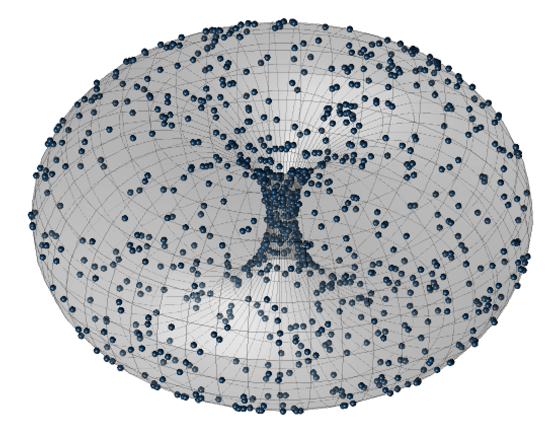
We start with a random sample of points from the uniform distribution on the sphere in with radius , and smooth the data with a kernel density estimator of bandwidth of . These are shown as Panels (a) and (b) of Figure 1.
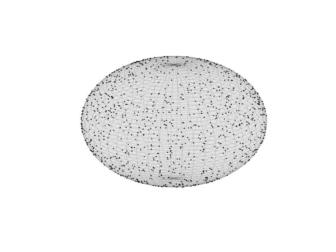
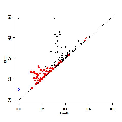
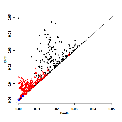
The corresponding persistence diagram of the upper level sets filtration of is shown in Panel (c) of Figure 1. This diagram contains points corresponding to the zeroth homology , represented by the black circles, points for the first homology , represented by the red triangles, and point for the second homology , represented by the blue diamond. As described above, each point in the diagram is a ‘death-birth’ pair . Since we know that the upper level sets of are characterized by having a single connected component and a single void, we expect to have one black circle somewhat isolated from the other points in the diagram and one blue diamond. The void does not have to be isolated from the other points due to a short lifetime of high dimensional homologies. This is in fact the case.
While the persistence diagram in Figure 1 performs as expected, and it is easy to identify the points that, a priori, we knew had to be there, there are many other points in the diagram which, were we not in the situation of knowing ahead of time, and we would have difficulty in knowing how to discount.
Note that there are more than enough and points in Figure 1 to fit a spatial model to each of the two homologies.
Adopting the approach described in the first three sections of the paper, and working first with the persistence diagram without including the ‘point at infinity111In all our persistence diagrams, the ‘point at infinity’ is the highest, leftmost point in the diagram. In essence, removing it from the analysis is much like working with reduced rather than standard homology, and has the effect of removing one generator from the diagram. Thus, in the statistical analysis to follow, it needs to be added, at the end, to all significant points found in the diagram.’, we estimated the parameters for a Gibbs distribution for the model with pseudolikelihood (2.5), taking . The estimate of was 0.0051. For this , the estimates of were , , , , and .
In order to test how well the estimated model matches the persistence diagram, we followed the procedure described in [2]. We generated 100 collections of samples from the 2-sphere according the same procedure that generated the original data, and for each we fitted the model we found for the original data set; viz. the model that includes the parameters , , , , and .
The blue plot in Figure 2 shows the (smoothed) empirical densities of the resulting parameter estimates222In some of these simulations the sums were identically zero for all simultaneously, since there were no -th nearest neighbours at distance less than . Consequently, the parameters , , and are all meaningless, and so these simulations (33 of them) were deleted from this part of the analysis. We shall do the same later on, in similar cases, without further comment.. (We will discuss the other two plots only later, when considering different replication procedures.) Overall, the results indicate that the estimation procedure is stable, with an acceptable spread.


.
4.1.2 Replicating the persistence diagram
For the calculation of the replicated persistence diagrams, we first need to determine the burn in period which we shall use for them. Following the procedure described in Section 3.1 we calculated the bottleneck and Wasserstein distances using the 100 simulated persistence diagrams of the previous subsection. The results are shown in blue in Figure 3.
The first row in Figure 3 shows the bottleneck distances, while the second row shows the differences. The first column shows the results of the first 50 steps of the MCMC algorithm on a linear scale. The second and third columns go out to 2,000 steps, first on a linear scale and then on a logarithmic scale. While the initial growth of the distances is rapid, they eventually approach their asymptotes at exponential rates. The rapidity is clear in Panels (a) and (d), and the exponential rate is clear from the linear behavior of the plot in logarithmic scales. The point where the initial rapid growth of the distance functions ceases is approximately 44 for the bottleneck distance and 47 in the Wasserstein case. At 44 steps, therefore, the results of Figure 3 indicate that the dependence of the MCMC on the initial persistence diagram has dropped significantly, while at the same time the MCMC has produced persistence diagrams remaining close to the true distribution.


.
In addition we considered summary statistics of the 100 persistence diagrams as the MCMC progressed, to see how well the simulations replicate the statistical properties of the persistence diagrams. The results are presented in Figure 4. Overall, the best fits are at burn in of 10, 25 and 50, which is consistent with the results of Figure 3.


4.1.3 Resampling
The replicated persistence diagrams described in the previous subsection were based on knowing, a priori, that the original data was generated by sampling from a 2-sphere. The typical real-life situation is that one does not know the space generating the persistence diagram. (If one did, it would hardly be necessary to estimate its homology by sampling.) Consequently, we now look at resampling as a method for generating replications of the persistence diagram.
There are two natural approaches based on resampling. One is to resample from the original persistence diagram (“Setting I”), and another is to resample from the original data (“Setting II”). We examined both these alternatives, repeating them 100 times.
The results of these approaches are the other two plots of Figure 2. The red (dot dashed) plot is the smoothed empirical density for the parameter estimates based on resampled sets from the original persistence diagram, and the yellow (dashed) plot corresponds to the resampled sets from the original data.
In order to assess the fit of the simulated data to the original, we computed, as previously, the bottleneck and the Wasserstein distances between the MCMC simulations and the data itself. The results are in Figure 3, in addition to the results based on the 100 simulated persistence diagrams. The red (dot dashed ) plot shows the results for the 100 resampled sets from the original persistence diagram, and the yellow (dashed) plot corresponds to the 100 resampled sets from the original data. The point where the initial rapid growth of the distance functions ceases is approximately 22 and 46, respectively, in Setting I and Setting II for the bottleneck distance, and approximately 20 and 48 in the Wasserstein case. This suggests taking a burn in period of 50 for generating the replicated persistence diagrams for .
4.1.4 persistence diagram
We now turn to the analysis of the persistence diagram. Again estimating the parameters for the Giibs pseudolikelihood (2.5), taking , the estimate of was 0.0047. For this , the estimates of were , , , , and .
To check the match between the estimated model and the persistence diagram, we used the same 100 simulated sets of the 2-sphere used for the diagram, following the same procedure that we adopted then, this time restricting to a model with only , , , and non-zero. The blue plot in Figure 5 shows the smoothed empirical densities for the parameter estimates generated by these simulations. As for the case, the results indicate that the estimation procedure is stable.


.
4.1.5 Replicating the persistence diagram
As for the analysis of the diagram, we calculated bottleneck and the Wasserstein distances between the original persistence diagram using those corresponding to 100 MCMC simulated diagrams of the previous section. The results are shown by the blue plots in Figure 6.
The first row in Figure 6 shows the bottleneck distances, while the second row shows the differences. The first column shows the results of the first 50 steps of the MCMC algorithm on a linear scale. The second and third columns go out to 2,000 steps, first on a linear scale and then on a logarithmic scale. The point where the initial rapid growth of the distance functions ceases, is approximately 44 for the bottleneck distance and 47 in the Wasserstein case.


In addition we considered summary statistics of the 100 simulated persistence diagrams as the MCMC progressed, to ensure that the simulations reliably replicate the statistical properties of the persistence diagrams. Here the best fits were for a burn in of 50, which is consistent with the results of Figure 6.
4.1.6 Resampling
As for the case, we again examine the performance of resampling from the original persistence diagram (Setting I) and from the original data (Setting II), repeating each procedure 100 times. The results are summarised in Figure 5. The red (dot dashed) plots are the smoothed empirical densities for the parameter estimates in Setting I, while the yellow (dashed) plot correspond to Setting II.
In order to assess the fit of the simulated data to the original, we computed, as previously, the bottleneck and the Wasserstein distances between the MCMC simulations and the data itself. The results are presented in Figure 6, in addition to the results based on the 100 simulated persistence diagrams. The red (dot dashed ) plot shows the results for the 100 resampled sets from the original persistence diagram, and the yellow (dashed) plot shows the same thing, but for the 100 resampled sets from the original data. The point where the initial rapid growth of the distance functions ceases, is approximately 22 and 46 in Setting I and Setting II, respectively, for the bottleneck distance, and approximately 20 and 48 in the Wasserstein case. This suggests taking a burn in period of 50 for generating the replicated persistence diagrams for .
4.1.7 Statistical inference
We are now finally in a position to carry out a simulation study to test how well we can identify the homology of 2-sphere, using the methodology described earlier. To do so, we generated 1,000 persistence diagrams from the fitted model, via MCMC, with a burn in period of 50 iterations and with given by (500,10,100), (500,20,50), (500,40,25), or (500,100,10). Using these four sets of simulations, we computed the maximum statistics , its confidence interval and its -value, for both the and persistence diagrams. Table 1 summarizes the results.
| homology | statistic | real PD | CI | -value | significance | |
|---|---|---|---|---|---|---|
| 0.4769 | (500,10,100) | [0, 0.4769] | 0.0990 | no | ||
| (500,20,50) | [0, 0.4769] | 0.0520 | no | |||
| (500,40,25) | [0, 0.3273] | 0.0320 | yes | |||
| (500,100,10) | [0, 0.2616] | 0.0100 | yes | |||
| 0.1673 | (500,10,100) | [0, 0.2140] | 0.4060 | no | ||
| (500,20,50) | [0, 0.2069] | 0.3780 | no | |||
| (500,40,25) | [0, 0.2065] | 0.3550 | no | |||
| (500,100,10) | [0, 0.1995] | 0.3270 | no |
The results for the persistence diagram show that , in two first scenarios, was statistically insignificant, and in the two other scenarios was significant. In other words, the evidence is split between one connected component (represented by the ‘point at infinity’ not included in the analysis) and two components. The fact that the correct result occurs in the cases of a larger number of shorter MCMC runs is consistent with earlier findings in [2].
As for the topology, all four scenarios showed that was insignificant for all MCMC parameter, implying, correctly, a trivial homology.
4.2 2-torus
We now turn to our second example, that of the two-dimensional torus. Since the analysis will be similar in approach to that for the two-dimensional sphere, we will give fewer details, concentrating primarily on the more important differences in the results.
4.2.1 The data and fitting the model
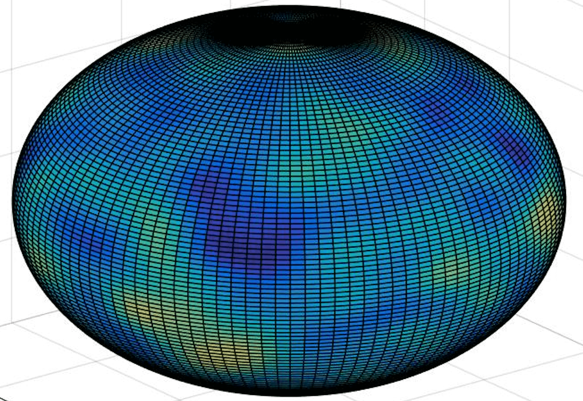
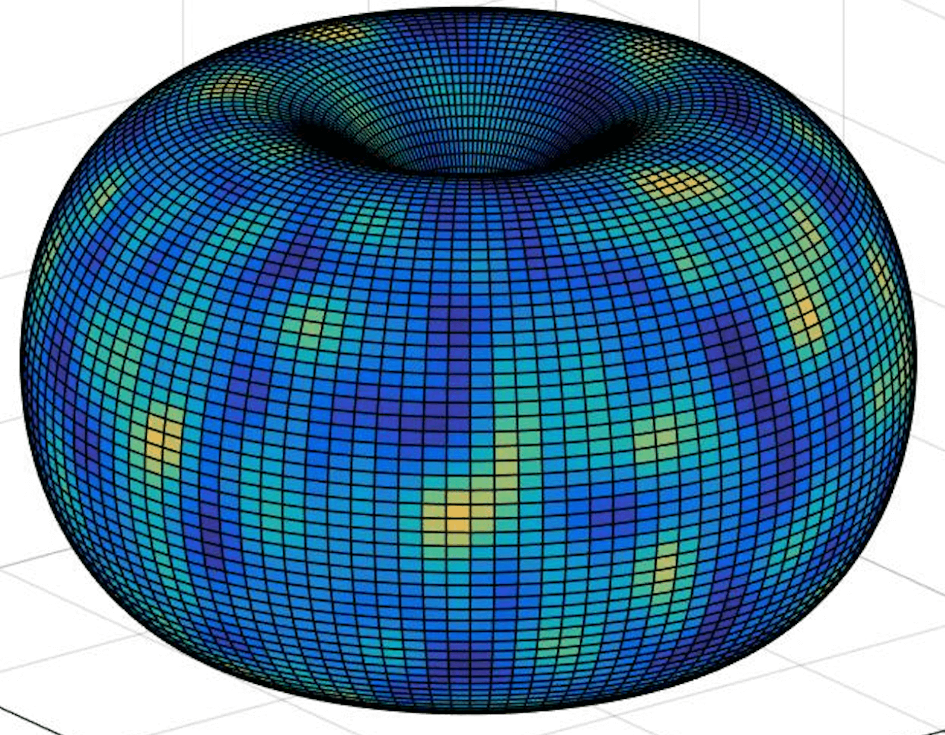
This example includes a sample of points from the 2-torus in , chosen uniformly with respect to the natural Riemannian metric induced on it as a subset on . This leads to the high density of points in the ‘interior’ of the torus, obvious from Figure 7. (For more details on sampling from tori and other manifolds, see [9].) More specifically, the torus was taken to be the rotation about the ‘ axis’ in of a circle of radius with center in the ‘ plane’ at distance 2 from the origin.
Panel (a) in Figure 7 shows the sample superimposed on the torus, and Panel (b) shows the corresponding kernel density estimator based on a bandwidth of . The corresponding persistence diagram of the upper level set filtration of is Panel (c). This diagram contains points of the zeroth homology , represented by the black circles, points of the first homology , represented by the red triangles, and points of the second homology , represented by the blue diamonds. Since we know that the upper level sets of are characterized by having a single connected component, two holes, and a single void, we expect to have one black circle and two red triangles somewhat isolated from the other points in the diagram, and one blue diamond. In fact, we can see the one isolated black circle point, but it is not clear which are the two main red triangles.
Adopting the approach described above separately for the and persistence diagrams, we estimated the parameters for a Gibbs distribution for the model with pseudolikelihood (2.5), taking . For the diagram, working without the point at infinity, the estimate of was 0.0010, and the estimates of were , , , , and .
For the persistence diagram, the estimate of was 0.0007, and the estimates of were , , , , and .
4.2.2 Replicating the persistence diagram
The determination of the burn in period in this example, for both and , was only heuristic. Figure 8 presents the original persistence diagrams of and and their MCMC with burn in periods of 10, 25, 50 and 1000. The best fits for both and occur for burn in periods in the range .


4.2.3 Statistical inference
We generated 1,000 replicated persistence diagrams from the fitted model with a burn in period of 10 iterations and with given by (500,10,100), (500,20,50), (500,40,25), or (500,100,10). Using these four sets of simulations, we computed the maximum statistics , , their confidence intervals and their -values. Table 2 summarizes the results.
| homology | statistics | real PD | CI | -value | significance | |
|---|---|---|---|---|---|---|
| 0.0295 | (500,10,100) | [0, 0.0371] | 0.3360 | no | ||
| (500,20,50) | [0, 0.0362] | 0.2770 | no | |||
| (500,40,25) | [0, 0.0359] | 0.2350 | no | |||
| (500,100,10) | [0, 0.0322]] | 0.2720 | no | |||
| 0.0136 | (500,10,100) | [0, 0.0123] | 0.0340 | yes | ||
| (500,20,50) | [0, 0.0118] | 0.0320 | yes | |||
| (500,40,25) | [0, 0.0107] | 0.0220 | yes | |||
| (500,100,10) | [0, 0.0134]] | 0.0490 | yes | |||
| 0.0118 | (500,10,100) | [0, 0.0103] | 0.0030 | yes | ||
| (500,20,50) | [0, 0.0102] | 0.0060 | yes | |||
| (500,40,25) | [0, 0.0102] | 0 | yes | |||
| (500,100,10) | [0, 0.0101]] | 0.0020 | yes | |||
| 0.0103 | (500,10,100) | [0, 0.0100] | 0.0360 | yes | ||
| (500,20,50) | [0, 0.0098] | 0.0060 | yes | |||
| (500,40,25) | [0, 0.0099] | 0.0060 | yes | |||
| (500,100,10) | [0, 0.0099]] | 0.0180 | yes |
The results for the diagram, for all scenarios, showed that was insignificant (the lowest -value reached in any of the six cases was 0.235). Thus, adding the ‘point at infinity’ back into the diagram, we have evidence for exactly one connected component, as we hoped to find.
For the diagram, the results for all scenarios showed that and were significant (the highest -value reached in any of the 8 cases was 0.049). That is, two significant holes, as we hoped to find.
Unfortunately, however, were also statistically significant, leading to a significantly over-estimation of the complexity of the homology. This seems to be due to the sparsity of points in the sample, which is clear from the first two panels in Figure 7. Our conclusion here, therefore, is a need for either a larger sample size or, perhaps, a larger bandwidth for the kernel density estimator.
4.3 Three circles
Our final example is that of three concentric circles in . We describe the main results, skimping on detail.
4.3.1 The data and fitting the model
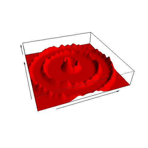
For this example we start with a random sample of points from three circles, of diameters 6, 4 and 1, as shown in the Panel (a) of Figure 9. In total, 600 points were chosen from the largest circle, 400 from the middle circle, and 200 from the smallest one. Panel (b) shows the corresponding kernel density estimate, for which we took the bandwidth . Panel (c) displays the corresponding persistence diagram of the upper level set filtration of , containing points of the zeroth homology , represented by the black circles, with the red triangles corresponding to the first homology . Since we know that the upper level sets of are characterized by having three main components, each of which contains a single 1-cycle (hole) we expect to see three black circles and three red triangles somewhat isolated from the other points in the diagram, which is in fact the case.
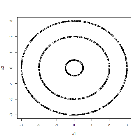
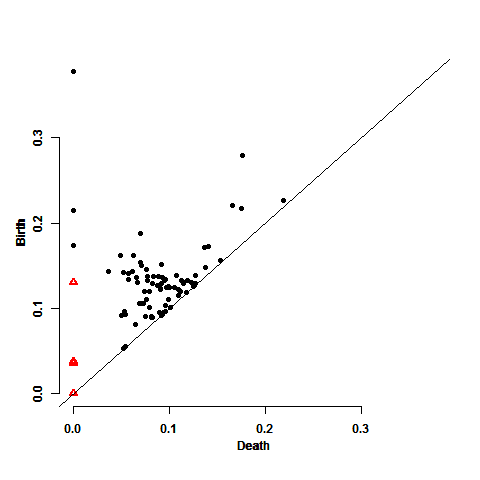
Note firstly that while there are quite a few (black, circular) points corresponding to the homology, there are only four (red, triangular) for . Since the methodology described in the previous sections requires the estimation of a sophisticated model with a number of parameters, it follows that it is not appropriate for modelling the part of the diagram. However, there are more than enough points in Figure 9 to fit a spatial model to them.
Adopting the approach described above, and working only with the persistence diagram without including the ‘point at infinity’, we estimated the parameters for a Gibbs distribution for the model with pseudolikelihood (2.5), taking . The estimate of was 0.0012. For this , the estimates of were , , , , and .
4.3.2 Statistical inference
We computed, as previously, the bottleneck and the Wasserstein distances between the MCMC simulations and the data itself, based on 100 simulated sets that behave the same as our original data. The point where the initial rapid growth of the distance functions ceases was approximately 10 for the bottleneck distance and was approximately 15 in the Wasserstein case. Based on these results, we generated 1,000 persistence diagrams from the fitted model with a burn in period of 10 iterations and with given by (500,20,50), (500,40,25), or (500,100,10). Using these three sets of simulations, we computed the maximum statistics , , their confidence intervals and their -value. Table 3 summarizes the results.
| statistics | real PD | CI | -value | significance | |
|---|---|---|---|---|---|
| 0.2145 | (500,20,50) | [0, 0.1848] | 0.0010 | yes | |
| (500,40,25) | [0, 0.1750] | 0.0020 | yes | ||
| (500,100,10) | [0, 0.1713]] | 0 | yes | ||
| 0.1740 | (500,20,50) | [0, 0.1428] | 0.0030 | yes | |
| (500,40,25) | [0, 0.1402] | 0.0010 | yes | ||
| (500,100,10) | [0, 0.1424] | 0.0020 | yes | ||
| 0.1180 | (500,20,50) | [0, 0.1250] | 0.1150 | no | |
| (500,40,25) | [0, 0.1232] | 0.0990 | no | ||
| (500,100,10) | [0, 0.1244] | 0.1170 | no |
The results, for all three scenarios, showed that and were highly significant (the largest -value reached in any of the six cases was 0.003). In none of the three scenarios was significant, with -values in the range (0.099, 0.117). That is, we found that the two points in the persistence diagram (as well as the ‘point at infinity’, which, recall, we removed from the analysis) are significant. Therefore we have three connected components, as we hoped to find.
References
- [1] Adcock, Aaron and Carlsson, Erik and Carlsson, Gunnar. The ring of algebraic functions on persistence bar codes. Homology, Homotopy and Applications 18 (2016), 381–402.
- [2] Adler, R. J. and Agami, S. and Pranav, P. Modeling and replicating statistical topology, and evidence for CMB non-homogeneity. Proc. Nat. Acad. Sci., Web version, October 2017, doi: 10.1073/pnas.1706885114.
- [3] Besag, Julian. Spatial interaction and the statistical analysis of lattice systems. Journal of the Royal Statistical Society. Series B. Methodological 36 (1974), 192–236.
- [4] Brooks, S. and Gemna, A. and Jones, G.L. and Meng, X-L. Handbook of Markov Chain Monte Carlo. Chapman and Hall, Boca Raton (2011).
- [5] Burnham, Kenneth P. and Anderson, David R. Model Selection and Multimodel Inference. Springer-Verlag, New York (2002).
- [6] Carlsson, G., Topology and data, Bull. Amer. Math. Soc. (N.S.), 46, 255–308, (2009).
- [7] Carlsson, G., Topological pattern recognition for point cloud data, Acta Numer., 23, 289–368, (2014).
- [8] Chalmond, B. Applied Mathematical Sciences. Springer-Verlag, New York (2003).
- [9] Diaconis, P., Holmes, S. and Shahshahani, M. Sampling from a manifold, IMS Collections, 10, 102–125, (2013).
- [10] Edelsbrunner, H., A Short Course in Computational Geometry and Topology, Springer, (2014).
- [11] Edelsbrunner, H. and Harer, J., Persistent homology—a survey, Contemp. Math., 453, 257–282, (2008).
- [12] Edelsbrunner, H. and Harer, J.L., Computational Topology, An introduction, American Mathematical Society, Providence, RI, (2010).
- [13] Ghrist, R., Elementary Applied Topology, Createspace, (2014).
- [14] Oudot, S.Y., Persistence Theory: From Quiver Representations to Data Analysis, Mathematical Surveys and Monographs, 209, (2015).
- [15] Robert, Christian P. and Casella, George. Monte Carlo Statistical Methods. Springer Texts in Statistics, Springer-Verlag, New York (2004).
- [16] Wasserman, L. Topological data analysis. arXiv 1609.08227 (2016).
- [17] Zomorodian, A.J., Topology for Computing, Cambridge Monographs on Applied and Computational Mathematics, 16, (2005).