Poverty Mapping Using Convolutional Neural Networks Trained on High and Medium Resolution Satellite Images, With an Application in Mexico
Abstract
Mapping the spatial distribution of poverty in developing countries remains an important and costly challenge. These “poverty maps” are key inputs for poverty targeting, public goods provision, political accountability, and impact evaluation, that are all the more important given the geographic dispersion of the remaining bottom billion severely poor individuals. In this paper we train Convolutional Neural Networks (CNNs) to estimate poverty directly from high and medium resolution satellite images. We use both Planet and Digital Globe imagery with spatial resolutions of 3-5 m2 and 50 cm2 respectively, covering all 2 million km2 of Mexico. Benchmark poverty estimates come from the 2014 MCS-ENIGH combined with the 2015 Intercensus and are used to estimate poverty rates for 2,456 Mexican municipalities. CNNs are trained using the 896 municipalities in the 2014 MCS-ENIGH. We experiment with several architectures (GoogleNet, VGG) and use GoogleNet as a final architecture where weights are fine-tuned from ImageNet. We find that 1) the best models, which incorporate satellite-estimated land use as a predictor, explain approximately 57% of the variation in poverty in a validation sample of 10 percent of MCS-ENIGH municipalities; 2) Across all MCS-ENIGH municipalities explanatory power reduces to 44% in a CNN prediction and landcover model; 3) Predicted poverty from the CNN predictions alone explains 47% of the variation in poverty in the validation sample, and 37% over all MCS-ENIGH municipalities; 4) In urban areas we see slight improvements from using Digital Globe versus Planet imagery, which explain 61% and 54% of poverty variation respectively. We conclude that CNNs can be trained end-to-end on satellite imagery to estimate poverty, although there is much work to be done to understand how the training process influences out of sample validation.
††footnotetext: Presented at NIPS 2017 Workshop on Machine Learning for the Developing World1 Introduction
Understanding the spatial distribution of poverty is an important step before poverty can be eradicated worldwide. In recent decades, we have seen dramatic declines of poverty in many areas including India, China, and many areas of East Asia, Latin America and Africa. There is much to celebrate in this decline, as billions of people have risen out of poverty. The poverty that remains – the roughly 1 billion individuals worldwide below the international poverty line of $1.90 per day – are distributed non-uniformly across space, often in rural and urban “pockets” that are inaccessible and frequently changing. It’s posited that these areas are unlikely to integrate with the path of the global economy unless policy measures are taken to ensure their integration.
The first step to addressing this poverty is knowing with precision where it is located. Unfortunately, this has proven to be a non-trivial task. The standard method of generating a geographic distribution of poverty – a “poverty map” – involves combining a household consumption survey with a broader survey, typically a Census. While this method is accurate enough to produce official statistics (Elbers, et al., 2003), it has several disadvantages. Censuses and consumption surveys are expensive, costing millions for countries to produce. The lag time between survey and production of poverty rates can be several years due to the time needed to collect, administer, and produce statistics on poverty rates. Finally, because of security concerns and geographic remoteness, it is often infeasible to survey every area within a country.
The combination of computer vision trained against satellite imagery holds much promise for the creation of frequently updated and accurate poverty maps. Several research groups have explored the capabilities of computer vision trained against satellite imagery to estimate poverty. Jean et al. (2015) use a transfer learning approach that uses the penultimate layer of a CNN trained against night time lights as explanatory variables to estimate poverty. Engstrom et al. (2017) use intermediate features (cars, roofs, crops) identified through computer vision to estimate poverty. This paper takes the direct route and estimates an end-to-end CNN trained to estimate poverty rates of urban and rural municipalities in Mexico. We complement these by incorporating land use estimates estimated from Planet imagery. The results are modest but encouraging. The best models, which incorporate land use as a predictor, explain 57% of poverty in a 10% validation sample. However, looking at all MCS-ENIGH municipalities, the explanatory power drops to 44%. We speculate as to why we see this decline out of the validation sample and suggest some possible improvements.
2 Data
2.1 Mexican Survey Data
The CNN is trained using survey data from the 2014 MCS-ENIGH. Poverty benchmark data is created using a combination of the 2014 MCS-ENIGH household survey, the second from the 2015 Intercensus. The 2014 MCS-ENIGH survey covers 58,125 households, of which approximately 75% are urban and 25% are rural. The survey samples 896 municipalities out of roughly 2,500. The survey collects income per adult equivalent, which is the income metric used to calculate the official poverty rate. The 2015 Intercensus is a survey of households conducted every 5 years. For 2015 the Intercensus samples 229,622 households. The Intercensus contains only household labor income and transfer income, and not total household income. However, labor income and household income are strongly linearly correlated, with an value of approximately 0.9. We experimented with different samples from the Intercensus to determine whether number of household data points on which the CNN is trained affects performance accuracy.
We considered two separate poverty rates: the minimum well-being poverty line and the well-being poverty line. These poverty lines varied for urban and rural areas. For each administrative unit we calculated the fraction of households living in poverty. Thus the end-to-end prediction task beings with satellite imagery and ends with a prediction for each administrative area of the distribution over three “buckets”: below minimum well-being, between minimum well-being and well-being, and above well-being.
2.2 Satellite Imagery
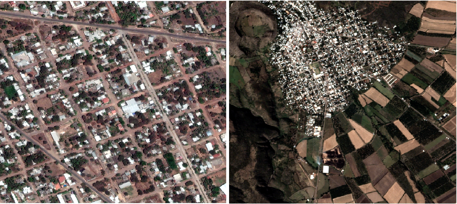
We used satellite imagery provided by both Planet and Digital Globe, examples of which is shown in figure 1. Assessing the comparative tradeoffs between Planet and Digital was one of the goals of the project. Digital Globe imagery is of higher resolution, with spatial resolution of 50 cm2, and covers the years 2014-2015. Planet imagery varies in resolution between 3 - 5 m2 and ranged in date from late 2015 to early 2017. Digital Globe imagery is only used in urban areas, as coverage in rural areas is sparse. Planet imagery is “4-band”, and includes the near-infrared (NIR) band, while the Digital Globe imagery does not. We experimented with including the NIR band during the training process, but ultimately saw better results with the exclusion of this band.
3 Technical Methodology
During the training process we experimented with two CNN architectures. The first is GoogleNet (Szegedy et al., 2014) and the second is a variant of VGG (Simoyan, 2014). We experimented with various solvers and weight initializations which were evaluated against an internal development or “dev” set. According to tests using this dev set, the GoogleNet architecture outperformed the VGG architecture. We also experimented with fine-tuning the weights of the GoogleNet models. We compared fine-tuned models, using weights initialized at the values of a model trained against ImageNet.
Digital Globe and Planet imagery both include three bands of Red, Blue and Green (RGB) values. Planet imagery includes a 4th band for near infrared. We experimented with training models to include this additional information. The ImageNet dataset consists only of RGB imagery, so it is not-trivial to fine-tune from an ImageNet-trained model to a model with a 4-band input. Therefore, for 4-band input we trained from scratch and only attempted fine-tuning from ImageNet for 3-band versions of the imagery. That is to say, ultimately the NIR band was dropped.
4 Results
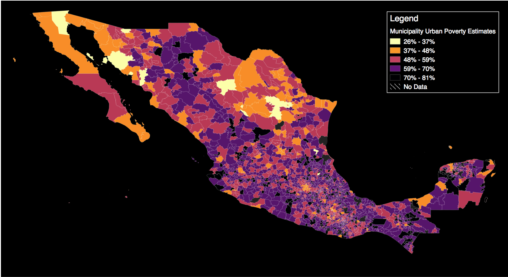
Focusing on the urban subsample, table 1 presents the CNN predictions for urban areas using imagery for either Digital Globe or Planet, using the 10% withheld validation sample. We present estimates that show the correlation between predicted poverty and benchmark poverty as measured in the 2015 Intercensus. is estimated at 0.61 using the Digital Globe imagery, and 0.54 using Planet imagery. Recall we can only compare urban areas due to lack of coverage of rural areas for Digital Globe. The drop in performance is modest but not severe, especially considering that Planet imagery offers daily revisit rates of the earth’s landmass. Poverty estimates for urban areas in Mexico are mapped shown in figure 2.
Table 2 shows the model performance varying the subsample to include more than the 10% validation sample. In the 10% validation sample, using CNN predictions, we estimate an value between predicted and true poverty between 0.47 and 0.54. When adding landcover classification, estimated via Planet imagery, to the CNN predictions we estimate an value between 0.57 and 0.64. However, when we compare this to estimates within all MCS-ENIGH areas, the coefficient of variation falls to 0.4 and 0.44 in urban and rural areas respectively. Outside of the 896 municipalities that comprise the MCS-ENIGH survey we see explanatory power fall precipitously, to roughly 0.3. The poor performance outside of MCS-ENIGH municipalities is puzzling. This could be due to weighting tiles by geographic area instead of population. It could also be due to MCS-ENIGH municipalities having differential characteristics from non-MCS-ENIGH municipalities, such as more homogeneous population density or differential size.
| Sample | CNN Predictions using Digital Globe imagery | CNN Predictions using Planet imagery | # municipalities |
| Urban areas | 0.61 | 0.54 | 58 |
| Validation | Sample | CNN Predictions | Landcover | Both | Areas |
|---|---|---|---|---|---|
| 10% MCS-ENIGH Validation | All | 0.47 | 0.49 | 0.57 | 109 |
| Urban | 0.54 | 0.52 | 0.64 | 58 | |
| Rural | 0.47 | 0.49 | 0.64 | 51 | |
| all MCS-ENIGH areas | All | 0.37 | 0.37 | 0.44 | 1115 |
| Urban | 0.34 | 0.31 | 0.4 | 619 | |
| Rural | 0.38 | 0.34 | 0.44 | 496 | |
| non MCS-ENIGH areas | All | 0.15 | 0.23 | 0.28 | 2834 |
| Urban | 0.06 | 0.19 | 0.21 | 944 | |
| Rural | 0.22 | 0.25 | 0.31 | 1890 |
References
[1] Elbers, Chris, Jean O. Lanjouw, and Peter Lanjouw. "Micro–level estimation of poverty and inequality." Econometrica 71, no. 1 (2003): 355-364.
[2] Engstrom, R., Hersh, J., Newhouse, D. “Poverty from space: using high resolution satellite imagery for estimating economic well-being and geographic targeting.” (2016).
[3] Jean, Neal, Marshall Burke, Michael Xie, W. Matthew Davis, David B. Lobell, and Stefano Ermon. "Combining satellite imagery and machine learning to predict poverty." Science 353, no. 6301 (2016): 790-794.
[4] Szegedy, Christian, Wei Liu, Yangqing Jia, Pierre Sermanet, Scott Reed, Dragomir Anguelov, Dumitru Erhan, Vincent Vanhoucke, and Andrew Rabinovich. "Going deeper with convolutions." In Proceedings of the IEEE conference on computer vision and pattern recognition, pp. 1-9. 2015.
[5] Simonyan, Karen, and Andrew Zisserman. "Very deep convolutional networks for large-scale image recognition." arXiv preprint arXiv:1409.1556 (2014).