IMACS: Image Model Attribution Comparison Summaries
Abstract.
Developing a suitable Deep Neural Network (DNN) often requires significant iteration, where different model versions are evaluated and compared. While metrics such as accuracy are a powerful means to succinctly describe a model’s performance across a dataset or to directly compare model versions, practitioners often wish to gain a deeper understanding of the factors that influence a model’s predictions. Interpretability techniques such as gradient-based methods and local approximations can be used to examine small sets of inputs in fine detail, but it can be hard to determine if results from small sets generalize across a dataset. We introduce IMACS, a method that combines gradient-based model attributions with aggregation and visualization techniques to summarize differences in attributions between two DNN image models. More specifically, IMACS extracts salient input features from an evaluation dataset, clusters them based on similarity, then visualizes differences in model attributions for similar input features. In this work, we introduce a framework for aggregating, summarizing, and comparing the attribution information for two models across a dataset; present visualizations that highlight differences between 2 image classification models; and show how our technique can uncover behavioral differences caused by domain shift between two models trained on satellite images.
1. Introduction
Developing a suitable Machine Learning (ML) model often requires significant iteration. In this process, ML engineers and researchers often train many versions of models that vary based on their training data, model architectures, hyperparameters, or any combination of these elements. A significant need within this development process is the ability to compare models resulting from these iterations. In this paper, we focus on the problem of comparing image models.
Models are frequently evaluated and compared using metrics such as AUC-ROC, precision, recall, or confusion matrices. These metrics provide high-level summaries of a model’s performance across an entire dataset, and facilitate comparisons between model versions. However, performance metrics can leave out important, deeper characteristics of models, such as their specific failure modes or the patterns they learn from data (Thomas and Uminsky, 2020; Sun et al., 2020; Cai et al., 2021). Prior work has shown that performance metrics alone are rarely satisfactory for selecting models, and that stakeholders desire a deeper understanding of why models make the predictions they do (Narkar et al., 2021).
try Research in Explainable Artificial Intelligence (XAI) and ML Interpretability has produced numerous techniques for inspecting the behavior of “black box” image models, such as Deep Neural Networks (DNNs), in finer detail. For example, attribution techniques aim to identify which inputs a DNN considers most important for a given prediction. For image models, these methods may use the gradients of predictions to annotate the most salient input pixels or regions in a given input (Sundararajan et al., 2017; Selvaraju et al., 2017; Kapishnikov et al., 2019), or perturb parts of model inputs to determine the features that contribute most to predictions (Shapley, 1953; Fong and Vedaldi, 2017; Ribeiro et al., 2016).
While attribution techniques are useful for examining the predictions of small sets of input instances in detail, it can be difficult to determine whether attribution results (e.g., the importance of particular regions) observed on a few instances generalize across a dataset. Techniques like ACE (Ghorbani et al., 2019) identify and summarize the high-level visual “concepts” of an entire dataset to help users develop a holistic understanding of a dataset, but these summaries are independent of a model’s attributions. If one could similarly summarize which input features (e.g., visual patterns) contribute most strongly to model predictions across an entire dataset, these data could then be used to more easily compare how two models differ in their attributions in aggregate.
This work introduces Image Model Attribution Comparison Summaries (imacs), a method that combines model attributions with aggregation and visualization techniques to summarize differences in attributions between two DNN image models. imacs extracts input features from an evaluation dataset, clusters them based on similarity, then visualizes differences in model attributions for similar input features (Figure 1). The examples in this paper demonstrate how this method can uncover model behavior differences due to differences in training data distributions.
This paper’s specific contributions are:
-
•
A novel technique for aggregating, summarizing, and comparing the attribution information of two models across an entire dataset.
-
•
A basic design space describing the core building blocks for summarizing model attributions and their differences.
-
•
A method that produces visualizations summarizing differences in image model attributions.
-
•
Example results, including basic validation checks, that validate imacs’s ability to extract high-level differences in model attributions between two models.
imacs and the results obtained via imacs are of interest to developers of machine learning models, as well as stakeholders and others with interests in understanding how choices in training data, model architectures, and training parameters affect model behavior in the aggregate.
2. Related Work
imacs builds on two related areas of research: 1) model performance and visualization frameworks to support ML development, and 2) model intepretability methods.
2.1. ML Model Inspection Frameworks
Numerous systems have been developed to scaffold the creation, debugging, and evaluation of machine learning models. One common strategy is to provide summary statistics of overall model performance. For example, ModelTracker (Amershi et al., 2015) and DeepCompare (Murugesan et al., 2019) provide aggregate statistics of model performance, while also enabling the user to drill down to examine model behavior on individual examples. Chameleon produces visualizations summarizing model behavior on subsets of a dataset, or prior versions of a dataset (Hohman et al., 2020).
Other tools facilitate comparisons between two or more models through high-level statistics and by identifying differently classified instances. For example, the MLCube Explorer (Kahng et al., 2016) and Boxer (Gleicher et al., 2020) both provide summary statistics for subsets of a dataset, but also offer the ability to compare two models on these subsets. ConfusionFlow enables users to view one or more models’ performance over time (Hinterreiter et al., 2020).
These prior works aggregate and summarize predictions on the instance level, i.e., entire images or complete input examples. imacs adapts aggregation and visualization techniques from these works to the analysis of sub-instance data, allowing users to view summaries of the features (e.g., visual patterns among many image segments) that influence model predictions. This takes a significant step beyond comparing prediction performance on subsets of a dataset, since extracting and summarizing influential features can help users gain a better understanding of the potential causes for failure cases and behavioral differences between models.
2.2. ML Interpretability Algorithms
Research in interpretability methods seeks to provide explanations for a model’s (Sokol and Flach, 2020). For example, attribution methods identify the most salient inputs for predicting a given class on a given example, e.g., for images, highlighting the most influential pixels to predictions for specified classes (Sundararajan et al., 2017). Region-based attribution methods can summarize pixel-level information over segments (Kapishnikov et al., 2019) or indicate influential areas in images (Selvaraju et al., 2017). Other methods perturb model inputs to approximate a local, interpretable model (Patel et al., 2021; Ribeiro et al., 2016) or determine the parts of inputs which contribute most to predictions (Shapley, 1953; Fong and Vedaldi, 2017). Concept-based methods, such as TCAVs, identify how high-level concepts (e.g., “stripes” in images) factor into a model’s predictions (Kim et al., 2017; Denton et al., 2019).
Given the central importance of datasets to model performance, research efforts also consider how to help people holistically understand a dataset (Gebru et al., 2021; Hutchinson et al., 2021). Automatic Concept-based Explanations (ACE) (Ghorbani et al., 2019) automatically extract concepts from a dataset, cluster them based on visual similarity, and present them to end-users. REVISE (Wang et al., 2020) similarly analyzes a dataset and outputs summary statistics of high-level attributes (e.g., the distribution of perceived gender in examples), as well as examples of what the model has learned for those high-level attributes (e.g., what it considers to be a sports uniform for a given perceived gender).
A key goal of our work is to introduce a framework for reasoning about model attributions in the aggregate. Specifically, imacs uses region-based attribution methods to determine what segments from a collection of images are the most influential for their respective predictions. imacs then groups these segments into sets of visually similar concepts. This enables users to compare models by the features used to make predictions, and by the differences in how those features are weighed, a novel capability.
| Data type | Concrete instances of data type | Examples |
|---|---|---|
| Model inputs | • Raw features (e.g., pixels) • Higher-level features (e.g., segments within the image) |
![[Uncaptioned image]](/html/2201.11196/assets/figures/new_segmentation/input_img.png) ![[Uncaptioned image]](/html/2201.11196/assets/figures/new_segmentation/slic_segments.png)
|
| Model outputs | • Model predictions • Prediction scores or confidence (e.g., softmax values) | Class probabilities: sunflower: 0.9700 daisy: 0.0228 tulip: 2.1e-3 |
| Model attributions | • Attributions for individual inputs (e.g., pixels) • Attributions for image segments |
![[Uncaptioned image]](/html/2201.11196/assets/figures/new_segmentation/ig_heatmap.png) ![[Uncaptioned image]](/html/2201.11196/assets/figures/new_segmentation/xrai_heatmap.png)
|
| Ground truth labels | • Class ID or binary classification • Additional annotations or labels applied to the data | class: sunflower species: […] |
3. Building Blocks for Summarizing Attribution Differences Between Models
Given the general goal of comparing the feature attributions of two models in aggregate, we summarize the basic building blocks for doing so in Table 1. We categorize these building blocks as Model Inputs, Model Outputs, Model Attributions, and Ground Truth Labels. To help summarize and understand model differences, any of these data can be transformed and filtered via arbitrary functions, individually or in the aggregate. For example, one could filter data to focus only on false positive predictions from both models. In this work, we make use of the following operations to assist in identifying differences between models’ attributions:
-
•
Segmenting images and assigning attribution scores for each segment.
-
•
Producing embeddings for image segments using an independent, third model.
-
•
Clustering image segments based on assigned embeddings to identify sets of similar features.
Image segments and embeddings provide a way to create clusters of similar, high-level visual patterns within an evaluation dataset. Once clustered, attribution scores for segments within a cluster provide a means for comparing the relative importance of the visual patterns contained within between the two models. The clusters also help reduce the amount of information a user must consider at once.
One challenge of using embeddings to identify similar visual patterns is that embeddings are idiosyncratic to each trained model. One strategy to address this issue is to assign embeddings values from an independent, third model. Image models trained on large-scale image datasets (e.g., ImageNet (Russakovsky et al., 2014), OpenImages (Kuznetsova et al., 2020)) have been shown to produce embeddings which correspond to perceptually similar inputs (Zhang et al., 2018), meaning that the clusters produced from these embeddings should represent visually similar concepts.
With these data building blocks (model inputs, outputs, attributions, and ground truth labels) and these basic operations (assigning embedding values to inputs, clustering data, and filtering data), one can then produce a wide range of summaries and visualizations to help users discover the specific ways models differ from one another. The next section describes our particular approach for surfacing differences in model attributions.
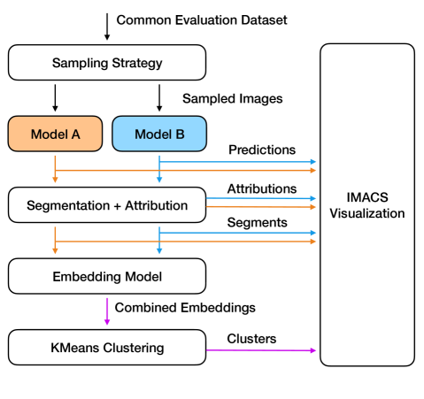
4. The imacs Algorithm
Our implementation of imacs (Figure 2) requires two trained image classification models, a third embedding model, a set of common evaluation images, prediction scores from both models on the evaluation set, and additional dataset labels for filtering inputs, if desired. We describe these components in greater detail below.
Data Sampling
imacs makes use of a dataset sampling strategy to help accentuate the differences between two models. In our current implementation, we sample 100 total images for each model, for a total of 200 images. Our examples use the sampling strategy of sampling a balanced confusion matrix, or an equal number of true positive, true negative, false positive, and false negative inputs (image instances) for each model.
Segmenting Input Images and Calculating Attribution Scores
For simplicity, we segment each image into a 4-by-4 grid of segments. (One opportunity for future work would be to experiment with segmentation techniques that identify regions of similar pixels, such as SLIC (Achanta et al., 2010)). We determine the contribution of individual image segments to a given model prediction by calculating segment Shapley values (Shapley, 1953). However, computing Shapley values for all segments is computationally prohibitive due to the combinatorial explosion of the Shapley algorithm. For that reason, we identify a reduced subset of segments of size () which are likely to have high influence on the model prediction. We do this by first computing segment attribution values with respect to the top predicted classes using the XRAI method (Kapishnikov et al., 2019) in combination with Guided Integrated Gradients (Kapishnikov et al., 2021). Then, we sort the segments by their attribution values and pick the top with the highest values. For our example dataset, we choose and , resulting in 500 total image segments per model with associated attribution scores for up to 5 classes.
Shapley values are computed by sequentially excluding segments from the input image and observing the changes in model predictions. One way to exclude a segment is to gray out all of its pixels. However, such an approach may result in undesirable effects if the model was not trained on images with removed parts, or if the gray color correlates with a particular class. To reduce these effects, we apply Gaussian Blur to excluded segments.
Assigning Embedding Values and Clustering
Image segments from both models are pooled into a single collection and clustered by their corresponding embedding values. We embed individual image segments by inputting them into an ImageNet-trained (Russakovsky et al., 2014) Inception-V2 model (Szegedy et al., 2016), and extracting the final pooling layer activation values. These embeddings are then clustered using k-means with a user-defined number of clusters. Adapting additional clustering methods, e.g., fair k-means (Ghadiri et al., 2021), to imacs is an opportunity for future work.
Because 100 images are sampled for each model based on each model’s predictions (i.e., an equal number of true positive, true negative, false positive, and false negative examples), a cluster of image segments may contain more segments from one model’s set of sampled images than from the other model’s sampled images. For example, if model A’s training leads to a large set of false positives that model B correctly classifies as true negatives, then it is possible to have a cluster of segments representing these false positives (with these segments deriving primarily from sampling images for model A). As will be evident in the visualizations produced by imacs, imbalances such as these can provide an indicator of how two models may behave differently in the aggregate.
5. Visualizing Differences in Attributions Across Models
In this section, we present the imacs visualizations and describe how they support answering the following questions drawn from research in concept-based explanations (Ghorbani et al., 2019):
-
D1
What features do the models use to make predictions, and how do they group into higher-level concepts?
-
D2
What is the relative importance of each cluster of similar features compared to others?
-
D3
What features are shared between models, and which are not?
-
D4
For common features, how does their importance differ between the models?
To illustrate how imacs can be used to compare the behavior of two models in this section, we construct a scenario with two models trained on a flower classification task using the TF-Flowers dataset (Team, 2019). One of the models is trained with a version of the dataset perturbed with watermarks, leading to an association between watermarks and sunflowers. Even though both models achieve high accuracy, we show how imacs surfaces differences due to the introduction of the watermark in the training data.

TF-Flowers comprises 3,670 images of flowers in 5 classes (tulips, daisies, dandelions, roses, and sunflowers). We split 85% of the images for training, and 15% for testing. One of the models is trained on the baseline dataset, and the other is trained on a modified version of TF-Flowers, where a watermark is added at a random location for 50% of the images in the “sunflower” class (Figure 3). The baseline model achieves an accuracy of 94.9%, while the “perturbed” model achieves an accuracy of 91.8% on their respective test sets. To construct an scenario demonstrating how a model’s unwanted association between a visual feature and class predictions can lead to unwanted behavior when that feature appears in other classes, we construct an additional test dataset introducing the same watermark at random locations to 50% of images in all classes. On this test set, the baseline model achieves an accuracy of 95.1% while the perturbed model achieves an accuracy of 79.6% (the drop in accuracy suggests the effects of the watermark the training data). While this dataset has an artificially introduced bias, we will next show how imacs can help surface biases. (In section 6, we show additional results from actual, unaltered satellite image datasets.)

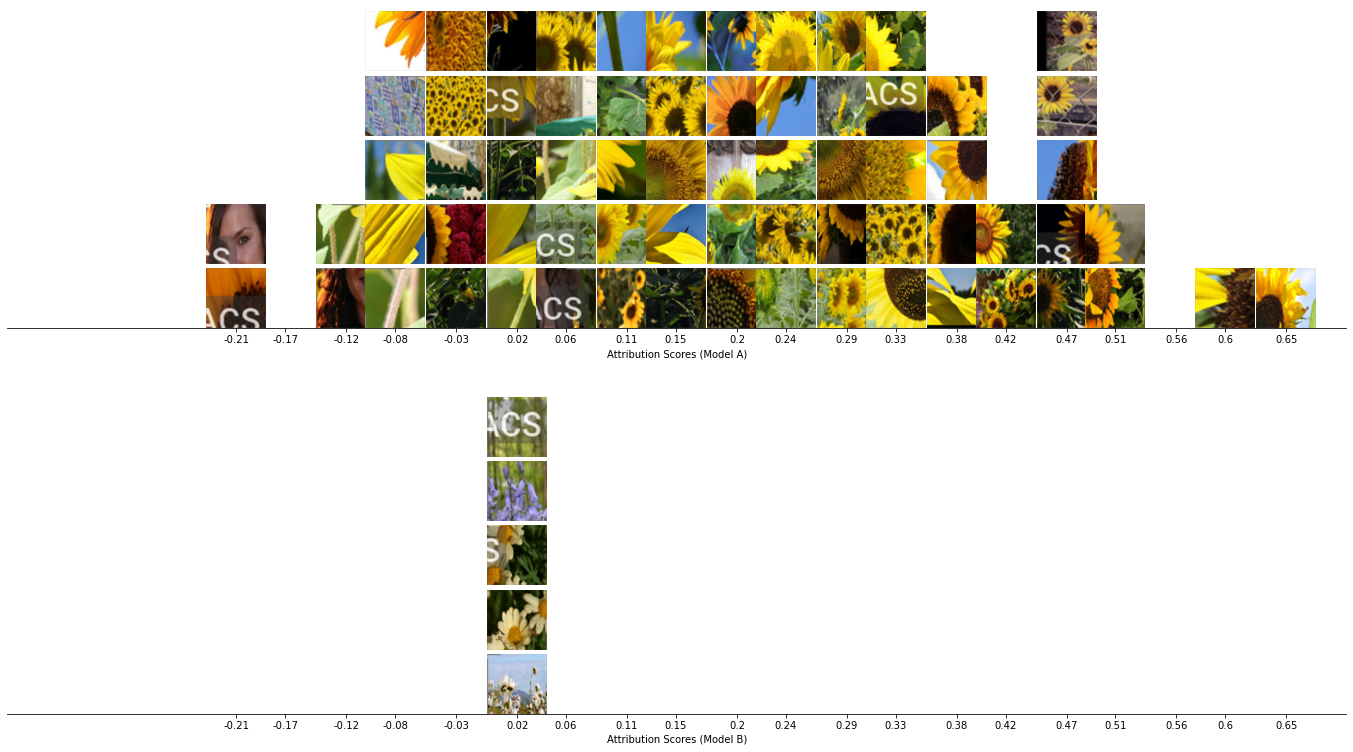
5.1. Cluster Histogram Visualization
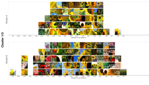
The imacs Cluster Histogram Visualization (Figure 1) shows, for predictions of a particular class, how the visual concepts contained in clusters are distributed by their attribution scores. Each cluster (out of a user-specified total; in this example, ) is presented by two histograms of image segment tiles bucketed by their attribution scores, one for each model being compared (D1). Image segments correspond to each model’s attribution-based sampling of the dataset. Histograms for all clusters share the same horizontal axis scale to aid in comparing the importance of visual features between clusters (D2). Binning segments by their importance allows users to assess the composition of individual clusters (i.e., what concepts are contained within), and compare the weighting of similar features among clusters (D4). This visualization also reveals when a feature is not apparent in one of the models’ sets of sample segments (due to dataset sampling differences, where a feature may not be present because it is not highly attributed by one model compared to the other). (Of note, the total number of tiles in this view is truncated to 5 to conserve space. A full (non-truncated) histogram of attribution scores within clusters is shown in the Cluster Concept View, described in the following section.)
Returning to the sunflower/watermarks scenario, clusters 1 (Figure 1) and 2 (top pair in Figure 4) provide the strongest signals for predicting images in the “sunflower” class. The presence of a distinct visual pattern (the “IMACS” watermark) in the second model’s histogram in cluster 1 indicates it is a significant feature for model B, and the high relative attribution scores of the watermarks (even above sunflower features) confirm model B’s association between the sunflower class and watermarks. Cluster 2 is comprised almost entirely of “IMACS” watermarks, and the difference in how this visual concept is weighted between the two models is readily apparent, with some segments almost completely responsible for model B’s predictions, and model A attributing most segments near zero. This reveals the true difference between the models: the second model was trained to artificially associate the presence of a watermark with sunflowers.
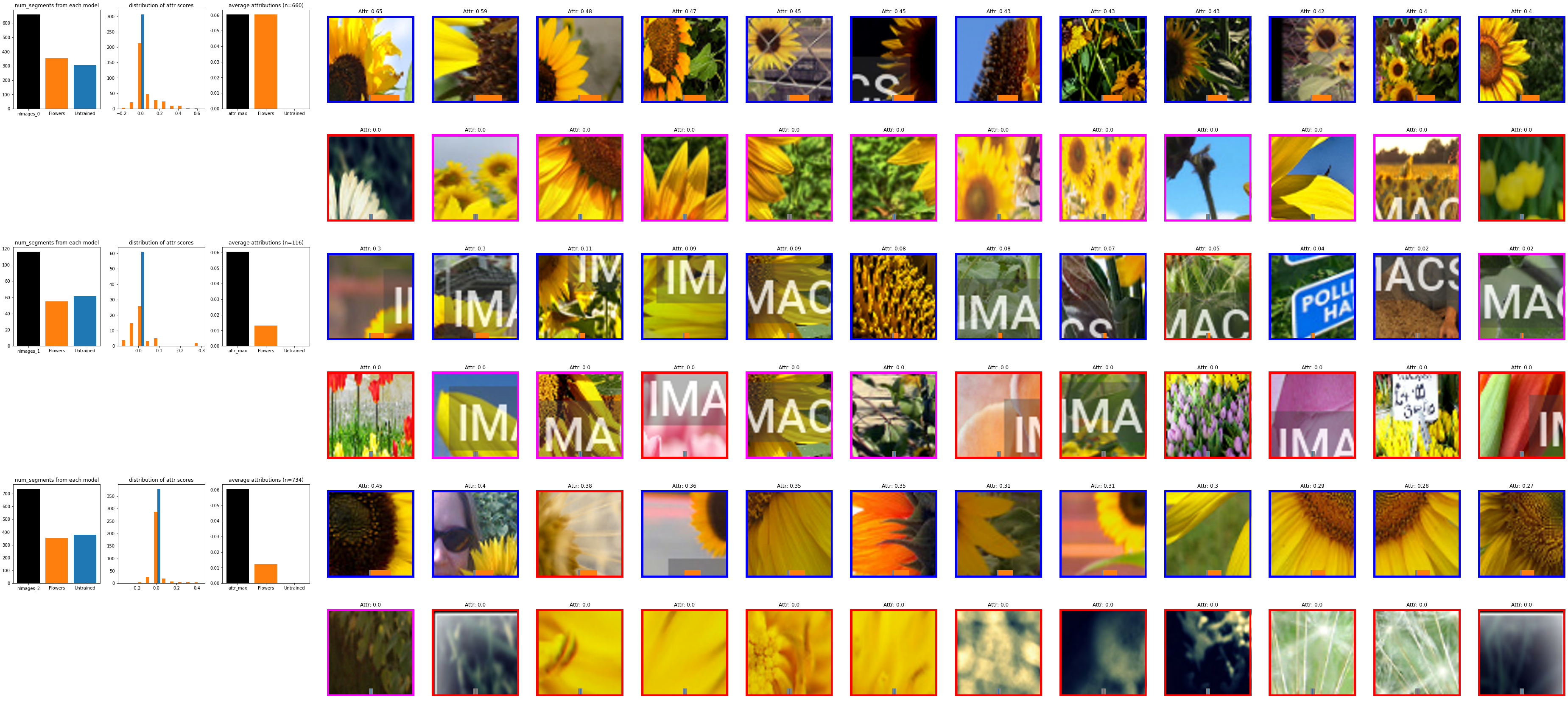
5.2. Concept Cluster Visualization
The imacs Concept Cluster Visualization (Figure 5) introduces descriptive statistics to each cluster and its constituent components (i.e., the individual image regions) to facilitate comparisons. More specifically, this visualization sorts the contents of each cluster, annotates individual elements with attribution data, and introduces plots summarizing key statistics of the clusters. We present details of these components below.
5.2.1. Organizing and Summarizing Visual Signals in Clusters
Each cluster is presented as two separate rows of image segment thumbnails (Figure 6) corresponding to each model’s sampling of the common evaluation dataset. Clusters are ordered from top to bottom based on the imbalance of their average attribution scores, with the largest disparities presented first. This ordering helps draw attention to the largest differences in feature attributions between models (D4). (One could also imagine alternative sorting methods, such as sorting by the highest average attribution score between the models, which would rank the most “important” (rather than the most differing) visual concepts first.) Within each cluster’s rows, image segments are ordered from highest to lowest attribution scores, providing an indication of which visual patterns the models consider most important (D2).

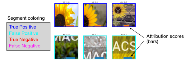
Within clusters, image segments are annotated by their classification correctness (true positive, true negative, false positive, false negative) by drawing a color-coded border around them. Attribution scores (which can be positive or negative) are also overlaid on top of each segment as a bar, color-coded by their source model (A or B) to help differentiate similar rows (Figure 7). The colored borders and attribution score bar help convey whether the visual features captured in a cluster are the source of class confusion or model errors.
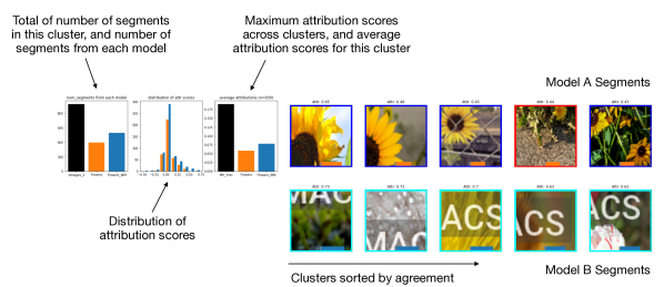
5.2.2. Determining Composition, Coherence, and Importance of Clusters
In addition to the visual presentation of the image segments, we also provide three graphs summarizing the data in each cluster (Figure 8). The left plot describes the composition of a cluster, by displaying the total number of segments in the cluster (black), and the number of segments contributed by each model’s sampling of the dataset. This graph helps users determine (1) whether the cluster contains a significant number of segments in comparison to other clusters (a “critical mass” suggests an influential visual pattern in the cluster could persist across the dataset (D1)); and (2) whether a cluster’s contents derive more from one model’s sampling process (suggesting the set of features are more important for one model than the other (D3)).
The center plot depicts the distribution of attribution scores via two histograms, corresponding to the two models’ sets of segments within the cluster. This is the same histogram shown in the Cluster Histogram Visualization, but is not truncated. In this view, examining the distribution of scores from each model can help determine the composition of a cluster (e.g., whether multiple concepts are represented in a single cluster (D1)). Significantly different attributions (e.g., a bimodal distribution within a cluster) may suggest the overlap of multiple concepts or potential differences between the models.
The right plot shows the importance of the cluster, by reporting the average segment attribution score calculated for each model, as well as the maximum mean attribution score across all clusters. The black bar serves as a visual reference point to help users determine the relative importance of a cluster (D2). The average attribution scores from each model serve multiple purposes. First, they establish the validity of the underlying concept (e.g., if the attribution is near zero, then the visual pattern is likely inconsequential to a model). Second, the scores indicate the relative importance of the concept between the models (D4). If the attributions do not differ significantly between models, then the visual pattern is not likely to be a key differentiator between the models.
Returning to our earlier scenario (Figure 5), imacs shows the second model highly attributes the watermarks when classifying sunflowers (first set of clusters). In the first cluster (top set of two rows), the most prevalent visual feature represented by the segments is the “IMACS” watermark added to the images. The histogram (center plot of this cluster) and average attribution score plot (right plot) show the baseline model (in orange) attributes watermark segments with a score near zero (meaning it is not an important feature for the baseline model). On the other hand, the watermark is the most important feature to the perturbed model for classifying the “sunflower” class: the average attribution score of the cluster with watermarks is the highest among all clusters.
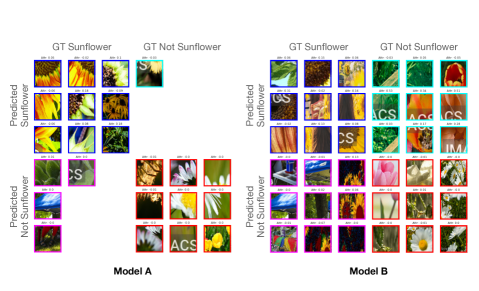
5.3. Cluster Confusion Matrix Visualization
To more deeply inspect a particular cluster, the imacs Cluster Confusion Matrix Visualization allows users to explode a cluster into two side-by-side confusion matrices (Figure 9). In this visualization, the segments from a particular cluster are split and organized by their classification correctness (e.g., true positives, false positives, true negatives, and false negatives). This can help users determine what visual patterns within a cluster are contributing to erroneous predictions.
5.4. Alternative Sorting and Filtering Strategies
In the concept cluster view (Figure 5), image segments within a cluster’s rows are ordered based on their attribution scores (in descending order, from high to low). This ordering helps the user understand which image segments are most important within the cluster, for each model. We also experimented with alternative methods for sorting within and between clusters. Sorting segments within a cluster based on their distance from the cluster’s centroid can provide a sense of the central visual concept for that cluster. This sorting criteria displays the most representative image segments of the cluster first. Clusters can also be ordered by their average attribution score, which would surface the most important concepts first, rather than highlighting imbalances between the models.
While sampling a balanced confusion matrix for each model highlights concept mismatches that contribute to misclassifications, additional dataset sampling strategies such as filtering for confident disagreements using models’ softmax scores, or filtering only for false positives in all visualizations, can similarly yield additional, useful perspectives on the differences between models.
6. Validation
In this section, we validate imacs’s technique of using attributions to organize, summarize, and compare the visual features used by two models. First, we conduct a basic validation check of imacs by comparing the baseline model from section 5 with an untrained model. Next, we evaluate imacs through the analysis of a case illustrating concept drift between two models.
6.1. Basic Validation Check
While prior techniques such as ACE (Ghorbani et al., 2019) also extract, cluster, and visualize concepts, our technique makes use of attribution scores to organize, summarize, and compare model capabilities. We demonstrate the utility of attributions in surfacing differences between two models through a basic validation check. For this, we use imacs to compare a trained model with an untrained model. As seen in Figure 10, the average attribution scores for the untrained model are nearly zero in all clusters. The histogram visualization shows this effect most strongly, with the untrained model’s segment tiles in a single bin centered on zero. In addition, segments in the Concept Cluster Visualization are not ordered in any discernible pattern: While the embeddings from the independent, third model are able to create clusters of similar inputs, we observe a lack of order to them without attributions from a trained model.

6.2. Visualizing Domain Shift with Satellite Images
In this section, we show how imacs visualizations can highlight clear behavioral differences between models in an additional scenario.
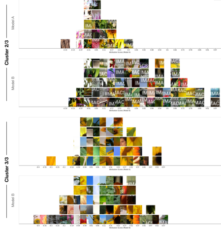
We illustrate the problem of domain shift, where a model trained on a land use dataset capturing European cities (Helber et al., 2019) does not generalize well to the overlapping classes in a similar dataset for regions in the United States, UC Merced Land Use (Yang and Newsam, 2010). We use imacs to compare the datasets, diagnosing the specific source of the confusion in predicting the “residential” class. Unlike the previous examples, this scenario does not modify the images in the datasets, and compares their real-world differences for a class they share in common.
To simplify model training, we identify the set of intersecting classes between these datasets (agricultural, forest, freeway, industrial, residential, river, vegetation), and train two ImageNet-pretrained ResNet50V2 models (He et al., 2016) on separate subsets of Eurosat and Merced, corresponding to their intersecting classes. These models achieve test-set accuracies on their own datasets of 93.3% and 95.1% respectively. To simulate domain shift, we evaluate both models on the Merced-subset dataset only, representing a scenario where a pretrained model fails on a dataset with similar labels but differently distributed data. The Eurosat-subset model achieves a test-set accuracy of 38.7% on the subset of intersecting classes with the Merced dataset. (The Merced-subset model achieves an accuracy of 23.06% on the Eurosat-subset test set.) We use imacs to show what features are responsible for the performance degradation of the Eurosat model on the “residential” class of the Merced dataset.
In Figure 11, the first two clusters in the imacs visualization uncover a key discrepancy between the models: the Eurosat model (orange bars) strongly weighs segments with vegetation for the “residential” class (top row of second cluster–almost all false positives with greenery), while the Merced model recognizes a wider variety of features (e.g., the first, third, and fourth clusters contain angled rooflines, small buildings next to patches of greenery, and residential streets). For deeper inspection, histogram visualizations of the clusters in Figure 11 are shown in Appendix A.
7. Discussion and Limitations
In this section, we discuss patterns observed in the use of imacs in our scenarios, and discuss implications for using imacs in new settings, including future work.
7.0.1. Aiding Efficient Understanding of Visual Patterns
In imacs, image segments are presented on their own, without the benefit of their original context (i.e., the rest of the image). This can make it difficult to quickly understand the particular “concept” represented by the cluster, and the contexts in which these image segments typically appear. Interactive techniques could be helpful to address these issues. For example, hovering over an image segment could show the original image in a tooltip to aid understanding.
7.0.2. Attribution Location Summaries
Our current implementation of imacs extracts image segments from the underlying image. This process effectively strips out location data for the image segment (more specifically, where in the image the segment derives from). Summarizing where the most highly attributed regions are in images, across the entire dataset, could provide additional, useful information. For example, if highly attributed image segments are all found in the center of images, or in one specific corner, this finding could suggest potential issues in the dataset itself. (It could also provide evidence that the model is learning the right visual patterns, if it is known that the important features should be located in a particular part of the image.)
7.1. Interactivity
As previously discussed, there are a number of possible variations for sorting, filtering, aggregating, and presenting model attributions for two models. It is unlikely that any one particular configuration will meet every possible use case. To address this situation, a promising extension to this work would be to provide interactive capabilities enabling end-users to dynamically adjust the pipeline to meet their specific needs.
8. Conclusion
This paper presents imacs, a method for summarizing and comparing feature attributions derived from two different models. We have shown how this technique can reveal key differences in what each model considers important for predicting a given class, an important capability in facilitating discovery of unintended or unexpected learned associations. Given these results, promising future directions include extending this technique to view differences between two datasets (given one model); linking segments in the visualization to their original context (i.e., source image); and supporting interactive sorting and filtering (e.g., comparing false positives only) to facilitate deeper exploration of datasets and models.
References
- (1)
- Achanta et al. (2010) Radhakrishna Achanta, Appu Shaji, Kevin Smith, Aurélien Lucchi, Pascal Fua, and Sabine Süsstrunk. 2010. SLIC superpixels. Technical report, EPFL (06 2010).
- Amershi et al. (2015) Saleema Amershi, Max Chickering, Steven M. Drucker, Bongshin Lee, Patrice Simard, and Jina Suh. 2015. ModelTracker: Redesigning Performance Analysis Tools for Machine Learning. In Proceedings of the 33rd Annual ACM Conference on Human Factors in Computing Systems (Seoul, Republic of Korea) (CHI ’15). Association for Computing Machinery, New York, NY, USA, 337–346. https://doi.org/10.1145/2702123.2702509
- Cai et al. (2021) Carrie J Cai, Samantha Winter, David Steiner, Lauren Wilcox, and Michael Terry. 2021. Onboarding Materials as Cross-Functional Boundary Objects for Developing AI Assistants. In Extended Abstracts of the 2021 CHI Conference on Human Factors in Computing Systems (Yokohama, Japan) (CHI EA ’21). Association for Computing Machinery, New York, NY, USA, Article 43, 7 pages. https://doi.org/10.1145/3411763.3443435
- Denton et al. (2019) Emily Denton, Ben Hutchinson, Margaret Mitchell, and Timnit Gebru. 2019. Detecting Bias with Generative Counterfactual Face Attribute Augmentation. CoRR abs/1906.06439 (2019). arXiv:1906.06439 http://arxiv.org/abs/1906.06439
- Fong and Vedaldi (2017) Ruth C Fong and Andrea Vedaldi. 2017. Interpretable explanations of black boxes by meaningful perturbation. In Proceedings of the IEEE International Conference on Computer Vision. 3429–3437.
- Gebru et al. (2021) Timnit Gebru, Jamie Morgenstern, Briana Vecchione, Jennifer Wortman Vaughan, Hanna Wallach, Hal Daumé III, and Kate Crawford. 2021. Datasheets for Datasets. Commun. ACM 64, 12 (nov 2021), 86–92. https://doi.org/10.1145/3458723
- Ghadiri et al. (2021) Mehrdad Ghadiri, Samira Samadi, and Santosh Vempala. 2021. Socially Fair K-Means Clustering. In Proceedings of the 2021 ACM Conference on Fairness, Accountability, and Transparency (Virtual Event, Canada) (FAccT ’21). Association for Computing Machinery, New York, NY, USA, 438–448. https://doi.org/10.1145/3442188.3445906
- Ghorbani et al. (2019) Amirata Ghorbani, James Wexler, James Y Zou, and Been Kim. 2019. Towards Automatic Concept-based Explanations. In Advances in Neural Information Processing Systems, H. Wallach, H. Larochelle, A. Beygelzimer, F. d'Alché-Buc, E. Fox, and R. Garnett (Eds.), Vol. 32. Curran Associates, Inc. https://proceedings.neurips.cc/paper/2019/file/77d2afcb31f6493e350fca61764efb9a-Paper.pdf
- Gleicher et al. (2020) Michael Gleicher, Aditya Barve, Xinyi Yu, and Florian Heimerl. 2020. Boxer: Interactive Comparison of Classifier Results. arXiv:2004.07964 [cs.HC]
- He et al. (2016) Kaiming He, Xiangyu Zhang, Shaoqing Ren, and Jian Sun. 2016. Identity Mappings in Deep Residual Networks. arXiv:1603.05027 [cs.CV]
- Helber et al. (2019) Patrick Helber, Benjamin Bischke, Andreas Dengel, and Damian Borth. 2019. EuroSAT: A Novel Dataset and Deep Learning Benchmark for Land Use and Land Cover Classification. IEEE Journal of Selected Topics in Applied Earth Observations and Remote Sensing 12, 7 (2019), 2217–2226. https://doi.org/10.1109/JSTARS.2019.2918242
- Hinterreiter et al. (2020) Andreas Hinterreiter, Peter Ruch, Holger Stitz, Martin Ennemoser, Jurgen Bernard, Hendrik Strobelt, and Marc Streit. 2020. ConfusionFlow: A model-agnostic visualization for temporal analysis of classifier confusion. IEEE Transactions on Visualization and Computer Graphics (2020), 1–1. https://doi.org/10.1109/tvcg.2020.3012063
- Hohman et al. (2020) Fred Hohman, Kanit Wongsuphasawat, Mary Beth Kery, and Kayur Patel. 2020. Understanding and Visualizing Data Iteration in Machine Learning. In Proceedings of the 2020 CHI Conference on Human Factors in Computing Systems (Honolulu, HI, USA) (CHI ’20). Association for Computing Machinery, New York, NY, USA, 1–13. https://doi.org/10.1145/3313831.3376177
- Hutchinson et al. (2021) Ben Hutchinson, Andrew Smart, Alex Hanna, Emily Denton, Christina Greer, Oddur Kjartansson, Parker Barnes, and Margaret Mitchell. 2021. Towards Accountability for Machine Learning Datasets: Practices from Software Engineering and Infrastructure. In Proceedings of the 2021 ACM Conference on Fairness, Accountability, and Transparency (Virtual Event, Canada) (FAccT ’21). Association for Computing Machinery, New York, NY, USA, 560–575. https://doi.org/10.1145/3442188.3445918
- Kahng et al. (2016) Minsuk Kahng, Dezhi Fang, and Duen Horng (Polo) Chau. 2016. Visual Exploration of Machine Learning Results Using Data Cube Analysis. In Proceedings of the Workshop on Human-In-the-Loop Data Analytics (San Francisco, California) (HILDA ’16). Association for Computing Machinery, New York, NY, USA, Article 1, 6 pages. https://doi.org/10.1145/2939502.2939503
- Kapishnikov et al. (2019) Andrei Kapishnikov, Tolga Bolukbasi, Fernanda Viégas, and Michael Terry. 2019. XRAI: Better Attributions Through Regions. In Proceedings of the IEEE International Conference on Computer Vision. 4948–4957.
- Kapishnikov et al. (2021) Andrei Kapishnikov, Subhashini Venugopalan, Besim Avci, Ben Wedin, Michael Terry, and Tolga Bolukbasi. 2021. Guided Integrated Gradients: An Adaptive Path Method for Removing Noise. In Proceedings of the IEEE/CVF Conference on Computer Vision and Pattern Recognition (CVPR). 5050–5058.
- Kim et al. (2017) Been Kim, Martin Wattenberg, Justin Gilmer, Carrie Cai, James Wexler, Fernanda Viegas, and Rory Sayres. 2017. Interpretability Beyond Feature Attribution: Quantitative Testing with Concept Activation Vectors (TCAV). arXiv:1711.11279 [stat.ML]
- Kuznetsova et al. (2020) Alina Kuznetsova, Hassan Rom, Neil Alldrin, Jasper Uijlings, Ivan Krasin, Jordi Pont-Tuset, Shahab Kamali, Stefan Popov, Matteo Malloci, Alexander Kolesnikov, Tom Duerig, and Vittorio Ferrari. 2020. The Open Images Dataset V4: Unified image classification, object detection, and visual relationship detection at scale. IJCV (2020).
- Murugesan et al. (2019) Sugeerth Murugesan, Sana Malik, Fan Du, Eunyee Koh, and Tuan Manh Lai. 2019. DeepCompare: Visual and Interactive Comparison of Deep Learning Model Performance. IEEE Comput. Graph. Appl. 39, 5 (Sept. 2019), 47–59. https://doi.org/10.1109/MCG.2019.2919033
- Narkar et al. (2021) Shweta Narkar, Yunfeng Zhang, Q. Vera Liao, Dakuo Wang, and Justin D. Weisz. 2021. Model LineUpper: Supporting Interactive Model Comparison at Multiple Levels for AutoML. In 26th International Conference on Intelligent User Interfaces (College Station, TX, USA) (IUI ’21). Association for Computing Machinery, New York, NY, USA, 170–174. https://doi.org/10.1145/3397481.3450658
- Patel et al. (2021) Neel Patel, Martin Strobel, and Yair Zick. 2021. High Dimensional Model Explanations: An Axiomatic Approach. In Proceedings of the 2021 ACM Conference on Fairness, Accountability, and Transparency (Virtual Event, Canada) (FAccT ’21). Association for Computing Machinery, New York, NY, USA, 401–411. https://doi.org/10.1145/3442188.3445903
- Ribeiro et al. (2016) Marco Tulio Ribeiro, Sameer Singh, and Carlos Guestrin. 2016. ”Why Should I Trust You?”: Explaining the Predictions of Any Classifier. In Proceedings of the 22nd ACM SIGKDD International Conference on Knowledge Discovery and Data Mining (San Francisco, California, USA) (KDD ’16). Association for Computing Machinery, New York, NY, USA, 1135–1144. https://doi.org/10.1145/2939672.2939778
- Russakovsky et al. (2014) Olga Russakovsky, Jia Deng, Hao Su, Jonathan Krause, Sanjeev Satheesh, Sean Ma, Zhiheng Huang, Andrej Karpathy, Aditya Khosla, Michael Bernstein, Alexander C. Berg, and Li Fei-Fei. 2014. ImageNet Large Scale Visual Recognition Challenge. arXiv:1409.0575 [cs] (Sept. 2014). http://arxiv.org/abs/1409.0575 arXiv: 1409.0575.
- Selvaraju et al. (2017) Ramprasaath R Selvaraju, Michael Cogswell, Abhishek Das, Ramakrishna Vedantam, Devi Parikh, and Dhruv Batra. 2017. Grad-cam: Visual explanations from deep networks via gradient-based localization. In Proceedings of the IEEE International Conference on Computer Vision. 618–626.
- Shapley (1953) Lloyd S Shapley. 1953. A value for n-person games. Contributions to the Theory of Games 2, 28 (1953), 307–317.
- Sokol and Flach (2020) Kacper Sokol and Peter Flach. 2020. Explainability Fact Sheets: A Framework for Systematic Assessment of Explainable Approaches. In Proceedings of the 2020 Conference on Fairness, Accountability, and Transparency (Barcelona, Spain) (FAT* ’20). Association for Computing Machinery, New York, NY, USA, 56–67. https://doi.org/10.1145/3351095.3372870
- Sun et al. (2020) Dong Sun, Zezheng Feng, Yuanzhe Chen, Yong Wang, Jia Zeng, Mingxuan Yuan, Ting-Chuen Pong, and Huamin Qu. 2020. DFSeer: A Visual Analytics Approach to Facilitate Model Selection for Demand Forecasting. In Proceedings of the 2020 CHI Conference on Human Factors in Computing Systems (Honolulu, HI, USA) (CHI ’20). Association for Computing Machinery, New York, NY, USA, 1–13. https://doi.org/10.1145/3313831.3376866
- Sundararajan et al. (2017) Mukund Sundararajan, Ankur Taly, and Qiqi Yan. 2017. Axiomatic Attribution for Deep Networks. In Proceedings of the 34th International Conference on Machine Learning - Volume 70 (Sydney, NSW, Australia) (ICML’17). JMLR.org, 3319–3328.
- Szegedy et al. (2016) Christian Szegedy, Vincent Vanhoucke, Sergey Ioffe, Jon Shlens, and ZB Wojna. 2016. Rethinking the Inception Architecture for Computer Vision. https://doi.org/10.1109/CVPR.2016.308
- Team (2019) The TensorFlow Team. 2019. Flowers. http://download.tensorflow.org/example_images/flower_photos.tgz
- Thomas and Uminsky (2020) Rachel Thomas and David Uminsky. 2020. The Problem with Metrics is a Fundamental Problem for AI. arXiv:2002.08512 [cs.CY]
- Wang et al. (2020) Angelina Wang, Arvind Narayanan, and Olga Russakovsky. 2020. REVISE: A Tool for Measuring and Mitigating Bias in Visual Datasets. In Computer Vision – ECCV 2020, Andrea Vedaldi, Horst Bischof, Thomas Brox, and Jan-Michael Frahm (Eds.). Springer International Publishing, Cham, 733–751.
- Yang and Newsam (2010) Yi Yang and Shawn Newsam. 2010. Bag-of-Visual-Words and Spatial Extensions for Land-Use Classification. In Proceedings of the 18th SIGSPATIAL International Conference on Advances in Geographic Information Systems (San Jose, California) (GIS ’10). Association for Computing Machinery, New York, NY, USA, 270–279. https://doi.org/10.1145/1869790.1869829
- Zhang et al. (2018) Richard Zhang, Phillip Isola, Alexei A Efros, Eli Shechtman, and Oliver Wang. 2018. The Unreasonable Effectiveness of Deep Features as a Perceptual Metric. In CVPR.
Appendix A Eurosat vs Merced imacs Histograms
This section contains histogram visualizations for the imacs comparison of the Eurosat and Merced Land Use models for the scenario in section 6. Histograms are presented with the same ordering of clusters as Figure 11.
A.1. Cluster 1
![[Uncaptioned image]](/html/2201.11196/assets/figures/satellite_images/sats_hist_0.png)
A.2. Cluster 2
![[Uncaptioned image]](/html/2201.11196/assets/figures/satellite_images/sats_hist_1.png)
A.3. Cluster 3
![[Uncaptioned image]](/html/2201.11196/assets/figures/satellite_images/sats_hist_3.png)
A.4. Cluster 4
![[Uncaptioned image]](/html/2201.11196/assets/figures/satellite_images/sats_hist_2.png)