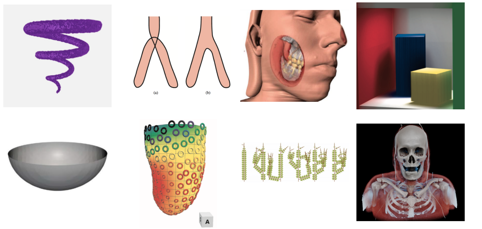
0 \vgtccategoryResearch \vgtcinsertpkg \teaser Most and least memorable scientific visualizations. From (a) to (b), left to right, and top to bottom: image courtesy of Quan et al. [26], Marino and Kaufman [21], Rautek et al. [27], Schlegel et al. [32], Thomas and Natarajan [36], Meyer-Spradow et al. [23], Kolesar et al. [16], Zhang and Ma [41], Mohammed et al. [25], Tao et al. [34], Sagrista et al. [30], Gu et al. [10], Hermosilla et al. [13], Marchesin et al. [20], Hermosilla et al. [13], and Lampe et al. [18].
Toward A Deep Understanding of What Makes a Scientific
Visualization Memorable
Abstract
We report results from a preliminary study exploring the memorability of spatial scientific visualizations, the goal of which is to understand the visual features that contribute to memorability. The evaluation metrics include three objective measures (entropy, feature congestion, the number of edges), four subjective ratings (clutter, the number of distinct colors, familiarity, and realism), and two sentiment ratings (interestingness and happiness). We curate 1142 scientific visualization (SciVis) images from the original 2231 images in published IEEE SciVis papers from 2008 to 2017 and compute memorability scores of 228 SciVis images from data collected on Amazon Mechanical Turk (MTurk). Results showed that the memorability of SciVis images is mostly correlated with clutter and the number of distinct colors. We further investigate the differences between scientific visualization and infographics as a means to understand memorability differences by data attributes.
MemorabilityClutterColorAffectiveness
Introduction
The inherent complexity of scientific data has led to many innovative solutions for visualizing complex spatial phenomenon such as structural patterns and relationships. The design of these techniques is based largely on the subjective experience of visualization experts. We still have limited knowledge on how and why visualizations are effective, what humans see and remember, and whether or not these techniques promote engaging experiences and learning.
Recent studies have revealed that our brain is sensitive to a high-level property that guides memory, touched upon the concept of memorability, defined as “an intrinsic, perceptual stimulus property correlated with the likelihood of an image being later remembered or forgotten” [1]. The memorability of different images shows high consistency across different groups of people [15] and this consistency holds for faces [2], photographs [15], and infographics [4]. Participants have more consistent memorability experience when seeing scientific visualizations than that of information visualization [3]. Could memorability also be an intrinsic property of scientific visualizations? What visual features contribute the memorability of information visualization also make scientific visualization more memorable?
The first contribution of this work is to advance our understanding of intrinsic visualization attribute of memorability. Our study first measures SciVis image memorability and then reveals whether memorability is correlated with 3D visualization image features in the objective and subjective metrics. We adapt and expand recent vision science studies [7, 31] and visualization methods and measured three objective (entropy, feature congestion, and the number of edges), four subjective (clutter, number of distinctive colors, familiarity, and realism), and two sentiment (interestingness or happiness) metrics to investigate the relationship between memorability and these image features.
The second contribution of this work is a scientific visualization memorability database. This database could ultimately promote the understanding of the evolution of spatial data analysis and be useful for benchmarking visualization methods. The current image collection contains 2231 original SciVis images and 1142 curated SciVis memorability dataset of which 228 are annotated with their memorability scores, all accessible at https://ivclexp.github.io/scivismemorability/.
1 Related work
This section discusses studies closely related to our work in memorability and visual features.
1.1 Memorability of Visualizations And Feature Space
Visualization aims to present data to aid communication and help transform insights into knowledge. Understanding the transition steps from human visual perception and memory is crucially important because we have to know what we see before we understand, remember, and interact with data [1].
Many features from low-level to high-level are found correlated with memorability in images and information visualization. Low-level features are used to describe image elements such as color statistics and luminance. For example, Borkin et al.’s online crowdsourcing experiment reported that color, density, and data-ink ratio enhance infographics memorability [4]. However, some features cannot be applied in SciVis, because data from infographics are mostly discrete, in contrast to continuous scientific data related to variety of physical phenomenons. For example, the concept of data-ink ratio suitable to measure density in information visualization would be ill-defined in spatial data in terms of legibility [5]. Though pictograms outperformed plain charts and texts in attracting viewers’ attention [12] and led to higher memorability scores [3], text displays also have many forms in spatial data visualizations [6] [33].
In this work, we have chosen SciVis-relevant measurements. For example, entropy can describe the “busyness” of a visualization and measures how difficult a visualization would be to compress [39]. Edges can define the boundaries of objects within a visualization, and the number of edges can help estimate how many different areas a visualization contains. We have also measured visual clutter defined as the extent to which there is no room in feature space for adding new salient items, followed the feature congestion model by Rosenholtz et al. [28].
1.2 High-Level and Affectiveness Features
Memorability is often studied by presenting a brief glimpse of images in a fraction of a second. This brief exposure to an image or art work is long enough to guide human attention to important regions, reflecting viewers’ personality traits or the inherent image attributes. Memory recall instead is studied in prolonged uses of interactive systems. High-level features containing Gestalt groupings can help humans interpret objects in complex spatial data visualization [42]. Symmetry, alignment, collinearity, and axis orthogonality align with human cognitive processes Network diagrams are early for network layout [22].
Affectiveness, which can be measured using sentiment analysis, can affect human creativity, trust, and analytical capacities. The affectiveness or emotional features of visualizations are often studied through interactive exploration. For example, Dasgupta et al. [7] investigated the relationship between familiarity of the analysis medium and domain experts’ trust. Their results indicated that the visual analytic system can inspire greater trust than other media for complex tasks. Saket et al. [31] compared the enjoyment of node-link and node-link-group visualization and found the latter to be more enjoyable. Previous studies has found that memorability is distinct from other stimulus properties and is uncorrelated with aesthetics and affectiveness [15].
Journalists and artists creating infographics are undoubtedly capable of manipulating multiple perspectives such as colors and lighting deliberately to create memorable experiences. Visualization can be beautiful or artistic to facilitates communication and interaction between the viewer and visualization and between the craft of design and the final product. But an important difference between images in vision science and visualizations is that visualization design is a process that proceeds from framing a problem (analyses) to a solution process (synthesis). It is indeed hoped that viewers of visualizations would discount their emotion and generate consistent knowledge from data.
2 Experiment
This section describes our hypotheses, the scientific visualization dataset collection, measurement metrics, and our online crowdsourcing experiment on MTurk.
2.1 Hypotheses
Inspired by this literature and our own experiences in the design and evaluation of visualization, our hypotheses entering the experiment were:
-
•
H1. Memorability may be intrinsic to scientific visualizations.
-
•
H2. A visualization may be easier to remember if it is less cluttered. Simple visualization (i.e., clear axes, clearly oriented) may be easier to memorize.
-
•
H3. Emotional responses may not be correlated with scientific visualization memorability.
2.2 Scientific Visualization Data Collection
.
There are 2231 images appearing at the annual IEEE SciVis papers from 2008 to 2017. To ensure that the dataset contains only typical scientific visualizations (visualizations used to present continuous and spatial data), we curated this data collection according to the following rules:
-
•
Remove charts (e.g., bar and line charts) mainly appearing in evaluation papers to show statistical results. For example, Fig. 1 is removed because the two superimposed visualizations show algorithmic validation results.
-
•
Remove tables, algorithms, or workflow diagrams mainly appearing in application and algorithm papers.
-
•
Split up multiple visualizations - those in which multiple images are grouped together - unless the image is part of a tool interface (Fig. 1). For example, Fig. 1 is split up because it contains multiple single visualizations. We randomly chose one visualization and here the visualization on the right in our dataset.
Following this process, we have curated 1142 samples.
2.3 Metrics
To study feature correlations with scientific visualization memorability, we include a set of measures that have been shown to be useful either in image and information visualization evaluation tasks or in interactive explorations to support recall.
We compute three objective measures of number of edges, feature congestion [29], and entropy [39]. We also collect subjective SciVis image ratings of (1) clutter (Is this visualization of a neat space or a cluttered space?); (2) familiarity (Do the objects in the visualization look familiar to you? [31]); (3) realism (Is the style of this visualization realistic or abstract? [37]); (4) happiness (How happy does this visualization make you? [31]); and (5) interestingness [9] (Is the visualization interesting?) These five measures are collected using MTurk. Three Ph.D. students studying visualization annotated the number of distinct colors in each SciVis image on a scale of 1 to 7.
2.4 Material and Methods
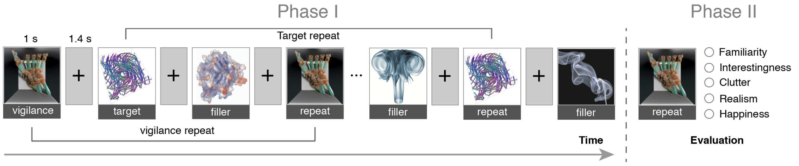
Our method to measure the memorability of scientific visualizations closely follows that of Borkin et al. [4] in an online memory game on MTurk using our SciVis data collection. 111Our empirical study is hosted at: http://18.217.0.175:3000/. Our memorability game experiment had two phases (Fig. 2). In the first phase, a stream of images was presented on the screen, each shown for 1 second(s), with a 1.4s-gap between consecutive images. The task of our participants was to press the space-bar immediately when they saw an repeated image. They received feedback on their answer right after they pressed the space-bar.
The participants could complete up to five levels with 600 different images. Each level of the memory game had a total of 120 images and took about about 5 minutes(min) to complete. Among these 120 images, are targets and are fillers. The targets were the images whose memorability were measured. Each target image was shown after at least 91 images and at most 109 images. Some fillers merely fill the space between the target images. Others are used for vigilance repeats intended to screen out participants who were not paying enough attention to the task. The vigilance repeats repeat at spacings of seven images or less and are meant to be easy to detect. Participants whose failed more than in the last 10 vigilance tests were blocked from the study. At the end of this phase I, participants were shown their hit rate and then went on to the next phase.
The second phase of our game is to collect subjective measures from our participants. For each target image that a participant saw during the game, we asked participants to rate five visualization attributes (clutter, familiarity, realism, happiness, and interestingness) on a 7-point Likert-scale using a range slider.
Validation Experiment. Before carrying out our experiment, we first performed a validation experiment based on Borkin et al. [4] to ensure that our setting is valid. We randomly choose 50 target images from their dataset and collected on average 45 responses for each image, replicating Borkin et al’s experiment [4]. We obtained a rank correlation of 0.69 when comparing the memorability scores of these 50 images with theirs. This result confirmed that our experiment setting was comparable for collecting visualization memorability scores.
3 Results and Discussion
This section presents the study results for 677 MTurk participants, our three objective, four subjective, and two sentiment measures, and their Spearman’s rank-order correlations to memorability scores. We have compared our results to those of Borkin et al. [4] to leverage the differences in memorability characteristics between infographics and sciVis images.
3.1 MTurk Objective Measure: Memorability Scores
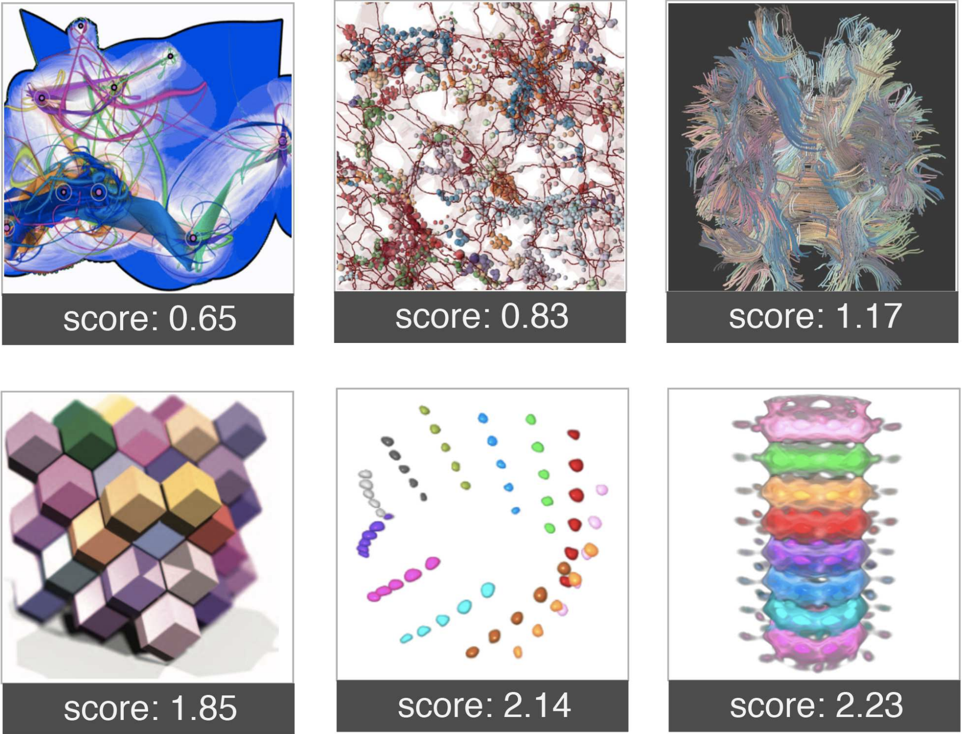
We collected 62 responses for each target on average in phase I and 34 responses on average in Phase II. All data were used in the analysis. Fig. Toward A Deep Understanding of What Makes a Scientific Visualization Memorable shows the top eight most memorable and least memorable visualizations and Table 1 shows the Spearman’s rank-order correlation results of correlating measures to the memorability scores in this and Borkin et al.’s studies [4].
We follow Borkin et al. [4] in using hit rate () and false-alarm rate () to compute the memorability score of an image. The hit rate is the rate at which users give correct feedback when they see repeated images. The false-alarm rate () indicates the proportion of users who mistakenly identify an image as a duplicate when it appears for the first time. Further, we take both and into consideration and compute as an image’s memorability score, where and Z is the inverse cumulative Gaussian distribution. A high memorability score requires the image’s to be high and the to be low.
Our first hypothesis, memorability is an intrinsic in scientific visualizations, was supported. We obtained a mean of ( = ) and mean of ( = ). We calculated the human consistency of our experiment and obtained a correlation rank of for HR, for FAR, and for , averaged over 25 random half-splits. Both our and were slightly lower than Borkin et al.’s memorability study results [4] on infographics (mean()=0.55 and mean() = 0.13). This result demonstrated that sciVis images in our dataset were harder to remember but less prone to false alarm.
| Index | Visualization feature | (Borkin et al. [4]) | |
| Objective measures | |||
| f1 | number of edges | -0.18 | 0.24 |
| f2 | feature congestion | -0.16 | 0.05 |
| f3 | entropy | -0.14 | 0.53 |
| Subjective measures | |||
| f4 | neat space vs. clutter space | -0.33 | / |
| f5 | number of distinct colors | -0.26 | 0.32 |
| f6 | familiarity | 0.17 | / |
| f7 | abstract vs. realism | 0.14 | / |
| Sentiment measures | |||
| f8 | Interestingness | -0.10 | / |
| f9 | Happiness | -0.05 | / |
We are cautious about generalizations on memorability without further exploration. The data attributes might have contributed this difference between scientific visualization and infographics. The dataset used in Borkin et al’s work [4] contained a large number of infographics collected from government documents and newspapers with fairly consistent layouts and color schemes. In contrast, all images in our dataset are sciVis images, which seem to be more diverse in visual complexity, users’ familiarity, and color schemes (many are specific to particular scientific disciplines, e.g., medical imaging or flow field), and thus MTurk participants may memorize these images, leading to our low false-alarm rate. With this diversity, it might also be hard for workers to remember them from a brief exposure without considerable visualization literacy.
3.2 Measurement of Visualization Features
Overall, the low correlations between memmorability scores and SciVis image features may suggest that memorability may be an independent trait.
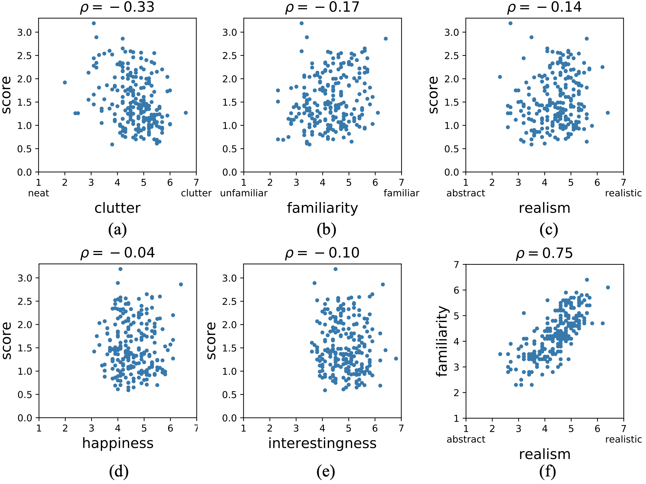
Clutter, Edges, and Entropy. We measured both subjective and objective clutter, number of edges, and entropy. We found a negative correlation between feature congestion (objective clutter) and memorability, meaning that those images with high feature-congestion scores tend to be less memorable. However, this correlation was not statistically significant. As it shown in Fig. 5(a) and Table 1, we also found that the subjective evaluation of clutter has a correlation of 0.33 with memorability.
The entropy was computed by the Shannon entropy equation: , where is the probability that the difference between two adjacent pixels is equal to and is the total scale in gray-color space. We got a correlation rank value of (), again a negative correlation, i.e., a visualization that contains more information is harder to remember.
These results may agree with our second hypothesis: improved spatial layout may not improve memorability. On the one hand, the lack of significance of the objective clutter may be because our feature-congestion algorithms compute line orientation and contrast, which has limited ability to describe the complexity of the visualization. On the other hand, we may not have found a meaningful layout measurement yet to generate meaningful results.
Number of Distinct Colors. Visualizations with more distinct colors (subjective judgment) had lower scores than images of a single hue. The Spearman’s rank-order correlation between the number of distinct colors and memorability score was and this negative correlation was significant (). This result means that images with more hues are harder to remember.
This result was at first considered contradictory to the information visualization study [4] indicating that colorful visualizations were easier to remember. One possible explanation of many-color-low-memorability might be the ‘clutter’ effect: the organization of the colors leads to a degradation of performance in remembering images [28]. This effect can be observed in Figures Toward A Deep Understanding of What Makes a Scientific Visualization Memorable and 3: visualizations containing more distinct colors in a less structured fashion tend to be scored lower on memorability than those colorful and well-structured images with higher memorability scores.
Familiarity and Realism. Familiarity and realism had a weak correlation with the memorability scores for scientific visualizations (Table 1). One interesting yet not surprising finding when comparing the experiment result of our dataset and Borkin et al’s [4] was that visualizations containing faces had high memorability scores. Our results again showed that ‘face is special.’ In addition, as shown in Fig.5(f), realism was strongly correlated with familiarity (). This indicated that users tend to view visualizations that contain familiar objects as more realistic.
Sentiment scores. Our third and last hypothesis was also supported. Not surprisingly, happiness and interestingness are not statistically correlated with the memorability of scientific visualizations.
3.3 Domain Specificity vs. Generalization
Though memorability is likely to be an intrinsic attribute of scientific Visualizations, as shown in our study, we are cautious about generalizations on memorability without further exploration. This is because scientific data visualizations tend to be domain specific, so that the memorability of medical imaging visualizations and atmospheric visualizations may depend on domain expertise. Our current study is also limited by the type of scientific visualizations we could find. These specific visualizations often represent work in a research domain that requires years of advanced study. As a result, there could also be variance in memorability scores due to research domains, data types, and viewer’ experiences. The memorability of visualizations from different domains also varies with different discovery tasks. In this case, it’s essential to ask the question, memorable to what group of experts? or in terms of what specific dataset? In future study we hope to gain further understanding of memorability and individual differences and investigate which features are important to specific data types.
4 Conclusion
We have shown that the memorability is an intrinsic property of scientific visualizations. The computational result of our experiment shown that visualizations with multiple colors and cluttered layouts tend to be harder to remember, contradicting previous studies in infographics. This result is worth further investigation to truly understand the differences between scientific and information visualizations. An interesting observation from this work is that scientific visualizations present continuous coloring schemes to encoding information. Thus, for visual images containing the same number of distinct colors, scientific visual images may contain more unstructured colors, which could lower memorability. Finally, our study does not contain interaction: the projected 2D images retain the visualization features shown in the original paper but not necessarily the communicative power of the original design.
Acknowledgements.
The authors would like to thank Drs. Jeremy Wolfe and Aude Oliva for discussions on memorability and the anonymous reviewers for their constructive comments. This work was supported in part by NSF IIS-1302755, CNS-1531491, and DBI-1260795 and by NIST MSE-70NANB13H181. Any opinions, findings, and conclusions or recommendations expressed in this material are those of the authors and do not necessarily reflect the views of National Institute of Standards and Technology (NIST) or the National Science Foundation (NSF.)References
- [1] W. A. Bainbridge, D. D. Dilks, and A. Oliva. Memorability: A stimulus-driven perceptual neural signature distinctive from memory. NeuroImage, 149:141–152, 2017. doi: 10 . 1016/j . neuroimage . 2017 . 01 . 063
- [2] W. A. Bainbridge, P. Isola, and A. Oliva. The intrinsic memorability of face photographs. Journal of Experimental Psychology: General, 142(4):1323, 2013. doi: 10 . 1037/a0033872
- [3] M. A. Borkin, Z. Bylinskii, N. W. Kim, C. M. Bainbridge, C. S. Yeh, D. Borkin, H. Pfister, and A. Oliva. Beyond memorability: Visualization recognition and recall. IEEE TVCG, 22(1):519–528, 2016. doi: 10 . 1109/TVCG . 2015 . 2467732
- [4] M. A. Borkin, A. A. Vo, Z. Bylinskii, P. Isola, S. Sunkavalli, A. Oliva, and H. Pfister. What makes a visualization memorable? IEEE TVCG, 19(12):2306–2315, 2013. doi: 10 . 1109/TVCG . 2013 . 234
- [5] J. Chen, H. Cai, A. P. Auchus, and D. H. Laidlaw. Effects of stereo and screen size on the legibility of three-dimensional streamtube visualization. IEEE TVCG, 18(12):2130–2139, 2012. doi: 10 . 1109/TVCG . 2012 . 216
- [6] J. Chen, P. S. Pyla, and D. A. Bowman. Testbed evaluation of navigation and text display techniques in an information-rich virtual environment. In Proceedings of IEEE Virtual Reality, pp. 181–188, 2004. doi: 10 . 1109/VR . 2004 . 1310072
- [7] A. Dasgupta, J.-Y. Lee, R. Wilson, R. A. Lafrance, N. Cramer, K. Cook, and S. Payne. Familiarity vs trust: A comparative study of domain scientists’ trust in visual analytics and conventional analysis methods. IEEE TVCG, 23(1):271–280, 2017. doi: 10 . 1109/TVCG . 2016 . 2598544
- [8] Ç. Demiralp, J. F. Hughes, and D. H. Laidlaw. Coloring 3D line fields using Boy’s real projective plane immersion. IEEE TVCG, 15(6):1457–1464, 2009. doi: 10 . 1109/TVCG . 2009 . 125
- [9] S. Dhar, V. Ordonez, and T. L. Berg. High level describable attributes for predicting aesthetics and interestingness. In the proceeding of CVPR, pp. 1657–1664, 2011. doi: 10 . 1109/CVPR . 2011 . 5995467
- [10] Y. Gu, C. Wang, T. Peterka, R. Jacob, and S. H. Kim. Mining graphs for understanding time-varying volumetric data. IEEE TVCG, 22(1):965–974, 2016. doi: 10 . 1109/TVCG . 2015 . 2468031
- [11] D. Günther, A. Jacobson, J. Reininghaus, H.-P. Seidel, O. Sorkine-Hornung, and T. Weinkauf. Fast and memory-efficient topological denoising of 2D and 3D scalar fields. IEEE TVCG, 20(12):2585–2594, 2014. doi: 10 . 1109/TVCG . 2014 . 2346432
- [12] S. Haroz, R. Kosara, and S. L. Franconeri. Isotype visualization: Working memory, performance, and engagement with pictographs. In ACM CHI, pp. 1191–1200, 2015. doi: 10 . 1145/2702123 . 2702275
- [13] P. Hermosilla, J. Estrada, V. Guallar, T. Ropinski, A. Vinacua, and P.-P. Vázquez. Physics-based visual characterization of molecular interaction forces. IEEE TVCG, 23(1):731–740, 2017. doi: 10 . 1109/TVCG . 2016 . 2598825
- [14] M. Hummel, C. Garth, B. Hamann, H. Hagen, and K. I. Joy. Iris: Illustrative rendering for integral surfaces. IEEE TVCG, 16(6):1319–1328, 2010. doi: 10 . 1109/TVCG . 2010 . 173
- [15] P. Isola, J. Xiao, D. Parikh, A. Torralba, and A. Oliva. What makes a photograph memorable? IEEE TPAMI, 36(7):1469–1482, 2014. doi: 10 . 1109/TPAMI . 2013 . 200
- [16] I. Kolesár, S. Bruckner, I. Viola, and H. Hauser. A fractional cartesian composition model for semi-spatial comparative visualization design. IEEE TVCG, 23(1):851–860, 2017. doi: 10 . 1109/TVCG . 2016 . 2598870
- [17] M. Krone, K. Bidmon, and T. Ertl. Interactive visualization of molecular surface dynamics. IEEE TVCG, 15(6):1391–1398, 2009. doi: 10 . 1109/TVCG . 2009 . 157
- [18] O. D. Lampe, C. Correa, K.-L. Ma, and H. Hauser. Curve-centric volume reformation for comparative visualization. IEEE TVCG, 15(6):1235–1242, 2009. doi: 10 . 1109/TVCG . 2009 . 136
- [19] J. G. Magnus and S. Bruckner. Interactive dynamic volume illumination with refraction and caustics. IEEE TVCG, 24(1):984–993, 2018. doi: 10 . 1109/TVCG . 2017 . 2744438
- [20] S. Marchesin, C.-K. Chen, C. Ho, and K.-L. Ma. View-dependent streamlines for 3D vector fields. IEEE TVCG, 16(6):1578–1586, 2010. doi: 10 . 1109/TVCG . 2010 . 212
- [21] J. Marino and A. Kaufman. Planar visualization of treelike structures. IEEE TVCG, 22(1):906–915, 2016. doi: 10 . 1109/TVCG . 2015 . 2467413
- [22] K. Marriott, H. Purchase, M. Wybrow, and C. Goncu. Memorability of visual features in network diagrams. IEEE TVCG, 18(12):2477–2485, 2012. doi: 10 . 1109/TVCG . 2012 . 245
- [23] J. Meyer-Spradow, L. Stegger, C. Döring, T. Ropinski, and K. Hinrichs. Glyph-based SPECT visualization for the diagnosis of coronary artery disease. IEEE TVCG, 14(6):1499–1506, 2008. doi: 10 . 1109/TVCG . 2008 . 136
- [24] M. Mirzargar and A. Entezari. Quasi interpolation with Voronoi splines. IEEE TVCG, 17(12):1832–1841, 2011. doi: 10 . 1109/TVCG . 2011 . 230
- [25] H. Mohammed, A. K. Al-Awami, J. Beyer, C. Cali, P. Magistretti, H. Pfister, and M. Hadwiger. Abstractocyte: A visual tool for exploring nanoscale astroglial cells. IEEE TVCG, 24(1):853–861, 2018. doi: 10 . 1109/TVCG . 2017 . 2744278
- [26] T. M. Quan, J. Choi, H. Jeong, and W.-K. Jeong. An intelligent system approach for probabilistic volume rendering using hierarchical 3D convolutional sparse coding. IEEE TVCG, 24(1):964–973, 2018. doi: 10 . 1109/TVCG . 2017 . 2744078
- [27] P. Rautek, S. Bruckner, M. E. Gröller, and M. Hadwiger. ViSlang: A system for interpreted domain-specific languages for scientific visualization. IEEE TVCG, 20(12):2388–2396, 2014. doi: 10 . 1109/TVCG . 2014 . 2346318
- [28] R. Rosenholtz, Y. Li, J. Mansfield, and Z. Jin. Feature congestion: a measure of display clutter. In ACM CHI, pp. 761–770. ACM, 2005. doi: 10 . 1145/1054972 . 1055078
- [29] R. Rosenholtz, Y. Li, and L. Nakano. Measuring visual clutter. Journal of Vision, 7(2):17, 2007. doi: 10 . 1167/7 . 2 . 17
- [30] A. Sagrista, S. Jordan, A. Just, F. Dias, L. G. Nonato, and F. Sadlo. Topological analysis of inertial dynamics. IEEE TVCG, 23(1):950–959, 2017. doi: 10 . 1109/TVCG . 2016 . 2599018
- [31] B. Saket, C. Scheidegger, and S. Kobourov. Comparing node-link and node-link-group visualizations from an enjoyment perspective. In CGF, vol. 35, pp. 41–50, 2016. doi: 10 . 1111/cgf . 12880
- [32] P. Schlegel, M. Makhinya, and R. Pajarola. Extinction-based shading and illumination in GPU volume ray-casting. IEEE TVCG, 17(12):1795–1802, 2011. doi: 10 . 1109/TVCG . 2011 . 198
- [33] H. Tamura, S. Mori, and T. Yamawaki. Textural features corresponding to visual perception. IEEE TSMC, 8(6):460–473, 1978. doi: 10 . 1109/TSMC . 1978 . 4309999
- [34] Y. Tao, H. Lin, F. Dong, C. Wang, G. Clapworthy, and H. Bao. Structure-aware lighting design for volume visualization. IEEE TVCG, 18(12):2372–2381, 2012. doi: 10 . 1109/TVCG . 2012 . 267
- [35] D. M. Thomas and V. Natarajan. Detecting symmetry in scalar fields using augmented extremum graphs. IEEE TVCG, 19(12):2663–2672, 2013. doi: 10 . 1109/TVCG . 2013 . 148
- [36] D. M. Thomas and V. Natarajan. Multiscale symmetry detection in scalar fields by clustering contours. IEEE TVCG, 20(12):2427–2436, 2014. doi: 10 . 1109/TVCG . 2014 . 2346332
- [37] I. Viola and T. Isenberg. Pondering the concept of abstraction in (illustrative) visualization. IEEE TVCG (pre-print), 2018. doi: 10 . 1109/TVCG . 2017 . 2747545
- [38] W. Von Funck, T. Weinkauf, H. Theisel, and H.-P. Seidel. Smoke surfaces: An interactive flow visualization technique inspired by real-world flow experiments. IEEE TVCG, 14(6):1396–1403, 2008. doi: 10 . 1109/TVCG . 2008 . 163
- [39] C. Wang and H.-W. Shen. Information theory in scientific visualization. Entropy, 13(1):254–273, 2011. doi: 10 . 3390/e13010254
- [40] K. Wu, A. Knoll, B. J. Isaac, H. Carr, and V. Pascucci. Direct multifield volume ray casting of fiber surfaces. IEEE TVCG, 23(1):941–949, 2017. doi: 10 . 1109/TVCG . 2016 . 2599040
- [41] Y. Zhang and K.-L. Ma. Lighting design for globally illuminated volume rendering. IEEE TVCG, 19(12):2946–2955, 2013. doi: 10 . 1109/TVCG . 2013 . 172
- [42] H. Zhao and J. Chen. Bivariate separable-dimension glyphs can improve visual analysis of holistic features. arXiv preprint arXiv:1712.02333, 2017.